Forum Discussion

How do you change the data label number format in Power BI Charts?
- 11 years ago
I tried the following with one of my calcuations in "Power BI Desktop" and I was able to get the type of formatting that you were looking for vs. the default #.##K type formatting you had in your screenshot. Unfortuneatly that only works for card style tyles since it changes the numeric format to text (And text style calcs can't be used in bar graphs and other charts)
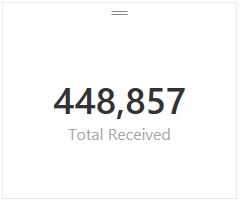
Total Received = FORMAT(SUM(Receipts[Receipts]),"#,###") -- This measure formula rendered like this:
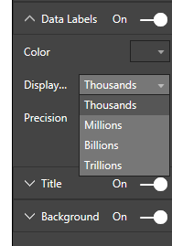
Based on the current version the only changes you can make to label formatting for measures are the following:
Hope this helped. I would expect that we'll see more control for formatting in a future build at some point although I don't know when that will happen.


I have a Matrix which has the details I want, but the values would look better if they were comma separated on the thousands. 'Data Labels' is not an option on the formatting.
Any ideas?
I'm in a similar situation. I have a large matrix table of data and it would be great to be able to show the values in thousands (151k instead of 151,147). Let's make this a feature request.
 MARoberts10 years ago
Advocate I
This works well on a single measure card, but unfortunately a multi-card visualization doesn't seem to have any option to show values in different scales (thousands, millions, etc.).