Forum Discussion

How do you change the data label number format in Power BI Charts?
- 11 years ago
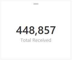
I tried the following with one of my calcuations in "Power BI Desktop" and I was able to get the type of formatting that you were looking for vs. the default #.##K type formatting you had in your screenshot. Unfortuneatly that only works for card style tyles since it changes the numeric format to text (And text style calcs can't be used in bar graphs and other charts)
Total Received = FORMAT(SUM(Receipts[Receipts]),"#,###") -- This measure formula rendered like this:
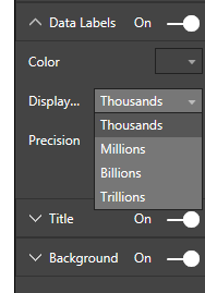
Based on the current version the only changes you can make to label formatting for measures are the following:
Hope this helped. I would expect that we'll see more control for formatting in a future build at some point although I don't know when that will happen.

 Advocate I
What is your data source? Its easy to adust if you built the model with Power BI Desktop. I can comment further once I have a sense of what the data source is and how the connection was published to the portal. Changing data formats on the fly from the portal is not currently possible but there are options at the model level.
- Anonymous11 years agoNot applicable
The data source is a simple flat table in Excel. I'm then pulling that table into Power BI Designer like you mentioned.
In Power BI Designer, I created a simple measure that uses COUNTROWS to give me the total number of row instances in the table, which I am simply displaying in a line chart to view the data over a 12-month period (e.g. Monthly Users Per Month).
So, I'm using a measure as my 'Values' field for the line chart visualization, and not a column from the source table (I'm not sure if that's why I can't format the numbers correctly or not).
Please see the screen shot below for more details.
Again, I'm simply trying to change the "66.22k" to "66,220" and so on.
Thanks!
- cdotzenrod11 years ago
I tried the following with one of my calcuations in "Power BI Desktop" and I was able to get the type of formatting that you were looking for vs. the default #.##K type formatting you had in your screenshot. Unfortuneatly that only works for card style tyles since it changes the numeric format to text (And text style calcs can't be used in bar graphs and other charts)
Total Received = FORMAT(SUM(Receipts[Receipts]),"#,###") -- This measure formula rendered like this:
Based on the current version the only changes you can make to label formatting for measures are the following:
Hope this helped. I would expect that we'll see more control for formatting in a future build at some point although I don't know when that will happen.
 Banrahul10 years agoRegular Visitor
This was really helpful. Do you know how can we format multiple columns in Power BI through a single querry?
- andre11 years ago
Memorable Member
click on a chart then click on the paint brush icon ( on the Visualizations section on the right) to see the formatting options. then click on Data Labels and now you can adjust the format.
- Anonymous11 years agoNot applicable
Thanks for the response, but this does not allow you to adjust the number format in a chart. All you can do here is change the number of decimal places. For example, instead of "50.25k", you can change it to "50.3k", etc.
I'm trying to change "50.3k" to "50,300", etc.
There is a "Display" drop-down button in this options section, but it is grayed out and inactive.
Thanks!
- Tsanka11 years ago
Kudo Collector
I cannot find where, but I read that for the moment it is not possible to skip the auto format/scaling of data in charts.
Pretty much the same pain is described here

