Join us at FabCon Vienna from September 15-18, 2025
The ultimate Fabric, Power BI, SQL, and AI community-led learning event. Save €200 with code FABCOMM.
Get registered- Power BI forums
- Get Help with Power BI
- Desktop
- Service
- Report Server
- Power Query
- Mobile Apps
- Developer
- DAX Commands and Tips
- Custom Visuals Development Discussion
- Health and Life Sciences
- Power BI Spanish forums
- Translated Spanish Desktop
- Training and Consulting
- Instructor Led Training
- Dashboard in a Day for Women, by Women
- Galleries
- Data Stories Gallery
- Themes Gallery
- Contests Gallery
- Quick Measures Gallery
- Notebook Gallery
- Translytical Task Flow Gallery
- TMDL Gallery
- R Script Showcase
- Webinars and Video Gallery
- Ideas
- Custom Visuals Ideas (read-only)
- Issues
- Issues
- Events
- Upcoming Events
Enhance your career with this limited time 50% discount on Fabric and Power BI exams. Ends August 31st. Request your voucher.
- Power BI forums
- Forums
- Get Help with Power BI
- Desktop
- Re: Share your thoughts on the new On-Object Inter...
- Subscribe to RSS Feed
- Mark Topic as New
- Mark Topic as Read
- Float this Topic for Current User
- Bookmark
- Subscribe
- Printer Friendly Page
- Mark as New
- Bookmark
- Subscribe
- Mute
- Subscribe to RSS Feed
- Permalink
- Report Inappropriate Content
Share your thoughts on the new On-Object Interaction feature (preview)
Hit Reply to tell us what you think about the new On-Object Interaction feature so we can continue to improve.
For example:
- What changes would you like to see?
- If you turned off the preview switch, why?
- Any suggestions for addititional settings or capabilities?
Thanks,
-Power BI team
To read more about the feature, see the announcement in the Power BI Product Blog or our documentation on how to Use on-object interaction
FAQs:
- Q: How can I open multiple panes at once?
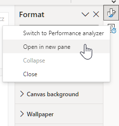
- A: You can CTRL + click or right click on the unselected pane you wish to open and choose "Open in new pane"
- Q: Where did aggregations move to?
- A: It's still on right click of a field, or you can use the new flyout aggregations dropdown while choosing or swapping a field.
- Q: Where did drillthrough and tooltip page setup move to?
- A: Drillthrough is now in the page settings of the format pane under Page Information > Page type > Drillthrough or Tooltip.
- Mark as New
- Bookmark
- Subscribe
- Mute
- Subscribe to RSS Feed
- Permalink
- Report Inappropriate Content
I have seen a lot great design updated in the past years and i always find myself quickly adapt to the new changes but this time i am really struggling. Not only it is not user friendly, from user experience point of view it is not intuitive, having to click so many times just to change the data or format and when you click on certain object to change when it shows blue or grey outline i dont really understand what are those, and when i couldn't copy and paste a visual easily i just switch it off and never look back. I really hope you won't release this feature ultimately.
- Mark as New
- Bookmark
- Subscribe
- Mute
- Subscribe to RSS Feed
- Permalink
- Report Inappropriate Content
Hello, understood on the first points around additional clicks, as echoed in the rest of this forum, we're looking at ways to address that. Could you elaborate on why copy/paste is more difficult? This should not have been impacted by on-object so we'd like to understand if there's a bug here.
- Mark as New
- Bookmark
- Subscribe
- Mute
- Subscribe to RSS Feed
- Permalink
- Report Inappropriate Content
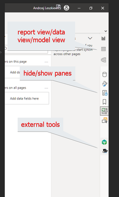
I really like the idea of the new vertical toolbar on the right (with buttons to show/hide panes).
Just make sure it always visible (now buttons disappear from the toolbar and then the entire toolbar dissapers) and add more buttons to the toolbar. Something like this:
The list of buttons to show/hide panes will be different for data view and model view.
Also, it will be great if we can just hold Ctrl and left lick on the icon instead of right click - open in new pane
- Mark as New
- Bookmark
- Subscribe
- Mute
- Subscribe to RSS Feed
- Permalink
- Report Inappropriate Content
Hi
I like the feature of On-object interaction.
The only thing I would like to be kept from the classic interface is the possibility to open several panes at the right for those lucky users who have large screens. I tried holding control and clicking different panes icons but they just replace each other. It's often more convenient to work and see several panes simultaneously, like Build a Visual + Data, or Bookmarks + Selection. Please retain this feature in On-object mode.
Thank you!
- Mark as New
- Bookmark
- Subscribe
- Mute
- Subscribe to RSS Feed
- Permalink
- Report Inappropriate Content
The top issue I'm having with this design is when I want to add or change a data field that feeds a visual (like adding a new column to a table visual). Previously, the formatting and data have lived under tabs in the same pane. Now I keep racking my brain to try to find where I can see the data fields.
Why can I open the visual formatting options in a pane but not view the visual's data fields in a pane? Yet another drastic redesign that has an inconsistent and non-intuitive interaction model.
- Mark as New
- Bookmark
- Subscribe
- Mute
- Subscribe to RSS Feed
- Permalink
- Report Inappropriate Content
Maybe it's just me stumbling over the new concept, but I feel like it was harder to change the Row and Column subtotals. I wanted a Row subtotal but not Column. I changed it the way I typically would and the Column subtotal remained. After a few tries I finally found the right settings.
I feel like changing the Visualization Panel to the menu bar was to both save screen real-estate while keeping with the Office theme of late with a vertical icon-based menu panel.
When I was "done" with my Format panel, I chose to Collapse it and then saw the Data and Format is on the far right in this Vertical menu layout.
Can you leave Visualizations as it's own Panel and then just Collapse it like Format and now Data panel?
Just my two cents.
Jessica.
- Mark as New
- Bookmark
- Subscribe
- Mute
- Subscribe to RSS Feed
- Permalink
- Report Inappropriate Content
While there are a lot of Cool Features in the new on Object Navication, It is an absolute dissaster for creating Complex navigation with booksmarks where you need to see the Selection and Bookmark Panel visible on Screen at the Same time in order to Create and Audit the Structure of your Bookmark Navigation quickly and Efficiently
- Mark as New
- Bookmark
- Subscribe
- Mute
- Subscribe to RSS Feed
- Permalink
- Report Inappropriate Content
The One that I can live without and coud be moved to a Side menu is the Filters Panel
- Mark as New
- Bookmark
- Subscribe
- Mute
- Subscribe to RSS Feed
- Permalink
- Report Inappropriate Content
I like the general direction of the functionality. I have grown accustomed to the pane layout and enjoy it, but would find value in on object editing once reports are built.
Why should the UI be an either or? Most functions in other object apps utilize an either/or approach.
- Mark as New
- Bookmark
- Subscribe
- Mute
- Subscribe to RSS Feed
- Permalink
- Report Inappropriate Content
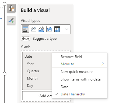
When I add a date to a visual, it defaults to "Date Hierarchy" and I do not see an option to show just the date like in the old version.
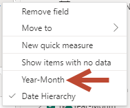
For example if column is "Year-Month" I don't see the option to select the "Year-Month" value lke in the old one.
In the old version I can select "Year-Month" which is a sigle date like: 2023-03
How do I do that on the new version?
Thanks.
- Mark as New
- Bookmark
- Subscribe
- Mute
- Subscribe to RSS Feed
- Permalink
- Report Inappropriate Content
Should still be available on right click:
- Mark as New
- Bookmark
- Subscribe
- Mute
- Subscribe to RSS Feed
- Permalink
- Report Inappropriate Content
It would be good if there was an option to select the default setting for dates, which is currently at Date Hierarchy, and can be time consuming to change if I want to display just the dates, especially in tables.
- Mark as New
- Bookmark
- Subscribe
- Mute
- Subscribe to RSS Feed
- Permalink
- Report Inappropriate Content
You can modify this setting for all your reports or the current file, to remove auto create of a date hierarchy if you prefer. Details are here: https://learn.microsoft.com/en-us/power-bi/transform-model/desktop-auto-date-time#configure-auto-dat...
- Mark as New
- Bookmark
- Subscribe
- Mute
- Subscribe to RSS Feed
- Permalink
- Report Inappropriate Content
It is nice, but needs some work to make some advanced reporting techniques work. My biggest need and I hit it within minutes of using the new feature is:
I need access to the multiple panels at once. Specifically the bookmarks and the selection panels. When you have bookmarks using (selected visuals) which interact with hidden slicers, there is not currently a way to select the visuals you want easily to update the bookmark in the new formatting. Since I have to toggle between the panels it makes it more difficult to update bookmarks. It would be nice to be able to pin them open instead of the side ribbon (image below) which only give me access to one panel at a time. I had to turn off the feature for speedier development.
- Mark as New
- Bookmark
- Subscribe
- Mute
- Subscribe to RSS Feed
- Permalink
- Report Inappropriate Content
@NickKennedy @DavidPitts right click on any of the icons you've shown in the image above and select the 'Open in new pane' option, that'll show panels side by side.
- Mark as New
- Bookmark
- Subscribe
- Mute
- Subscribe to RSS Feed
- Permalink
- Report Inappropriate Content
Well isn't that just a handy little hidden feature. Thank you @cc_pbi ! That helps out a lot.
- Mark as New
- Bookmark
- Subscribe
- Mute
- Subscribe to RSS Feed
- Permalink
- Report Inappropriate Content
That is Great - A little Hidden - but it addresses my Major concern - It would be good though if these setting persist between Session, (even in the prior Version they didn't) so that I could set up my preference for working rather than reestablish it every time I open the app
- Mark as New
- Bookmark
- Subscribe
- Mute
- Subscribe to RSS Feed
- Permalink
- Report Inappropriate Content
I Agree I have same comment
- Mark as New
- Bookmark
- Subscribe
- Mute
- Subscribe to RSS Feed
- Permalink
- Report Inappropriate Content
@RosieL This has the potential to be great, it feels more natural and intuitive.
The only improvement I would suggest would be to have an option to make the features (Format, Bookmark, Selection etc) on the pane switcher permanently pinned. I found it annoying having to add these to the pane switcher every time I opened a file whereas having these always pinned makes it even more userfriendly.
- Mark as New
- Bookmark
- Subscribe
- Mute
- Subscribe to RSS Feed
- Permalink
- Report Inappropriate Content
This is a great point and suggestion. Every time I open a new report I find myself pausing, trying to remember how to access the visual formatting and selection panes. As a result, this change has slowed my productivity as I stumble around trying to find these settings.
But if they could be pinned - and the pinning persisted across report opens - this would be much easier on my cognitive load.
- Mark as New
- Bookmark
- Subscribe
- Mute
- Subscribe to RSS Feed
- Permalink
- Report Inappropriate Content
The worst feature ever.
Stop trying being so creative... focus on the ribbon at the top like in all O365 products and PBI will gain much more credits.
Helpful resources
| User | Count |
|---|---|
| 81 | |
| 74 | |
| 42 | |
| 30 | |
| 28 |
| User | Count |
|---|---|
| 108 | |
| 96 | |
| 53 | |
| 48 | |
| 47 |


