- Subscribe to RSS Feed
- Mark Topic as New
- Mark Topic as Read
- Float this Topic for Current User
- Bookmark
- Subscribe
- Printer Friendly Page
- Mark as New
- Bookmark
- Subscribe
- Mute
- Subscribe to RSS Feed
- Permalink
- Report Inappropriate Content

Share your thoughts on the new On-Object Interaction feature (preview)
Hit Reply to tell us what you think about the new On-Object Interaction feature so we can continue to improve.
For example:
- What changes would you like to see?
- If you turned off the preview switch, why?
- Any suggestions for addititional settings or capabilities?
Thanks,
-Power BI team
To read more about the feature, see the announcement in the Power BI Product Blog or our documentation on how to Use on-object interaction
FAQs:
- Q: How can I open multiple panes at once?
- A: You can CTRL + click or right click on the unselected pane you wish to open and choose "Open in new pane"
- Q: Where did aggregations move to?
- A: It's still on right click of a field, or you can use the new flyout aggregations dropdown while choosing or swapping a field.
- Q: Where did drillthrough and tooltip page setup move to?
- A: Drillthrough is now in the page settings of the format pane under Page Information > Page type > Drillthrough or Tooltip.
- Mark as New
- Bookmark
- Subscribe
- Mute
- Subscribe to RSS Feed
- Permalink
- Report Inappropriate Content

I like the general direction of the functionality. I have grown accustomed to the pane layout and enjoy it, but would find value in on object editing once reports are built.
Why should the UI be an either or? Most functions in other object apps utilize an either/or approach.
- Mark as New
- Bookmark
- Subscribe
- Mute
- Subscribe to RSS Feed
- Permalink
- Report Inappropriate Content
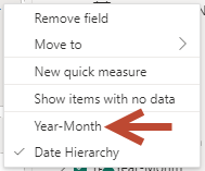
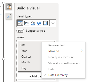
When I add a date to a visual, it defaults to "Date Hierarchy" and I do not see an option to show just the date like in the old version.
For example if column is "Year-Month" I don't see the option to select the "Year-Month" value lke in the old one.
In the old version I can select "Year-Month" which is a sigle date like: 2023-03
How do I do that on the new version?
Thanks.
- Mark as New
- Bookmark
- Subscribe
- Mute
- Subscribe to RSS Feed
- Permalink
- Report Inappropriate Content

Should still be available on right click:
- Mark as New
- Bookmark
- Subscribe
- Mute
- Subscribe to RSS Feed
- Permalink
- Report Inappropriate Content

It would be good if there was an option to select the default setting for dates, which is currently at Date Hierarchy, and can be time consuming to change if I want to display just the dates, especially in tables.
- Mark as New
- Bookmark
- Subscribe
- Mute
- Subscribe to RSS Feed
- Permalink
- Report Inappropriate Content

You can modify this setting for all your reports or the current file, to remove auto create of a date hierarchy if you prefer. Details are here: https://learn.microsoft.com/en-us/power-bi/transform-model/desktop-auto-date-time#configure-auto-dat...
- Mark as New
- Bookmark
- Subscribe
- Mute
- Subscribe to RSS Feed
- Permalink
- Report Inappropriate Content
It is nice, but needs some work to make some advanced reporting techniques work. My biggest need and I hit it within minutes of using the new feature is:
I need access to the multiple panels at once. Specifically the bookmarks and the selection panels. When you have bookmarks using (selected visuals) which interact with hidden slicers, there is not currently a way to select the visuals you want easily to update the bookmark in the new formatting. Since I have to toggle between the panels it makes it more difficult to update bookmarks. It would be nice to be able to pin them open instead of the side ribbon (image below) which only give me access to one panel at a time. I had to turn off the feature for speedier development.
- Mark as New
- Bookmark
- Subscribe
- Mute
- Subscribe to RSS Feed
- Permalink
- Report Inappropriate Content
@NickKennedy @DavidPitts right click on any of the icons you've shown in the image above and select the 'Open in new pane' option, that'll show panels side by side.
- Mark as New
- Bookmark
- Subscribe
- Mute
- Subscribe to RSS Feed
- Permalink
- Report Inappropriate Content
Well isn't that just a handy little hidden feature. Thank you @cc_pbi ! That helps out a lot.
- Mark as New
- Bookmark
- Subscribe
- Mute
- Subscribe to RSS Feed
- Permalink
- Report Inappropriate Content
That is Great - A little Hidden - but it addresses my Major concern - It would be good though if these setting persist between Session, (even in the prior Version they didn't) so that I could set up my preference for working rather than reestablish it every time I open the app
- Mark as New
- Bookmark
- Subscribe
- Mute
- Subscribe to RSS Feed
- Permalink
- Report Inappropriate Content
I Agree I have same comment
- Mark as New
- Bookmark
- Subscribe
- Mute
- Subscribe to RSS Feed
- Permalink
- Report Inappropriate Content

@RosieL This has the potential to be great, it feels more natural and intuitive.
The only improvement I would suggest would be to have an option to make the features (Format, Bookmark, Selection etc) on the pane switcher permanently pinned. I found it annoying having to add these to the pane switcher every time I opened a file whereas having these always pinned makes it even more userfriendly.
- Mark as New
- Bookmark
- Subscribe
- Mute
- Subscribe to RSS Feed
- Permalink
- Report Inappropriate Content

This is a great point and suggestion. Every time I open a new report I find myself pausing, trying to remember how to access the visual formatting and selection panes. As a result, this change has slowed my productivity as I stumble around trying to find these settings.
But if they could be pinned - and the pinning persisted across report opens - this would be much easier on my cognitive load.
- Mark as New
- Bookmark
- Subscribe
- Mute
- Subscribe to RSS Feed
- Permalink
- Report Inappropriate Content

The worst feature ever.
Stop trying being so creative... focus on the ribbon at the top like in all O365 products and PBI will gain much more credits.
- Mark as New
- Bookmark
- Subscribe
- Mute
- Subscribe to RSS Feed
- Permalink
- Report Inappropriate Content

"Drill through" disappeared from all my charts. It stopped working. What happened?
- Mark as New
- Bookmark
- Subscribe
- Mute
- Subscribe to RSS Feed
- Permalink
- Report Inappropriate Content

I've found two really annoying bugs so far with the "On object interaction" enabled:
- In my report I sometimes add a blank row to my table, to make it look better. I've done this by creating a blank measure. In my visual I could rename that measure to a space, so there is no visible measure name in the report. This is however no longer possible.
- In the title and subtitle of a visual you can now use conditional formatting, so use a value to give you the title of the visual. If you work in a file which contains the model, you can select measures. If you however connect to a dataset, selecting measures is not possible. It would be great if that could also be enabled.
- Mark as New
- Bookmark
- Subscribe
- Mute
- Subscribe to RSS Feed
- Permalink
- Report Inappropriate Content

I have found a bug in the new on-object interaction feature.
Bug: if you make a change to the reports current theme (and by this I mean the customizing option for the current theme) - the format panel seems to get stuck on the page options. Even completely closing the format pane (by clicking the show/hide option in the ribbon) - does not fix this. Reopening from a visual does not fix this. The only solution appears to be - restart the report, without the customized theme.
NOTES: It took some time to find the format pane option - but once I did I thought I could get used to the way the feature works (although I echo the sentiment of those who don't like the way we add data to the new layout). Unfortunately, I found the bug mentioned above within a day - had to revert.
- Mark as New
- Bookmark
- Subscribe
- Mute
- Subscribe to RSS Feed
- Permalink
- Report Inappropriate Content

I think the functionality is a nice added option to what we have already when you need to make a quick change to a chart that is already set up.
I however did not like that you have now hidden the format bar and data bar by default. I miss the quick overview of what is in a chart.
So for me ideally you have both in, or at least in the option menu a way to turn back on the old visualization and format bar.
Based on the above I had to turn off this feature and was reducing my working efficiency.
- Mark as New
- Bookmark
- Subscribe
- Mute
- Subscribe to RSS Feed
- Permalink
- Report Inappropriate Content

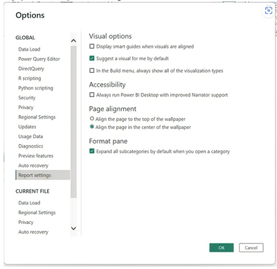
Love where this is going, much more intuitive design. Please give us the option to turn off the "Suggest a type" option as default. It's trying to help but it's more annoying than Word in that regard.
- Mark as New
- Bookmark
- Subscribe
- Mute
- Subscribe to RSS Feed
- Permalink
- Report Inappropriate Content

You can turn it off by default from here:
- Mark as New
- Bookmark
- Subscribe
- Mute
- Subscribe to RSS Feed
- Permalink
- Report Inappropriate Content

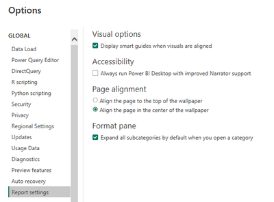
what version are you running? I am 2.115.842.0 and I do not have that option.....
- Mark as New
- Bookmark
- Subscribe
- Mute
- Subscribe to RSS Feed
- Permalink
- Report Inappropriate Content

"Drill through" disappeared from all my charts. It stopped working. What happened?
Helpful resources
| Subject | Author | Posted | |
|---|---|---|---|
| 01-22-2025 12:20 PM | |||
| 09-05-2024 05:00 AM | |||
| 01-06-2025 12:51 PM | |||
| 01-14-2025 10:21 AM | |||
| 03-13-2023 11:41 PM |
| User | Count |
|---|---|
| 95 | |
| 86 | |
| 85 | |
| 52 | |
| 46 |


