This is best Fabric, Power BI, SQL and AI community event. How do we know? The last event sold out! Save €200 with code FABCMTY200.
Register nowThe Fabric community is now in read-only for platform upgrade. Learn more
Hello! I'm a bit new to PowerBI so this might be a dumb question, apologies in advance if my explanation is not the best either.
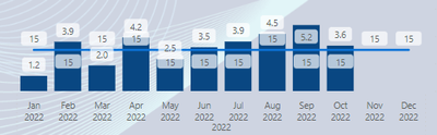
I have a Line and clustered column chart, the columns are showing an average number and the line chart is a static number Measure (15).
I would like the line Y-axis to be in relation to the columns but right now the columns are higher than the line even though their values are less. How would I go about fixing this?
Solved! Go to Solution.
Not getting this to work as expected unfortunately, please see my reply below.
But have you tried the Secondary Y-axis?
Ohhh, I totally missed this, thank you so much!
My pleasure, Jowh!
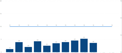
By tampering with min/max values of Y axis I can adjust the placement of the line somewhat but it is still not "aligned" with the bars. Ie in the picture it looks like 5 is 50% to 15:
I understand that this is because the Y and X axis ranges are different (0-20 & 12-18) but I cant find any way of setting the range of the X axis.
Join us in Barcelona for FabCon and SQLCon, the Fabric, Power BI, SQL, and AI community event. Save €200 with code FABCMTY200.
| User | Count |
|---|---|
| 20 | |
| 18 | |
| 14 | |
| 13 | |
| 13 |
| User | Count |
|---|---|
| 48 | |
| 35 | |
| 24 | |
| 20 | |
| 19 |