FabCon is coming to Atlanta
Join us at FabCon Atlanta from March 16 - 20, 2026, for the ultimate Fabric, Power BI, AI and SQL community-led event. Save $200 with code FABCOMM.
Register now!- Power BI forums
- Get Help with Power BI
- Desktop
- Service
- Report Server
- Power Query
- Mobile Apps
- Developer
- DAX Commands and Tips
- Custom Visuals Development Discussion
- Health and Life Sciences
- Power BI Spanish forums
- Translated Spanish Desktop
- Training and Consulting
- Instructor Led Training
- Dashboard in a Day for Women, by Women
- Galleries
- Data Stories Gallery
- Themes Gallery
- Contests Gallery
- QuickViz Gallery
- Quick Measures Gallery
- Visual Calculations Gallery
- Notebook Gallery
- Translytical Task Flow Gallery
- TMDL Gallery
- R Script Showcase
- Webinars and Video Gallery
- Ideas
- Custom Visuals Ideas (read-only)
- Issues
- Issues
- Events
- Upcoming Events
Vote for your favorite vizzies from the Power BI Dataviz World Championship submissions. Vote now!
- Power BI forums
- Forums
- Get Help with Power BI
- Custom Visuals Development Discussion
- Re: Power BI Custom Visuals' Community
- Subscribe to RSS Feed
- Mark Topic as New
- Mark Topic as Read
- Float this Topic for Current User
- Bookmark
- Subscribe
- Printer Friendly Page
- Mark as New
- Bookmark
- Subscribe
- Mute
- Subscribe to RSS Feed
- Permalink
- Report Inappropriate Content
Power BI Custom Visuals' Community
Welcome to Power BI Custom Visuals Community!
Power BI custom visuals is all about community. We are very excited to announce that custom visuals now have a special place in the Power BI community site, to share knowledge, ideas and news!
- Custom visuals development discussion – Ask questions and share knowledge about developing custom visuals.
- Custom visuals ideas – Share your ideas, ask for features, propose new custom visuals.
- Custom visuals community blog – Community news and announcements for new custom visuals available, new APIs released, tips & tricks from developers and users.
Power BI custom visuals useful links for developers
- Developer documents - find here all documents you need
- Step-by-step tutorial
- Looking for advanced tutorial? Find it here
- Visit also our github
- Find here Power BI visuals' Samples
- Custom visual's webinar
- For technichal questions and help please reach out pbicvsupport@microsoft.com
- Mark as New
- Bookmark
- Subscribe
- Mute
- Subscribe to RSS Feed
- Permalink
- Report Inappropriate Content
Hi Team,
I am Anshika & have just started working with deneb for creating custom visuals, I wanted to know if deneb is not helpful around bigger size dataset ,more specifically if the column has bigger number of unique values to create custom visuals with or they can be included to create something meaning with the help of deneb.
pls help if anybody could be able to.
Thanks!!
- Mark as New
- Bookmark
- Subscribe
- Mute
- Subscribe to RSS Feed
- Permalink
- Report Inappropriate Content
Good Afternoon,
I have one problem wiht the "table" graphs. For exemple:
From the table "costs" i have one cloumn called "Proyecto".
From the table "Lecturas", I also have a column called "Proyecto".
The problem is: When I select the proyecto at the first "graph" (Alibar in this exemple), the second graph still showing all the projects. Can somewone help me please?
- Mark as New
- Bookmark
- Subscribe
- Mute
- Subscribe to RSS Feed
- Permalink
- Report Inappropriate Content
Do you have a relationship created between those two tables? If one has unique values, you can create 1:m relationship. Or maybe you have a separate table with the 'Proyecto' unique items which you can use as a dimension and create relationships to the other two tables..
- Mark as New
- Bookmark
- Subscribe
- Mute
- Subscribe to RSS Feed
- Permalink
- Report Inappropriate Content
I want to format the Timeline 2.4.0 in my themes.json file and import that theme in my other reports too. The problem is I don't know the properties of this custom visual. I don't want to format this timeline control with the visual level formatting options since there will be a lot of repetition to reproduce the same effect in other reports. Can somebody help me with that?
Here is the link of that custom visual: https://appsource.microsoft.com/en-us/product/power-bi-visuals/wa104380786?tab=overview&exp=...
- Mark as New
- Bookmark
- Subscribe
- Mute
- Subscribe to RSS Feed
- Permalink
- Report Inappropriate Content
I am trying to modify the enhanced scatter open source to create a matrix with a bubble with 2 categorical data as x and y-axis, and one measure as bubble size. Could anyone please suggest how to deal it with?
https://github.com/microsoft/powerbi-visuals-enhancedscatter
Thanks!
- Mark as New
- Bookmark
- Subscribe
- Mute
- Subscribe to RSS Feed
- Permalink
- Report Inappropriate Content
Hi community,
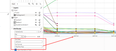
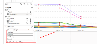
I need to modify the format of the date in the charticulator like dd/mm/yy.
I already change the Tick format in Data as {%d/%m/%y}
but when I SAVE the graph the Tick format is deleted and all date change to old format like this
Do you have what I have to do to fix this ?
Thanks
- Mark as New
- Bookmark
- Subscribe
- Mute
- Subscribe to RSS Feed
- Permalink
- Report Inappropriate Content
Hello!
I'd like to use Gantt 2.2.3, but I have miltiple levels in my projects' catalogue so I need a tree of projects. If I understant this correctly, this type of diargam allow to use only two levels: a child and one parent. Is it possible to add more than one parent to the diagram? How?
Thank you!
- Mark as New
- Bookmark
- Subscribe
- Mute
- Subscribe to RSS Feed
- Permalink
- Report Inappropriate Content
Hello,
I am using Sankey 3.0.3 custom visual. I have set Display Units as Millions in Data labels. But in tooltip, the formatting appears for some links and for some links it does not. Even the columns/measures used are formatted but that formatting does not appear in Sankey visual tooltip.
- Mark as New
- Bookmark
- Subscribe
- Mute
- Subscribe to RSS Feed
- Permalink
- Report Inappropriate Content
Hi,
Does anyone have issues with the title space padding within the Horizontal Bar Chart v 1.5.7? The first bar is always cut in half by the tile regardless of the font size and bar settings. I wonder if there's a way to get around this.
- Mark as New
- Bookmark
- Subscribe
- Mute
- Subscribe to RSS Feed
- Permalink
- Report Inappropriate Content
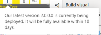
This morning (AEST) we have noticed that the Chiclet Slicer from AppSource is causing glitching in the PowerBI Service. It is difficult to change the selection in the slicer and matrix visuals are flashing until this custom visual is removed from the page. I noticed a week ago that the visual had the below note on it:
I wondered if the issue is a result of the new version. Is this a known issue. Would be great to know when it will be fixed, in the meantime we are switching all reporting away from this visual back to the standard slicer.
- Mark as New
- Bookmark
- Subscribe
- Mute
- Subscribe to RSS Feed
- Permalink
- Report Inappropriate Content
I have also come across the same issue today. Worked perfectly fine until today. Now we are seeing lots of screen flickering on reports that contain the chiclet slicer.
Will be intersting to know if this is to be addressed in the 2.0.0.0 version
- Mark as New
- Bookmark
- Subscribe
- Mute
- Subscribe to RSS Feed
- Permalink
- Report Inappropriate Content
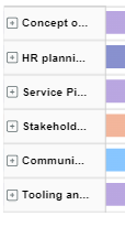
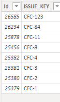
I'm having issues with the 'Parent' field of the visual. There are 8 Items but the Gantt Chart is only displaying 6
Gant Chart displays this
But the Number of Paren Items is as follows
How can this be correceted?
- Mark as New
- Bookmark
- Subscribe
- Mute
- Subscribe to RSS Feed
- Permalink
- Report Inappropriate Content
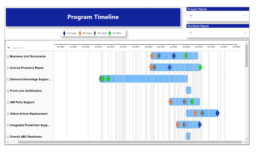
The lines that go across the milestones look terrible and it would be such an easy update to give us control of this. Can we PLEASE get this updated so that they can be removed...
Or if someone knows how to contact Microsoft over this please let me know.
- Mark as New
- Bookmark
- Subscribe
- Mute
- Subscribe to RSS Feed
- Permalink
- Report Inappropriate Content
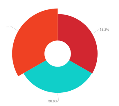
Anyone having any issues with the Pie in the Aster Plot 1.4.0? I find the Details Labels disappear outside the boundaries of the visual. See the below image where the label for the left hand pie slice is missing.
- Mark as New
- Bookmark
- Subscribe
- Mute
- Subscribe to RSS Feed
- Permalink
- Report Inappropriate Content
Hi,
I have tried Stream Graph in PowerBI desktop (From more visual option). The graph has a bug which needs to be fixed.
The bug is Y axis of the graph is not alligned propery with the visual.
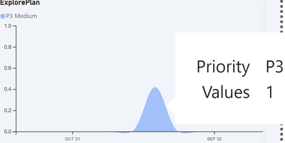
For Ex- if I have a count of 1 closed ticket for specific month than as per the Y axis of the stream graph it is 0.5 and NOT count of 1. (Screenshot attached)
Explanation-
In the graph you can see "ExplorePlan" application has 1 closed ticket for Apr 22 but as per the Y axis of the stream graph it count is between 0.4-0.5 value. which is not correct.
- Mark as New
- Bookmark
- Subscribe
- Mute
- Subscribe to RSS Feed
- Permalink
- Report Inappropriate Content
Morning all,
I am relatively new to Power BI and i imagine this is a fairly simple thing to do but i cannot work it out, I am trying to filter out words from the wordcloud visual such as "the", "and" as they provide no insight. I would really appreciate any help anyone can provide me around how to do this.
Thanks!
- Mark as New
- Bookmark
- Subscribe
- Mute
- Subscribe to RSS Feed
- Permalink
- Report Inappropriate Content
i am facing a problem for last few months in chiclet slicer, when i am opening my report it is taking 9 to 10 seconds for loading the chiclet slicer and due to which it is appearing late, is there any solution to load the slicer faster??
- Mark as New
- Bookmark
- Subscribe
- Mute
- Subscribe to RSS Feed
- Permalink
- Report Inappropriate Content
I am having a similar issue to a previous poster...
The 'Text Filter' custom visual show me this error "To see this custom visual, add it to this report first: textFilter" once published to BI Service. Works fine in BI Desktop. Thanks.
- Mark as New
- Bookmark
- Subscribe
- Mute
- Subscribe to RSS Feed
- Permalink
- Report Inappropriate Content
Hi, bkara. I was able to resolve my issue by changing the FIPS field in my table to whole number instead of text. Once I did that, the visual rendered correctly. I referred to this link:
https://community.powerbi.com/t5/Desktop/Shape-Map-unique-map-keys/m-p/474154
Had to read it a couple of times before I actually got it into my head to check the field formatting. . .
Hope this helps.
- Mark as New
- Bookmark
- Subscribe
- Mute
- Subscribe to RSS Feed
- Permalink
- Report Inappropriate Content
Drilldown Choropleth Visual Issue: The following has been noted in using the Drilldown Choropleth Visual for Microsoft Power BI - Filtering on First Level location causes inaccurate Second Level location geographical visual - For example filtering on States results in inaccurate depiction of County level mapping. Also, if the source data does not contain a complete state-county representation, drilling down on the visual creates similar inaccurate representation of counties especially in cases where counties in different states have the same name. This could be due to how the Json shape files are constructed, but I experienced similar results using different json files. I may need to forego using this visual and defer to the Shape File visual which does not offer drill down capabilities.
- Mark as New
- Bookmark
- Subscribe
- Mute
- Subscribe to RSS Feed
- Permalink
- Report Inappropriate Content
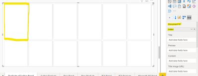
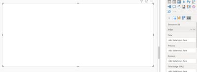
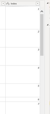
Card Browser Visual is not working with the document id of one table, although it works just fine on another. Eliminating all discrepancies, the index column on both tables are the same data type, both are created exactly the same way, yet one populates into the "card" format, while the other remains blank. Any suggestions?
Helpful resources

Power BI Dataviz World Championships
Vote for your favorite vizzies from the Power BI World Championship submissions!

Join our Community Sticker Challenge 2026
If you love stickers, then you will definitely want to check out our Community Sticker Challenge!

Power BI Monthly Update - January 2026
Check out the January 2026 Power BI update to learn about new features.


