Join us at FabCon Vienna from September 15-18, 2025
The ultimate Fabric, Power BI, SQL, and AI community-led learning event. Save €200 with code FABCOMM.
Get registered- Power BI forums
- Get Help with Power BI
- Desktop
- Service
- Report Server
- Power Query
- Mobile Apps
- Developer
- DAX Commands and Tips
- Custom Visuals Development Discussion
- Health and Life Sciences
- Power BI Spanish forums
- Translated Spanish Desktop
- Training and Consulting
- Instructor Led Training
- Dashboard in a Day for Women, by Women
- Galleries
- Data Stories Gallery
- Themes Gallery
- Contests Gallery
- Quick Measures Gallery
- Notebook Gallery
- Translytical Task Flow Gallery
- TMDL Gallery
- R Script Showcase
- Webinars and Video Gallery
- Ideas
- Custom Visuals Ideas (read-only)
- Issues
- Issues
- Events
- Upcoming Events
Compete to become Power BI Data Viz World Champion! First round ends August 18th. Get started.
- Power BI forums
- Forums
- Get Help with Power BI
- Service
- Thin columns in column chart when using time as ax...
- Subscribe to RSS Feed
- Mark Topic as New
- Mark Topic as Read
- Float this Topic for Current User
- Bookmark
- Subscribe
- Printer Friendly Page
- Mark as New
- Bookmark
- Subscribe
- Mute
- Subscribe to RSS Feed
- Permalink
- Report Inappropriate Content
Thin columns in column chart when using time as axis
Update: Please vote for the idea to make this happen
---
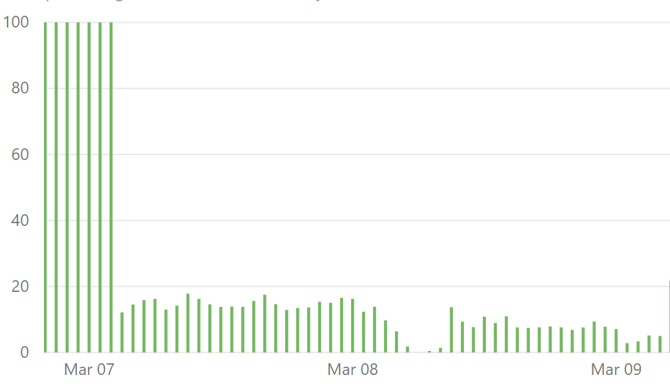
My data has a single value for each hour in a 7 day timeframe. I want to display it as a column chart.
I did just that, and the columns are too thin and skinny. Is there a way to make them wider?

I've tried using both stacked and clustered charts - but in both cases the spacing is the same.
If I switch the x axis from continous to categorical, the chart looks much better - but then not all of my values are displayed (I have 168 values).
Is there a way to make the columns wider?
Solved! Go to Solution.
- Mark as New
- Bookmark
- Subscribe
- Mute
- Subscribe to RSS Feed
- Permalink
- Report Inappropriate Content
@v-yuta-msft - thanks! I've purposed the idea: https://ideas.powerbi.com/forums/265200-power-bi-ideas/suggestions/37106872-ability-to-adjust-column...
@Anonymous , that option exists only for Categorical axis. For continuous axis, there is no such option
- Mark as New
- Bookmark
- Subscribe
- Mute
- Subscribe to RSS Feed
- Permalink
- Report Inappropriate Content
In a line and stacked column chart, under the formatting pane --> X-Axis, you can adjust the inner padding to be smaller. That should widen your columns.
- Mark as New
- Bookmark
- Subscribe
- Mute
- Subscribe to RSS Feed
- Permalink
- Report Inappropriate Content
@v-yuta-msft - thanks! I've purposed the idea: https://ideas.powerbi.com/forums/265200-power-bi-ideas/suggestions/37106872-ability-to-adjust-column...
@Anonymous , that option exists only for Categorical axis. For continuous axis, there is no such option
- Mark as New
- Bookmark
- Subscribe
- Mute
- Subscribe to RSS Feed
- Permalink
- Report Inappropriate Content
@SN1 ,
Thank you for submitting idea. I have voted for this idea.
Community Support Team _ Jimmy Tao
If this post helps, then please consider Accept it as the solution to help the other members find it more quickly.
- Mark as New
- Bookmark
- Subscribe
- Mute
- Subscribe to RSS Feed
- Permalink
- Report Inappropriate Content
@SN1 ,
I'm afraid currently stacked bar chart only can change the size of label and text in X-axis and Y-axis. I would suggest you to submit your idea here to help improve power bi.
Community Support Team _ Jimmy Tao
If this post helps, then please consider Accept it as the solution to help the other members find it more quickly.


