A new Data Days event is coming soon!
This time we’re going bigger than ever. Fabric, Power BI, SQL, AI and more. We're covering it all. You won't want to miss it.
Learn more- Power BI forums
- Get Help with Power BI
- Desktop
- Service
- Report Server
- Power Query
- Mobile Apps
- Developer
- DAX Commands and Tips
- Custom Visuals Development Discussion
- Health and Life Sciences
- Power BI Spanish forums
- Translated Spanish Desktop
- Training and Consulting
- Instructor Led Training
- Dashboard in a Day for Women, by Women
- Galleries
- Data Stories Gallery
- Themes Gallery
- Contests Gallery
- QuickViz Gallery
- Quick Measures Gallery
- Visual Calculations Gallery
- Notebook Gallery
- Translytical Task Flow Gallery
- TMDL Gallery
- R Script Showcase
- Webinars and Video Gallery
- Ideas
- Custom Visuals Ideas (read-only)
- Issues
- Issues
- Events
- Upcoming Events
Level up your Power BI skills this month - build one visual each week and tell better stories with data! Get started
- Power BI forums
- Forums
- Get Help with Power BI
- Service
- Re: Script runtime error for published R script on...
- Subscribe to RSS Feed
- Mark Topic as New
- Mark Topic as Read
- Float this Topic for Current User
- Bookmark
- Subscribe
- Printer Friendly Page
- Mark as New
- Bookmark
- Subscribe
- Mute
- Subscribe to RSS Feed
- Permalink
- Report Inappropriate Content
Script runtime error for published R script on the Power BI Service
Hello!
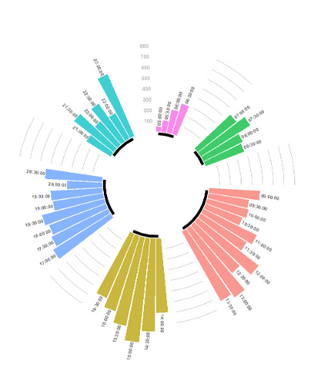
I have created a circular barchart in Power BI desktop using R. Everything works fine in Power BI Desktop. Image of the visual and
the R-script can be seen below. However, when publishing the report I get the Script Runtime error and the visual won't display.
R-script:
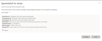
Script Runtime Error:
The error message is in Norwegian, but it says: "Try again later, or contact customer support".
Licence used: Pro Licence
R version used: 4.2.1
tidyverse version used: 1.3.2
What I found interesting is that when I created a simple barchart where I hard coded the values needed for the plot instead of using the data I have loaded into Power BI Desktop, the visual works after I publish it.
The loaded data I am trying to use is not exceeding the limit of 150 000 rows, as I have shaved it down to just 7 values and I still get the Script Runtime Error.
Any help in solving this would be much appreciated.
Thanks!
Solved! Go to Solution.
- Mark as New
- Bookmark
- Subscribe
- Mute
- Subscribe to RSS Feed
- Permalink
- Report Inappropriate Content
Solved!
Power BI was not able to display the graph when data column name contained æ, ø or å.
- Mark as New
- Bookmark
- Subscribe
- Mute
- Subscribe to RSS Feed
- Permalink
- Report Inappropriate Content
Solved!
Power BI was not able to display the graph when data column name contained æ, ø or å.
Helpful resources

Power BI Monthly Update - April 2026
Check out the April 2026 Power BI update to learn about new features.

Data Days 2026 coming soon!
Sign up to receive a private message when registration opens and key events begin.

New to Fabric Survey
If you have recently started exploring Fabric, we'd love to hear how it's going. Your feedback can help with product improvements.

| User | Count |
|---|---|
| 12 | |
| 11 | |
| 8 | |
| 7 | |
| 7 |
| User | Count |
|---|---|
| 38 | |
| 27 | |
| 25 | |
| 22 | |
| 22 |


