Get Fabric certified for FREE!
Don't miss your chance to take the Fabric Data Engineer (DP-600) exam for FREE! Find out how by watching the DP-600 session on-demand now through April 28th.
Learn more- Power BI forums
- Get Help with Power BI
- Desktop
- Service
- Report Server
- Power Query
- Mobile Apps
- Developer
- DAX Commands and Tips
- Custom Visuals Development Discussion
- Health and Life Sciences
- Power BI Spanish forums
- Translated Spanish Desktop
- Training and Consulting
- Instructor Led Training
- Dashboard in a Day for Women, by Women
- Galleries
- Data Stories Gallery
- Themes Gallery
- Contests Gallery
- QuickViz Gallery
- Quick Measures Gallery
- Visual Calculations Gallery
- Notebook Gallery
- Translytical Task Flow Gallery
- TMDL Gallery
- R Script Showcase
- Webinars and Video Gallery
- Ideas
- Custom Visuals Ideas (read-only)
- Issues
- Issues
- Events
- Upcoming Events
Join the FabCon + SQLCon recap series. Up next: Power BI, Real-Time Intelligence, IQ and AI, and Data Factory take center stage. All sessions are available on-demand after the live show. Register now
- Power BI forums
- Forums
- Get Help with Power BI
- Service
- Re: Conditional Formatting in Clustered Column Cha...
- Subscribe to RSS Feed
- Mark Topic as New
- Mark Topic as Read
- Float this Topic for Current User
- Bookmark
- Subscribe
- Printer Friendly Page
- Mark as New
- Bookmark
- Subscribe
- Mute
- Subscribe to RSS Feed
- Permalink
- Report Inappropriate Content
Conditional Formatting in Clustered Column Chart
Hi All,
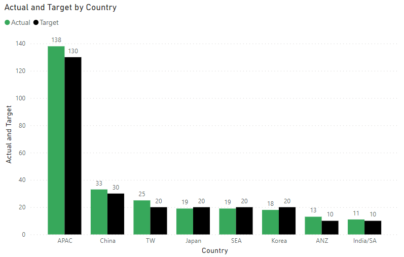
I am using Cluster Column Chart to compare Actual vs Target in Revenue and would like to apply conditional formatting to the "Actual" columns such that it will be green if Actual >= Target and red if Actual < Target.
X Axis - Country
Y Axis - Actual
Y Axis - Target
However, I am unable to find the "fx" button under Columns to apply the conditional formatting. I am currently using the April 2022 version. Is there another way to apply the conditional formatting?
Solved! Go to Solution.
- Mark as New
- Bookmark
- Subscribe
- Mute
- Subscribe to RSS Feed
- Permalink
- Report Inappropriate Content
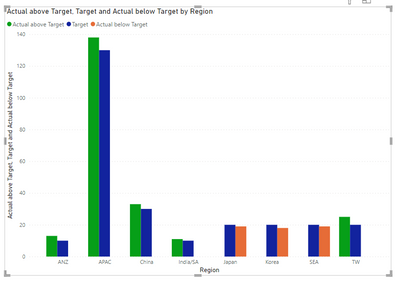
see attached. I cheated by separating the scenarios into different columns Then I cheated again by arranging the value fields in a certain order.
- Mark as New
- Bookmark
- Subscribe
- Mute
- Subscribe to RSS Feed
- Permalink
- Report Inappropriate Content
Sample data:
| Country | Actual | Target |
APAC | 138 | 130 |
| China | 33 | 30 |
| Japan | 19 | 20 |
| India/SA | 11 | 10 |
| ANZ | 13 | 10 |
| Korea | 18 | 20 |
| SEA | 19 | 20 |
| TW | 25 | 20 |
Clustered Column Chart:
Would like to have Actual that are more than the corresponding Target to be in green and red when lower than the corresponding Target, i.e. columns of APAC, China, TW & ANZ to remain green and the columns of Japan, SEA and Korea to be in red.
- Mark as New
- Bookmark
- Subscribe
- Mute
- Subscribe to RSS Feed
- Permalink
- Report Inappropriate Content
Like this?
- Mark as New
- Bookmark
- Subscribe
- Mute
- Subscribe to RSS Feed
- Permalink
- Report Inappropriate Content
Yes, this will work. May I know how did you achieve this as i am wondering whether it will be feasible for a huge data set (without doing much manual adjustment to the data set, or none at all if possible)?
- Mark as New
- Bookmark
- Subscribe
- Mute
- Subscribe to RSS Feed
- Permalink
- Report Inappropriate Content
- Mark as New
- Bookmark
- Subscribe
- Mute
- Subscribe to RSS Feed
- Permalink
- Report Inappropriate Content
Guess this works. Thank you! 👍
- Mark as New
- Bookmark
- Subscribe
- Mute
- Subscribe to RSS Feed
- Permalink
- Report Inappropriate Content
You may need separate Actual series. Please provide sanitized sample data that fully covers your issue.
Please show the expected outcome based on the sample data you provided.
Helpful resources

Power BI Monthly Update - April 2026
Check out the April 2026 Power BI update to learn about new features.

New to Fabric Survey
If you have recently started exploring Fabric, we'd love to hear how it's going. Your feedback can help with product improvements.

Power BI DataViz World Championships - June 2026
A new Power BI DataViz World Championship is coming this June! Don't miss out on submitting your entry.

| User | Count |
|---|---|
| 9 | |
| 9 | |
| 9 | |
| 7 | |
| 7 |
| User | Count |
|---|---|
| 39 | |
| 29 | |
| 26 | |
| 19 | |
| 19 |


