Get certified for free when you join Fabric Data Days 2026 and dive into Fabric, Power BI, SQL, AI, and other essential data skills.
Join nowJuly 7 - July 17 | Round 2 of the Power BI Dataviz World Championships. Don't miss your chance! Learn more
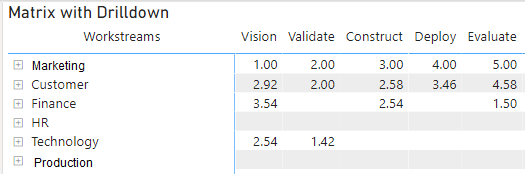
I have spent a lot of time getting results of data from a survey (which has 5 dimensions in data model) into a matrix like I want to see it in the resulting chart.
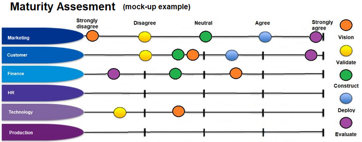
Below is a mock-up image (done in MS Paint) of how I expect this chart to look.
Just wondering if anybody else has any recommendations on visualizations that could produce a chart like this?
Solved! Go to Solution.
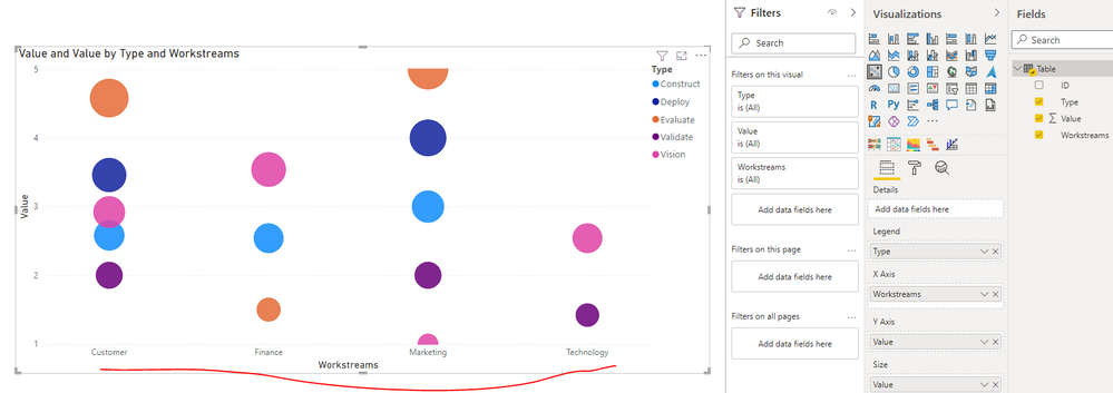
Thank you very much for your response. So close, if only there was a way to flip X and Y Axis 🙂
I will mark as response as I think this will be as close as I am going to get. I tried Scatter graph before but probably got hung up on trying to get Worsstreams on the Y Axis.
Also noted the additional Visuals you had tried and after fidling with the Power KPI Matrix a bit I think it might also be a suitable alternative workaround. (i.e. it is supposed to show progress as progress is made through vision, validate, construct...etc.) I will try attach .pbix that will give better visual (but cannot see how this is done)
Really appreciate the time you have put in to respond to this.
Join us in Barcelona for FabCon and SQLCon, the Fabric, Power BI, SQL, and AI community event. Save €200 with code FABCMTY200.
Join Data Days 2026: 60 days of free live/on-demand sessions, challenges, study groups, and certification opportunities.
| User | Count |
|---|---|
| 2 | |
| 1 | |
| 1 | |
| 1 | |
| 1 |
| User | Count |
|---|---|
| 5 | |
| 3 | |
| 3 | |
| 2 | |
| 2 |