FabCon is coming to Atlanta
Join us at FabCon Atlanta from March 16 - 20, 2026, for the ultimate Fabric, Power BI, AI and SQL community-led event. Save $200 with code FABCOMM.
Register now!- Power BI forums
- Get Help with Power BI
- Desktop
- Service
- Report Server
- Power Query
- Mobile Apps
- Developer
- DAX Commands and Tips
- Custom Visuals Development Discussion
- Health and Life Sciences
- Power BI Spanish forums
- Translated Spanish Desktop
- Training and Consulting
- Instructor Led Training
- Dashboard in a Day for Women, by Women
- Galleries
- Data Stories Gallery
- Themes Gallery
- Contests Gallery
- QuickViz Gallery
- Quick Measures Gallery
- Visual Calculations Gallery
- Notebook Gallery
- Translytical Task Flow Gallery
- TMDL Gallery
- R Script Showcase
- Webinars and Video Gallery
- Ideas
- Custom Visuals Ideas (read-only)
- Issues
- Issues
- Events
- Upcoming Events
The Power BI Data Visualization World Championships is back! Get ahead of the game and start preparing now! Learn more
- Power BI forums
- Forums
- Get Help with Power BI
- Developer
- Re: Maturity Assessment chart (slightly different)
- Subscribe to RSS Feed
- Mark Topic as New
- Mark Topic as Read
- Float this Topic for Current User
- Bookmark
- Subscribe
- Printer Friendly Page
- Mark as New
- Bookmark
- Subscribe
- Mute
- Subscribe to RSS Feed
- Permalink
- Report Inappropriate Content
Maturity Assessment chart (slightly different)
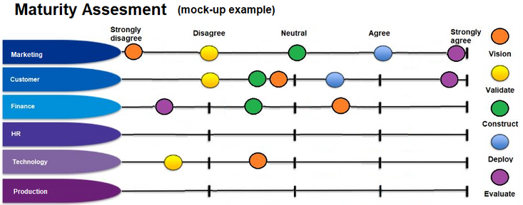
I have spent a lot of time getting results of data from a survey (which has 5 dimensions in data model) into a matrix like I want to see it in the resulting chart.
Below is a mock-up image (done in MS Paint) of how I expect this chart to look.
Just wondering if anybody else has any recommendations on visualizations that could produce a chart like this?
Solved! Go to Solution.
- Mark as New
- Bookmark
- Subscribe
- Mute
- Subscribe to RSS Feed
- Permalink
- Report Inappropriate Content
- Mark as New
- Bookmark
- Subscribe
- Mute
- Subscribe to RSS Feed
- Permalink
- Report Inappropriate Content
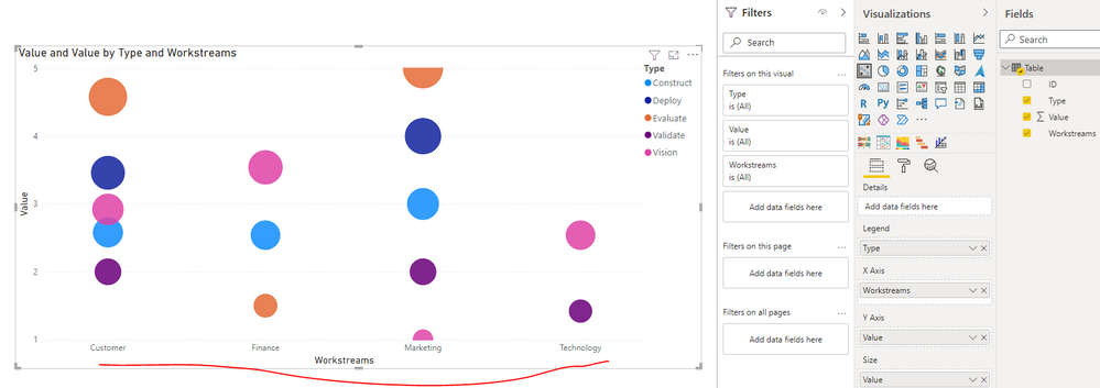
Thank you very much for your response. So close, if only there was a way to flip X and Y Axis 🙂
I will mark as response as I think this will be as close as I am going to get. I tried Scatter graph before but probably got hung up on trying to get Worsstreams on the Y Axis.
Also noted the additional Visuals you had tried and after fidling with the Power KPI Matrix a bit I think it might also be a suitable alternative workaround. (i.e. it is supposed to show progress as progress is made through vision, validate, construct...etc.) I will try attach .pbix that will give better visual (but cannot see how this is done)
Really appreciate the time you have put in to respond to this.
- Mark as New
- Bookmark
- Subscribe
- Mute
- Subscribe to RSS Feed
- Permalink
- Report Inappropriate Content
Helpful resources

Power BI Dataviz World Championships
The Power BI Data Visualization World Championships is back! Get ahead of the game and start preparing now!

| User | Count |
|---|---|
| 4 | |
| 3 | |
| 2 | |
| 1 | |
| 1 |
| User | Count |
|---|---|
| 4 | |
| 4 | |
| 4 | |
| 3 | |
| 3 |


