Get Fabric certified for FREE!
Don't miss your chance to take the Fabric Data Engineer (DP-600) exam for FREE! Find out how by attending the DP-600 session on April 23rd (pacific time), live or on-demand.
Learn more- Power BI forums
- Get Help with Power BI
- Desktop
- Service
- Report Server
- Power Query
- Mobile Apps
- Developer
- DAX Commands and Tips
- Custom Visuals Development Discussion
- Health and Life Sciences
- Power BI Spanish forums
- Translated Spanish Desktop
- Training and Consulting
- Instructor Led Training
- Dashboard in a Day for Women, by Women
- Galleries
- Data Stories Gallery
- Themes Gallery
- Contests Gallery
- QuickViz Gallery
- Quick Measures Gallery
- Visual Calculations Gallery
- Notebook Gallery
- Translytical Task Flow Gallery
- TMDL Gallery
- R Script Showcase
- Webinars and Video Gallery
- Ideas
- Custom Visuals Ideas (read-only)
- Issues
- Issues
- Events
- Upcoming Events
Next up in the FabCon + SQLCon recap series: The roadmap for Microsoft SQL and Maximizing Developer experiences in Fabric. All sessions are available on-demand after the live show. Register now
- Power BI forums
- Forums
- Get Help with Power BI
- Developer
- Re: Adding Dynamic Average to scatter plot
- Subscribe to RSS Feed
- Mark Topic as New
- Mark Topic as Read
- Float this Topic for Current User
- Bookmark
- Subscribe
- Printer Friendly Page
- Mark as New
- Bookmark
- Subscribe
- Mute
- Subscribe to RSS Feed
- Permalink
- Report Inappropriate Content
Adding Dynamic Average to scatter plot
Hi
I've been looking to add a dynamic average line to a scatter plot and can't seem to find a solution to something that seems quite basic.
Here's what I want to do:
Assume I have the following table:
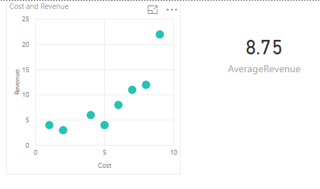
I created a scatter plot of my data and created a measure for the Average Revenue, which is displayed below.
I want to add a horizontal line which shows the Average Revenue to my scatter chart.
This is a simple example, but in real life my scatter chart has a bunch of filters and the average is recalculated automatically based on the selected filters. The Average Line needs to adjust when I change filtering options.
Is there an easy (or any) way to do this?
Thanks!
- Mark as New
- Bookmark
- Subscribe
- Mute
- Subscribe to RSS Feed
- Permalink
- Report Inappropriate Content
Use the Analytics tab (magnifying glass), there is a built-in option for an Average Line. Click visual, underneath VISUALIZATIONS click the magnifying glass.
Follow on LinkedIn
@ me in replies or I'll lose your thread!!!
Instead of a Kudo, please vote for this idea
Become an expert!: Enterprise DNA
External Tools: MSHGQM
YouTube Channel!: Microsoft Hates Greg
Latest book!: DAX For Humans
DAX is easy, CALCULATE makes DAX hard...
- Mark as New
- Bookmark
- Subscribe
- Mute
- Subscribe to RSS Feed
- Permalink
- Report Inappropriate Content
Hi Greg
Yes, I have been looking for that option, but it's not there. The only options available are the trendlines and constant X and Y values. Average doesn't show up. My guess is it's because there are no Y values to average for any given X value (as each X value has a different Y value).
- Mark as New
- Bookmark
- Subscribe
- Mute
- Subscribe to RSS Feed
- Permalink
- Report Inappropriate Content
@Anonymous,
In the Visualizations pane, right-click [Revenue] dragged to Y Axis, and change the aggregation to Sum.
https://docs.microsoft.com/en-us/power-bi/service-aggregates
If this post helps, then please consider Accept it as the solution to help the other members find it more quickly.
- Mark as New
- Bookmark
- Subscribe
- Mute
- Subscribe to RSS Feed
- Permalink
- Report Inappropriate Content
Thanks, but that does not display a dynamic Average of the selected filered values. I want the average line to change when I change selected filters. This average is static.
Helpful resources

New to Fabric Survey
If you have recently started exploring Fabric, we'd love to hear how it's going. Your feedback can help with product improvements.

Power BI DataViz World Championships - June 2026
A new Power BI DataViz World Championship is coming this June! Don't miss out on submitting your entry.

Join our Fabric User Panel
Share feedback directly with Fabric product managers, participate in targeted research studies and influence the Fabric roadmap.

| User | Count |
|---|---|
| 1 | |
| 1 | |
| 1 | |
| 1 | |
| 1 |
| User | Count |
|---|---|
| 4 | |
| 4 | |
| 3 | |
| 3 | |
| 2 |


