FabCon is coming to Atlanta
Join us at FabCon Atlanta from March 16 - 20, 2026, for the ultimate Fabric, Power BI, AI and SQL community-led event. Save $200 with code FABCOMM.
Register now!- Power BI forums
- Get Help with Power BI
- Desktop
- Service
- Report Server
- Power Query
- Mobile Apps
- Developer
- DAX Commands and Tips
- Custom Visuals Development Discussion
- Health and Life Sciences
- Power BI Spanish forums
- Translated Spanish Desktop
- Training and Consulting
- Instructor Led Training
- Dashboard in a Day for Women, by Women
- Galleries
- Data Stories Gallery
- Themes Gallery
- Contests Gallery
- QuickViz Gallery
- Quick Measures Gallery
- Visual Calculations Gallery
- Notebook Gallery
- Translytical Task Flow Gallery
- TMDL Gallery
- R Script Showcase
- Webinars and Video Gallery
- Ideas
- Custom Visuals Ideas (read-only)
- Issues
- Issues
- Events
- Upcoming Events
The Power BI Data Visualization World Championships is back! Get ahead of the game and start preparing now! Learn more
- Power BI forums
- Forums
- Get Help with Power BI
- Desktop
- Re: Weighted Avg GP%
- Subscribe to RSS Feed
- Mark Topic as New
- Mark Topic as Read
- Float this Topic for Current User
- Bookmark
- Subscribe
- Printer Friendly Page
- Mark as New
- Bookmark
- Subscribe
- Mute
- Subscribe to RSS Feed
- Permalink
- Report Inappropriate Content
Weighted Avg GP%
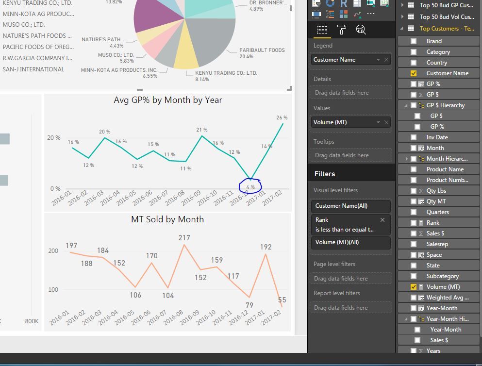
I am trying to get Power BI to calculate the weighted average Gross profit % (GP $/Sales$) by customer. I am doing a customer analsysis and i currently have my data setup to show the top 10 customers by brand. I am analyzing lbs sold and GP $ by customer, but i would also like to have a line chart in my data showing the weight avg GP % by month, by year that will update when i slice by customer. My data currently has the GP $ and Sales $ on every order that we received. I set up a column to calculate the GP% and i am currently able to have my line chart show the Avg GP% but its not the WEIGHTED Avg GP%. Could anyone help me with how I would set this up in my Power BI data? I just started using Power Bi so I appologize for the question. I appreciate any help someone can give me! Thank you!
- Mark as New
- Bookmark
- Subscribe
- Mute
- Subscribe to RSS Feed
- Permalink
- Report Inappropriate Content
@Nacujo wrote:
I am trying to get Power BI to calculate the weighted average Gross profit % (GP $/Sales$) by customer. I am doing a customer analsysis and i currently have my data setup to show the top 10 customers by brand. I am analyzing lbs sold and GP $ by customer, but i would also like to have a line chart in my data showing the weight avg GP % by month, by year that will update when i slice by customer. My data currently has the GP $ and Sales $ on every order that we received. I set up a column to calculate the GP% and i am currently able to have my line chart show the Avg GP% but its not the WEIGHTED Avg GP%. Could anyone help me with how I would set this up in my Power BI data? I just started using Power Bi so I appologize for the question. I appreciate any help someone can give me! Thank you!
I don't think you have to create a column, instead you can create a measure. If you'd like further suggestion, please post some sample data and expected output.
- Mark as New
- Bookmark
- Subscribe
- Mute
- Subscribe to RSS Feed
- Permalink
- Report Inappropriate Content
@Eric_Zhang - On my top 10 customers for each brand, i want my measure to look at what the total gross profit by month for the customer that is selected divided by the total sales $. The data for my Power BI dashboard is taken from an excel pivot table. Below is a picture of some sales data for one of my top customers Pacific Foods in December 2016. Currently, Power BI is taking an avg GP % of each sale and averaging those GP % against each other, so it shows for this customer in December 2016, that we had a GP % of 4%. However, if you add up all the GP for the month/Sales $, the GP % for the month of December 2016 for Pacific Foods SHOULD be -2%. I hope this is enough info to give me an idea how to set this up.


- Mark as New
- Bookmark
- Subscribe
- Mute
- Subscribe to RSS Feed
- Permalink
- Report Inappropriate Content
- Mark as New
- Bookmark
- Subscribe
- Mute
- Subscribe to RSS Feed
- Permalink
- Report Inappropriate Content
Helpful resources

Power BI Dataviz World Championships
The Power BI Data Visualization World Championships is back! Get ahead of the game and start preparing now!

| User | Count |
|---|---|
| 38 | |
| 36 | |
| 33 | |
| 32 | |
| 29 |
| User | Count |
|---|---|
| 129 | |
| 88 | |
| 79 | |
| 68 | |
| 63 |

