cancel
Showing results for 
Search instead for 
Did you mean: 

July 7 - July 17 | Round 2 of the Power BI Dataviz World Championships. Don't miss your chance! Learn more

Reply
Anonymous
Not applicable

Visualization for Time Difference

Hello everyone!


I have this data which contain date and time. Time an activity was closed and target time.

Currently, we still cannot use Time as Y-axis right?


But is there a way or could you suggest a visualization that I can use to show Time Closed vs Target Time where my shared axis or X-axis is the date? 


Thank you!

3 REPLIES 3
zlokesh
Resolver I
Resolver I

Hi @Anonymous,

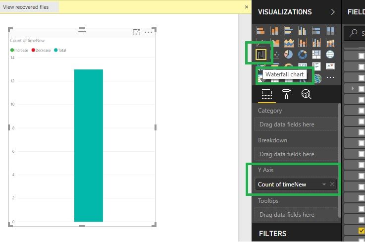
      Waterfall chart will hep you to take Y-Axis, Please go through the below screenshot. Thanks.


Time.jpg


Anonymous
Not applicable

Hi @Anonymous,


No, I haven't heard any plan about this feature.

In fact, current power bi visuals require at least one value filed that can be aggregated as axis field.

AFAIK, time and date type not support summarized, maybe you can try to convert to text type then use it on axis.


BTW, gantt visual may suitable for your requirement.


Regards,

Xiaoxin Sheng

Anonymous
Not applicable

Thank you @Anonymous. Yes, I considered using the Gantt visuals for time-related data.


Thank you!

Helpful resources

Announcements
FabCon and SQLCon Barcelona 2026

FabCon & SQLCon – Barcelona 2026

Join us in Barcelona for FabCon and SQLCon, the Fabric, Power BI, SQL, and AI community event. Save €200 with code FABCMTY200.

60 days of Data Days Carousel

Data Days 2026

Join Data Days 2026: 60 days of free live/on-demand sessions, challenges, study groups, and certification opportunities.

Power BI DataViz World Championships carousel

Power BI DataViz World Championships - June 2026

A new Power BI DataViz World Championship is coming this June! Don't miss out on submitting your entry.

Top Solution Authors