Join us at FabCon Vienna from September 15-18, 2025
The ultimate Fabric, Power BI, SQL, and AI community-led learning event. Save €200 with code FABCOMM.
Get registered- Power BI forums
- Get Help with Power BI
- Desktop
- Service
- Report Server
- Power Query
- Mobile Apps
- Developer
- DAX Commands and Tips
- Custom Visuals Development Discussion
- Health and Life Sciences
- Power BI Spanish forums
- Translated Spanish Desktop
- Training and Consulting
- Instructor Led Training
- Dashboard in a Day for Women, by Women
- Galleries
- Data Stories Gallery
- Themes Gallery
- Contests Gallery
- Quick Measures Gallery
- Notebook Gallery
- Translytical Task Flow Gallery
- TMDL Gallery
- R Script Showcase
- Webinars and Video Gallery
- Ideas
- Custom Visuals Ideas (read-only)
- Issues
- Issues
- Events
- Upcoming Events
Compete to become Power BI Data Viz World Champion! First round ends August 18th. Get started.
- Power BI forums
- Forums
- Get Help with Power BI
- Desktop
- Re: Share your thoughts on the new On-Object Inter...
- Subscribe to RSS Feed
- Mark Topic as New
- Mark Topic as Read
- Float this Topic for Current User
- Bookmark
- Subscribe
- Printer Friendly Page
- Mark as New
- Bookmark
- Subscribe
- Mute
- Subscribe to RSS Feed
- Permalink
- Report Inappropriate Content
Share your thoughts on the new On-Object Interaction feature (preview)
Hit Reply to tell us what you think about the new On-Object Interaction feature so we can continue to improve.
For example:
- What changes would you like to see?
- If you turned off the preview switch, why?
- Any suggestions for addititional settings or capabilities?
Thanks,
-Power BI team
To read more about the feature, see the announcement in the Power BI Product Blog or our documentation on how to Use on-object interaction
FAQs:
- Q: How can I open multiple panes at once?
- A: You can CTRL + click or right click on the unselected pane you wish to open and choose "Open in new pane"
- Q: Where did aggregations move to?
- A: It's still on right click of a field, or you can use the new flyout aggregations dropdown while choosing or swapping a field.
- Q: Where did drillthrough and tooltip page setup move to?
- A: Drillthrough is now in the page settings of the format pane under Page Information > Page type > Drillthrough or Tooltip.
- Mark as New
- Bookmark
- Subscribe
- Mute
- Subscribe to RSS Feed
- Permalink
- Report Inappropriate Content
Where it should be.
- Mark as New
- Bookmark
- Subscribe
- Mute
- Subscribe to RSS Feed
- Permalink
- Report Inappropriate Content
- If you turned off the preview switch, why? - Rightside menu is changing and picture is jumping too much. I prefer if I have turned in options I would like to use, they stay there till I switch them off.
- Also there could be option to fold them as slice as in original >> option.
But in general it seems much better than in the beginning 🙂 keep working on it, but it is not ready to be implemented yet.
- Mark as New
- Bookmark
- Subscribe
- Mute
- Subscribe to RSS Feed
- Permalink
- Report Inappropriate Content
Too much confusing.... add more click just to change from date hierachy visual to be general format...
consumed too much space in my mornitor just want to recheck which data I selected to the visual.
- Mark as New
- Bookmark
- Subscribe
- Mute
- Subscribe to RSS Feed
- Permalink
- Report Inappropriate Content
I understand it takes time to get used to a new way of working but this is just less efficient. I understand that it might be a little more intuitive but there are just more clicks needed to add data fields to a visual.
- Mark as New
- Bookmark
- Subscribe
- Mute
- Subscribe to RSS Feed
- Permalink
- Report Inappropriate Content
I tested the new August update which brought several improvements, I liked some of them, but I had to disable them in order to be able to perform my work, I believe there is still a long way to go for the new method to replace the current standard (I hope the two methods remain at the end for user choice).
Some improvements and fixes to be made:
1. Collapse the menus in one click (as in the default and not open a menu with several options);
2. No Ctrl+Click to open and pin a menu, just a click (reducing the number of clicks should be the goal for it to be viable);
3. Correct the bug: when a menu is closed and you want to open it by clicking on the icon (without ctrl+click) instead of opening it, all the other menus that are still open are closed.
- Mark as New
- Bookmark
- Subscribe
- Mute
- Subscribe to RSS Feed
- Permalink
- Report Inappropriate Content
I am not a fan of this. It's annoying. Please make it optional and not the default. The old way was better. In my experience of training new analysts, I feel this option has made the learning curve that much more worse to climb.
- Mark as New
- Bookmark
- Subscribe
- Mute
- Subscribe to RSS Feed
- Permalink
- Report Inappropriate Content
I've had to disable it, too awkward.
Main issue: Data field width too narrow and unadjustable.
Also;
1. Annoying to add a data field and then have to shift it from the bottom of the list to where I want it to be. In the old version, I could
2. Annoying to have to search in a separate list, rather than just have the field list and drag onto the viz pane.
- Mark as New
- Bookmark
- Subscribe
- Mute
- Subscribe to RSS Feed
- Permalink
- Report Inappropriate Content
Hi,
regarding the new feature "On-object format subselections now supported in spotlight and focus mode", I think there is a bug :
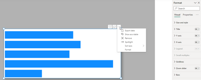
I select the Format from elipse button (top-rigth of the visual), Then the Format pane is appear :
I click the cross icon on the pane and close it :
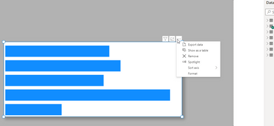
Now when I Focus on the visual (by clicking the Focus Mode), It show me the "Exit format mode" without the format pane :
best regards
Mahyar
- Mark as New
- Bookmark
- Subscribe
- Mute
- Subscribe to RSS Feed
- Permalink
- Report Inappropriate Content
I do not like. I remove this options from PBI.
- Mark as New
- Bookmark
- Subscribe
- Mute
- Subscribe to RSS Feed
- Permalink
- Report Inappropriate Content
I have tried to give the feature a fair shake. Removing the pane itself is the most annoying part. I wish the visual pane was still available along with the On-Object interaction.
It takes too much time to hover over an object, click the icon and then start dropping in data. It is much faster if the panes can be opened side by side.
- Mark as New
- Bookmark
- Subscribe
- Mute
- Subscribe to RSS Feed
- Permalink
- Report Inappropriate Content
I have tried this many times - turned it on after each update, then turned it back off within the same day because I got frustrated. I know additional changes are coming, and perhaps at some point this will be an acceptable feature for me. But honestly, if this is the only option for change - I would rather it be left alone. I understand that you're trying to make it more like the Excel experience, not sure that is the best choice here. As many others have said, please keep listening to the community - forcing change is not always a good option.
More clicks in the design process isn't needed, and this doesn't solve the 'where can I find x feature problem' either. I think the best solution for that would be to move the visual design features to the ribbon.
Other options could be:
1. keep the panes we have - but let us undock and move them away from the side panel (even outside of the design window!)
2. ditch the panes, put the design detail onto the ribbon - there's LOTS of real-estate there, and drop-downs are more intuitive in that area.
3. a few of the changes - like adding text header information might make sense to have on-object, but we don't need to have EVERYTHING there.
- Mark as New
- Bookmark
- Subscribe
- Mute
- Subscribe to RSS Feed
- Permalink
- Report Inappropriate Content
I agree. If the amount of developer effort that was being assigned to this feature was directed to refining/fixing the existing UI we would all be way better off.
- Mark as New
- Bookmark
- Subscribe
- Mute
- Subscribe to RSS Feed
- Permalink
- Report Inappropriate Content
I agree
- Mark as New
- Bookmark
- Subscribe
- Mute
- Subscribe to RSS Feed
- Permalink
- Report Inappropriate Content
Oh my goodness, yes. Or rather put, if the CAT Team were engaged and helped to put commonsense into this in the same way they envisioned Fabric....., and if Satya himself said look what awesomeness we have for you. We care about the Makers, the Admins, the Business users, and envision a way to help you all to have a better experience and outshine Tableau and Google. Maybe then I would believe in this. But no.
- Mark as New
- Bookmark
- Subscribe
- Mute
- Subscribe to RSS Feed
- Permalink
- Report Inappropriate Content
- Mark as New
- Bookmark
- Subscribe
- Mute
- Subscribe to RSS Feed
- Permalink
- Report Inappropriate Content
I would like to know if is possible to create acumulate value in the matrix, but with Product Name and acumulate values in the vertical and dates (by day) in horizontal
I need to do acumulated value by day, but like it.
- Mark as New
- Bookmark
- Subscribe
- Mute
- Subscribe to RSS Feed
- Permalink
- Report Inappropriate Content
In the Build a visual pane when the Visual types section is expanded, you can't scroll the pane anymore until you collapse the Visual types section.
- Mark as New
- Bookmark
- Subscribe
- Mute
- Subscribe to RSS Feed
- Permalink
- Report Inappropriate Content
I cant stand it - awfull
- Mark as New
- Bookmark
- Subscribe
- Mute
- Subscribe to RSS Feed
- Permalink
- Report Inappropriate Content
I'm not a fan of the pane switcher. The Build a Visual option disappears from my switcher, and other panes collapse even without me selecting the collapse dropdown randomly. Also the X at the top of the pane doesn't behave intuitively: instead of collapsing the pane, it removes the pane from the pane switcher, requiring more 'fixing'.
While I appreciate the effort to increase real estate for the visuals, I strongly prefer the old way of collapsing panes.
- Mark as New
- Bookmark
- Subscribe
- Mute
- Subscribe to RSS Feed
- Permalink
- Report Inappropriate Content
Really hope it doesn't get implemented.
It is so distracting and more difficult and time consuming to use.
- Mark as New
- Bookmark
- Subscribe
- Mute
- Subscribe to RSS Feed
- Permalink
- Report Inappropriate Content
I turned off On-Object Interaction 4 times due to spending so much time doing my work. It isn't charming ever in Power bi preview history.


