- Subscribe to RSS Feed
- Mark Topic as New
- Mark Topic as Read
- Float this Topic for Current User
- Bookmark
- Subscribe
- Printer Friendly Page
- Mark as New
- Bookmark
- Subscribe
- Mute
- Subscribe to RSS Feed
- Permalink
- Report Inappropriate Content

Share your thoughts on the new On-Object Interaction feature (preview)
Hit Reply to tell us what you think about the new On-Object Interaction feature so we can continue to improve.
For example:
- What changes would you like to see?
- If you turned off the preview switch, why?
- Any suggestions for addititional settings or capabilities?
Thanks,
-Power BI team
To read more about the feature, see the announcement in the Power BI Product Blog or our documentation on how to Use on-object interaction
FAQs:
- Q: How can I open multiple panes at once?
- A: You can CTRL + click or right click on the unselected pane you wish to open and choose "Open in new pane"
- Q: Where did aggregations move to?
- A: It's still on right click of a field, or you can use the new flyout aggregations dropdown while choosing or swapping a field.
- Q: Where did drillthrough and tooltip page setup move to?
- A: Drillthrough is now in the page settings of the format pane under Page Information > Page type > Drillthrough or Tooltip.
- Mark as New
- Bookmark
- Subscribe
- Mute
- Subscribe to RSS Feed
- Permalink
- Report Inappropriate Content

To be honest, flat out a very bad move - who thought of this way of doing things? With this new feature, it requires a lot of unnescessary clicks - please keep it the way it was. I have turned it off.
- Mark as New
- Bookmark
- Subscribe
- Mute
- Subscribe to RSS Feed
- Permalink
- Report Inappropriate Content

As a Power BI consultant, I work with client's reports daily. I have turned off it four times, it wastes so much of my time. As long as the option is there for you to choose if it is there, I'm okay. But if our current feature is gone, instead of this new one, then for me personally, I would probably switch to another visualization tools.
- Mark as New
- Bookmark
- Subscribe
- Mute
- Subscribe to RSS Feed
- Permalink
- Report Inappropriate Content

I share your thoughts and I believe that, based on the comments, 99.9% of powerbi developers do too.
- Mark as New
- Bookmark
- Subscribe
- Mute
- Subscribe to RSS Feed
- Permalink
- Report Inappropriate Content

Agree 100%. This is a terrible idea.
- Mark as New
- Bookmark
- Subscribe
- Mute
- Subscribe to RSS Feed
- Permalink
- Report Inappropriate Content

not a fan of the feature. I work as a consultant and I use PBI alot with clients to help them moving towards advanced analytics. This means that I build quite a lot of reports and dashboards. The new features makes it really cumbersome to quickly build and change visuals. Too many clicks, and quite often I need to add back the panes. Its a real hassle. I have turned it off as it tripled my time spent with generating reports. As long as the option is there for you to choose if its there, i'm happy. But if that feature is gone, then for me personally I would problably switch to another visualization tool.
- Mark as New
- Bookmark
- Subscribe
- Mute
- Subscribe to RSS Feed
- Permalink
- Report Inappropriate Content

Hi
The On-Object Interaction is not working when I click OK in the options dialog box. The page remains grey.
Could you please show a solution for this?
- Mark as New
- Bookmark
- Subscribe
- Mute
- Subscribe to RSS Feed
- Permalink
- Report Inappropriate Content

I also completely agree, I like some things implemented, but overall it's not productive at all.
- Mark as New
- Bookmark
- Subscribe
- Mute
- Subscribe to RSS Feed
- Permalink
- Report Inappropriate Content

Not a fan at all, really oversimplifying it to the point that it makes it difficult to do anything with any sort of detail. Please keep the option to switch off. It's a good idea to try to simplify PBI as a front end tool but it doesn't really lend itself to the report developer experience.
- Mark as New
- Bookmark
- Subscribe
- Mute
- Subscribe to RSS Feed
- Permalink
- Report Inappropriate Content

The panes keep on disappearing.
Too many clicks in the new experience.
Turned off. Fourth month in a row....
- Mark as New
- Bookmark
- Subscribe
- Mute
- Subscribe to RSS Feed
- Permalink
- Report Inappropriate Content

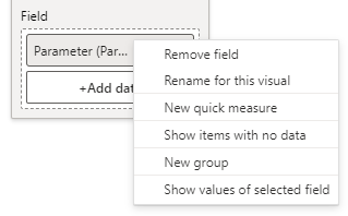
Hi with the object oriented interface i cannot enable "Show values of selected filed" whith a slicer, I use this with a parameter field to select which fields will be presented on the matrix that i have.
- Mark as New
- Bookmark
- Subscribe
- Mute
- Subscribe to RSS Feed
- Permalink
- Report Inappropriate Content

I need to switch back to the old version to enable it....
Maybe is just me that cant find where is the equivalent
- Mark as New
- Bookmark
- Subscribe
- Mute
- Subscribe to RSS Feed
- Permalink
- Report Inappropriate Content

It should still be available on right click for the parameter
- Mark as New
- Bookmark
- Subscribe
- Mute
- Subscribe to RSS Feed
- Permalink
- Report Inappropriate Content

Thanks works like a charm, I was fixated that should be on the expansion arrow...
- Mark as New
- Bookmark
- Subscribe
- Mute
- Subscribe to RSS Feed
- Permalink
- Report Inappropriate Content

Where it should be.
- Mark as New
- Bookmark
- Subscribe
- Mute
- Subscribe to RSS Feed
- Permalink
- Report Inappropriate Content

- If you turned off the preview switch, why? - Rightside menu is changing and picture is jumping too much. I prefer if I have turned in options I would like to use, they stay there till I switch them off.
- Also there could be option to fold them as slice as in original >> option.
But in general it seems much better than in the beginning 🙂 keep working on it, but it is not ready to be implemented yet.
- Mark as New
- Bookmark
- Subscribe
- Mute
- Subscribe to RSS Feed
- Permalink
- Report Inappropriate Content

Too much confusing.... add more click just to change from date hierachy visual to be general format...
consumed too much space in my mornitor just want to recheck which data I selected to the visual.
- Mark as New
- Bookmark
- Subscribe
- Mute
- Subscribe to RSS Feed
- Permalink
- Report Inappropriate Content

I understand it takes time to get used to a new way of working but this is just less efficient. I understand that it might be a little more intuitive but there are just more clicks needed to add data fields to a visual.
- Mark as New
- Bookmark
- Subscribe
- Mute
- Subscribe to RSS Feed
- Permalink
- Report Inappropriate Content

I tested the new August update which brought several improvements, I liked some of them, but I had to disable them in order to be able to perform my work, I believe there is still a long way to go for the new method to replace the current standard (I hope the two methods remain at the end for user choice).
Some improvements and fixes to be made:
1. Collapse the menus in one click (as in the default and not open a menu with several options);
2. No Ctrl+Click to open and pin a menu, just a click (reducing the number of clicks should be the goal for it to be viable);
3. Correct the bug: when a menu is closed and you want to open it by clicking on the icon (without ctrl+click) instead of opening it, all the other menus that are still open are closed.
- Mark as New
- Bookmark
- Subscribe
- Mute
- Subscribe to RSS Feed
- Permalink
- Report Inappropriate Content

I am not a fan of this. It's annoying. Please make it optional and not the default. The old way was better. In my experience of training new analysts, I feel this option has made the learning curve that much more worse to climb.
- Mark as New
- Bookmark
- Subscribe
- Mute
- Subscribe to RSS Feed
- Permalink
- Report Inappropriate Content

I've had to disable it, too awkward.
Main issue: Data field width too narrow and unadjustable.
Also;
1. Annoying to add a data field and then have to shift it from the bottom of the list to where I want it to be. In the old version, I could
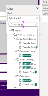
2. Annoying to have to search in a separate list, rather than just have the field list and drag onto the viz pane.
- Mark as New
- Bookmark
- Subscribe
- Mute
- Subscribe to RSS Feed
- Permalink
- Report Inappropriate Content

Hi,
regarding the new feature "On-object format subselections now supported in spotlight and focus mode", I think there is a bug :
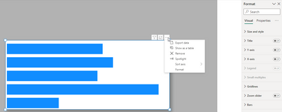
I select the Format from elipse button (top-rigth of the visual), Then the Format pane is appear :
I click the cross icon on the pane and close it :
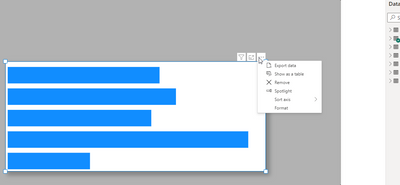
Now when I Focus on the visual (by clicking the Focus Mode), It show me the "Exit format mode" without the format pane :
best regards
Mahyar
Helpful resources
| Subject | Author | Posted | |
|---|---|---|---|
| 09-05-2024 05:00 AM | |||
| 01-06-2025 12:51 PM | |||
| 01-14-2025 10:21 AM | |||
| 03-13-2023 11:41 PM | |||
| 08-09-2023 01:53 AM |
| User | Count |
|---|---|
| 109 | |
| 89 | |
| 81 | |
| 55 | |
| 46 |


