Join us at the 2025 Microsoft Fabric Community Conference
Microsoft Fabric Community Conference 2025, March 31 - April 2, Las Vegas, Nevada. Use code FABINSIDER for a $400 discount.
Register now- Power BI forums
- Get Help with Power BI
- Desktop
- Service
- Report Server
- Power Query
- Mobile Apps
- Developer
- DAX Commands and Tips
- Custom Visuals Development Discussion
- Health and Life Sciences
- Power BI Spanish forums
- Translated Spanish Desktop
- Training and Consulting
- Instructor Led Training
- Dashboard in a Day for Women, by Women
- Galleries
- Webinars and Video Gallery
- Data Stories Gallery
- Themes Gallery
- Power BI DataViz World Championships Gallery
- Quick Measures Gallery
- R Script Showcase
- COVID-19 Data Stories Gallery
- Community Connections & How-To Videos
- 2021 MSBizAppsSummit Gallery
- 2020 MSBizAppsSummit Gallery
- 2019 MSBizAppsSummit Gallery
- Events
- Ideas
- Custom Visuals Ideas (read-only)
- Issues
- Issues
- Events
- Upcoming Events
The Power BI DataViz World Championships are on! With four chances to enter, you could win a spot in the LIVE Grand Finale in Las Vegas. Show off your skills.
- Power BI forums
- Forums
- Get Help with Power BI
- Desktop
- Re: Share your thoughts on the new On-Object Inter...
- Subscribe to RSS Feed
- Mark Topic as New
- Mark Topic as Read
- Float this Topic for Current User
- Bookmark
- Subscribe
- Printer Friendly Page
- Mark as New
- Bookmark
- Subscribe
- Mute
- Subscribe to RSS Feed
- Permalink
- Report Inappropriate Content
Share your thoughts on the new On-Object Interaction feature (preview)
Hit Reply to tell us what you think about the new On-Object Interaction feature so we can continue to improve.
For example:
- What changes would you like to see?
- If you turned off the preview switch, why?
- Any suggestions for addititional settings or capabilities?
Thanks,
-Power BI team
To read more about the feature, see the announcement in the Power BI Product Blog or our documentation on how to Use on-object interaction
FAQs:
- Q: How can I open multiple panes at once?
- A: You can CTRL + click or right click on the unselected pane you wish to open and choose "Open in new pane"
- Q: Where did aggregations move to?
- A: It's still on right click of a field, or you can use the new flyout aggregations dropdown while choosing or swapping a field.
- Q: Where did drillthrough and tooltip page setup move to?
- A: Drillthrough is now in the page settings of the format pane under Page Information > Page type > Drillthrough or Tooltip.
- Mark as New
- Bookmark
- Subscribe
- Mute
- Subscribe to RSS Feed
- Permalink
- Report Inappropriate Content
What I like:
- it is easier / more intuitive for new users coming from Excel
- for some basic formatting / adjustment it is much faster (e.g. editing the Title is awesome like this)
- the toggle for performance analyzer pane / bookmarks, etc. but I don't like that my data fields are also hidden. would wish that one could stay permanent (maybe give users some PIN feature for a pane they always want to see)
What I don't like / why I'm turning it off
- the loss of the "visualization pane" means many times a lot of extra clicks to do the same thing. Annoying enough to turn the whole feature off.
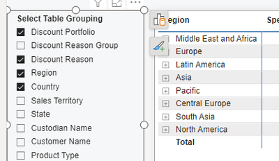
- the new modification buttons are always in the way (e.g. if I click on a slicer to change a filter, then the new modify buttons overlaps into my visuals, because my reports are rather tightly laid out ... see screenshot below)
My suggestion: Make everyone happy. Leave the old visualization pane in place for the power users and allow to simulatenously display the Data pane AND the Visualization pane. And keep all the new features of editing directly on the visualization in place (but please find a way to not have those buttons always in the way
- Mark as New
- Bookmark
- Subscribe
- Mute
- Subscribe to RSS Feed
- Permalink
- Report Inappropriate Content
I am not a fan of the new On-Object interaction feature and plan on turning off the preview.
I think this change would be a good thing for new Power BI users, especially for those who have had previous time working in excel to make visuals. However, as a Power BI report developer who has spent more time on the Desktop application than I have in excel, I think it is a negative change.
As some other replies have said, the biggest issue is that it slows down report development. It used to be very easy, and quick, to add multiple fields to a visual. Now, every time you add a field from the on-object interaction itself the menu closes and has to be reopened to make another selection.
It is not intuitive how to make a new visual now - you would not even know that visuals exist in the application unless you choose to right-click somewhere on the screen. This has the consequence of "hiding" away a bunch of different visuals as the "default" visual recommended is usually either a Table, a Matrix, a Card, or a slicer.
I think this could be a good option, but that is all it should be: an option. If this change goes live in GA, I would very much like to have the option to toggle it off.
- Mark as New
- Bookmark
- Subscribe
- Mute
- Subscribe to RSS Feed
- Permalink
- Report Inappropriate Content
Hi, I really like much of the on-object interaction. I think it's here to stay, and will only get better from here.
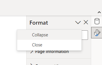
I would like to be able to collapse the Format and Data panes without needing to choose the dropdown and clicking "collapse."
I also agree I'd like to be able to also have the old visualization pane open if I want to move measures that way...
Thanks for your hard work. PowerBI isn't perfect, but it's revolutionized how I handle data, and I'm grateful for that.
William
- Mark as New
- Bookmark
- Subscribe
- Mute
- Subscribe to RSS Feed
- Permalink
- Report Inappropriate Content
I think, the great advantages of the previous panes is that their location is static. So it is very fast to drag-and-drop, the hand "remembers" the exact positions of "Rows", "Columns" and "Values" - where to place columns and measures.
Not any more.
With the new on-visual experience, my hand and brain are confused, each time I stop to think where do I drag, and if not drag, where do I click? On what location? For each visual - it is different location. This got me tired very fast. My eyes are all over the canvas, I move mouse back and forth. Very slows down the work.
You can keep the new on-visual interaction, but please, allow the option to use the old, static-located panes.
Thanks
- Mark as New
- Bookmark
- Subscribe
- Mute
- Subscribe to RSS Feed
- Permalink
- Report Inappropriate Content
I've just started playing with this feature, so don't have a ton of experience yet, but my comments are:
1. On object interaction is a sorely needed function. Using the format pane is SO completely unintuitive. Every Power BI class I teach, people ask "why can't I just click directly on the item to change it". In general on-object orientation is 100% the right way to go.
2. I've noticed a bug - if I select a specific visual type, the "Suggest a Type" toggle does not automatically turn off. Which means when I add a new field it switches the visual to something different than what I chose.
3. I did see an issue where I was getting problems saying something like an error with a filtered field. Didn't catch the error at the time and so far I've been unable to reproduce
4. Like others, it would be nice if we could have "both" the old and the new ways of editing visuals turned on at the same time.
Keep up the good work - this feature needs a ton of work, but it's absolutely the right way to go.
Thanks,
Scott
- Mark as New
- Bookmark
- Subscribe
- Mute
- Subscribe to RSS Feed
- Permalink
- Report Inappropriate Content
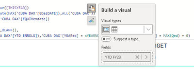
If you go into the DAX formula bar to edit a DAX measure or column when a visual is selected, the Build a visual pane and icons are on top of the bar, obscuring code underneath. See example below. Very frustrating, can't seem to get rid of it without coming out of the bar, which then AUTOMATICALLY calculates the DAX whether it is finished or not (this is my pet gripe). You can't click escape, either to get rid of the annoying pane that is now in the way, or to STOP the resulting calculation. Please, I beg you, two things
1. Make the Build a Visual pane BEHIND the DAX formula bar by default ALWAYS. Please don't say, ensure that no visuals are selected before going into the DAX bar. That is not a solution.
2. Onbly calculate a DAX formula if the tick is ticked, NOT if you accidently click return, NOT if you accidently click outside of the bar, ONLY if the tick is ticked.
Thank you. 🙂
- Mark as New
- Bookmark
- Subscribe
- Mute
- Subscribe to RSS Feed
- Permalink
- Report Inappropriate Content
Bella42's point 2 is an amazing suggestion, the amount of times I hit return rather than Alt/Shift + Return and then have to wait for the unfinished formula to calculate and tell me there's an error is unbelievable... I can't be the only one (hopefully not)
A solution to this would be amazing, and only calculating when the tick is clicked is a good idea, but then how would you know to check if you have uncalculated formulas... maybe an banner indicator or a turn calculations off/on button, like there is in Excel would be a better option, especially to stop everything recalcuating when making other changes in the report too
When will Microsoft start focussing on user suggetsions and stop introducing feature that don;t work and clearly nobody wants... What about a stacked and clustred chart, or a much better guage or better control over the size of areas within charts... I'm sure there's many more uggestions that users make that MS pay no never mind too
- Mark as New
- Bookmark
- Subscribe
- Mute
- Subscribe to RSS Feed
- Permalink
- Report Inappropriate Content
Hadn't thought of the possiblity of 'uncalculated' formulas. I generally finish what I am doing in the bar, and would click the tick before exiting but I can imagine it not happening that way. I was about to suggest a 'calculate all' button, and stopped myself, it would take the whole day 🙂 maybe a little signal on changed but uncalculated measures?
If I started on 'suggestions' to improve existing features rather than add new, unwanted, unworkable features, it would also take the whole day. Hate to seem ungrateful but Power BI is a shocker, and seems to have learnt zip from previous softwares. The neighbours must think there is some kind of murderous rampage going on in here 9 to 5, given the bloodcurdling screams of frustration. The only time it stops is when I am in Excel, coding in lovely VBA. Sigh...
- Mark as New
- Bookmark
- Subscribe
- Mute
- Subscribe to RSS Feed
- Permalink
- Report Inappropriate Content
I've been playing with the new on-object Interaction all day while doing the rutine Power BI projects.
My thoughts:
- It is good and fast for double-clicking to change format properties, such as color, etc.
- It is very confusing when I need to replace, add measures. It requires me to do many clicks on different parts of my screen (first, on visual, then on pane). My hand is actually hurting moving the mouse so much. And I also have a little dizziness because my eyes are jumping all over the screen.
Please, allow us to KEEP USING the old formatting + data panes on the right, while keeping the new on-visual feature. Please don't limit us just to the new way.
I am switching it off because it adds work for me.
The best way to see what I am talking about is just seeing me work. If you need more info, feel free to contact me.
Thanks!
- Mark as New
- Bookmark
- Subscribe
- Mute
- Subscribe to RSS Feed
- Permalink
- Report Inappropriate Content
- On-object formatting such as double-clicking a title to edit or having a context restricted formatting box appearing above it is great.
- I did not experience bugs so far, like other users.
- The build pane is a must, we need it back.
- Having to turn on the formatting pane on the view ribbon is annoying. Plus, we can now only have one pane open at a time, which is very limiting. After turning on the panes on the view ribbon, they show up in the right hand "Panes Bar", if that's what you call it. Why not have the panes bar showing up all icons by default, or having a "sticky" behavior based on the last instance of Power BI Desktop that was used?
On Summary, the problems around on-object interaction as it is currently implemented are mostly around the panes and not really on-object interaction which is the main feature. While the interaction on PowerPoint and Excel is great, the panes that allow finer control are less accessible there, please don't go that way with Power BI too. We gotta have our panes.
- Mark as New
- Bookmark
- Subscribe
- Mute
- Subscribe to RSS Feed
- Permalink
- Report Inappropriate Content
I'll agree with the majority who are saying let us keep the old visualisation and data pane active while using On-Object. If we can use BOTH versions at the same time then this wouldn't be so bad, for me having to choose between having the Data pane active or the Formatting Pane active with a new intrusive sidebar that can't be hidden is a no go for me.
I get some people want to save on screen real estate but there's a good portion of us that need a lot of information on the screen, especially when OnObject doesn't show items with DAX errors well.
Just a regular guy doin' Data Science.
If my post has helped you, please don't forget to thumbs up or click "Accept as solution" if it solved your problem!
- Mark as New
- Bookmark
- Subscribe
- Mute
- Subscribe to RSS Feed
- Permalink
- Report Inappropriate Content
Having the visualizations over the right hand side was much better. Consider I'm working with complex measures that have quite long names, I expand out the visualizations pane on the right hand side and the data tab next to it and it makes everything visable and easy to read.
With the visualisations pane next to the chart of table in the middle of my screen I can't expand it out to be as large as it was on the side pane and i can't now ready my measure unless I hover the mouse over it, quite annoying. I prefer the old style.
Maybe the old and the new can be combined with having the visualizations tab on the right hand side stacked under the data tab.
- Mark as New
- Bookmark
- Subscribe
- Mute
- Subscribe to RSS Feed
- Permalink
- Report Inappropriate Content
Not a fan of this new feature at all. Blocks visuals, feels a bit clunky and does not add value in any way. For me, its made working a bit tougher as I have to break muscle memory with these changes and slows me down. But overall, I just fail to see the added value of this feature. There are orther things the PBI community has been asking for that would add much more value. Just my opinion.
- Mark as New
- Bookmark
- Subscribe
- Mute
- Subscribe to RSS Feed
- Permalink
- Report Inappropriate Content
As a trainer, I like to kick around new features before teaching them. When the March 2023 update brought On-Object Interaction, I tried it out. Initially, when I tried to move fields from one field well to another, I got an error message inviting me to report this to Microsoft, which I did. Today I built a report making a clustered column chart using the X axis and the legend. Again I swapped the fields and this time it didn't raise an error. However, when I clikcked on a column to filter other visuals by my selection, it didn't filter them; instead it took me to a data table view of my filtered figures, with a "Back to report" button.
It seems that if I create a visual, it filters as long as I don't edit the fields, but once I have done so, then it takes me to this data page. I have found this to be repeatable.
- Mark as New
- Bookmark
- Subscribe
- Mute
- Subscribe to RSS Feed
- Permalink
- Report Inappropriate Content
Please give us the option to have the on-visual formatting but retain the formatting, visualisation AND data panes. Whoever scoped this design clearly does not use the product.
While I am at it,
1. why cannot the app remember the width of the the panes? it is painful to keep resizing them.
2. why not make the build pane and fromat panes separate? or at least the option to separate them? We live in a world of ultra-wide screens nowadays 🙂
Cheers!
- Mark as New
- Bookmark
- Subscribe
- Mute
- Subscribe to RSS Feed
- Permalink
- Report Inappropriate Content
What changes would you like to see?
- I liked the Visualization pane where it was. We build muscle memory of selecting the visual and going back to the panes for everything and now I click on a visual and have to wait for the litle icon to show up. The new in-object pane shows up in different places, if it happens to be in a visual down on the page I have to scroll down - it really does now flow well - not to mention the extra clicks.
If you turned off the preview switch, why?
- It slowed me down, all reasons above
Any suggestions for addititional settings or capabilities?
- Provide the option to have the Visualization pane
thank you.
- Mark as New
- Bookmark
- Subscribe
- Mute
- Subscribe to RSS Feed
- Permalink
- Report Inappropriate Content
Exactly this!
Muscle memory saves tons of time. FIXED location IS VERY IMPORTANT!
- Mark as New
- Bookmark
- Subscribe
- Mute
- Subscribe to RSS Feed
- Permalink
- Report Inappropriate Content
The number one rule of software design is not to mess with what people know. Give us the option to still have a visualization pane. It takes many more clicks now than it used to with the visualization pane, like changing visual types, renaming fields, etc. The new user interface is not intuitive and needs work.
- Mark as New
- Bookmark
- Subscribe
- Mute
- Subscribe to RSS Feed
- Permalink
- Report Inappropriate Content
I turned off the The On-Object Interation feature after a few minutes of use. I hope that we are not forced to use it in the future.
The extra click to get/see the list of fields has no value. When the build 'menu' pops open and it is near the right hand side of the canvas, it covers up part of the visual that you are trying to modify. I noticed that the yellow warning triangle that is present when a column is no longer available is not shown in the 'build' panel.
The stacking of the Selection, bookmark, data... panels in the right side nav bar is nice though. My only thing that I dislike is the build menu and it's placement.
- Mark as New
- Bookmark
- Subscribe
- Mute
- Subscribe to RSS Feed
- Permalink
- Report Inappropriate Content
Thank you for the feedback and giving the preview a try. Can you share a screenshot of the first issue of the overlap? We are tracking a bug on the missing error state within the build menu.
- Mark as New
- Bookmark
- Subscribe
- Mute
- Subscribe to RSS Feed
- Permalink
- Report Inappropriate Content
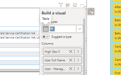
When the visual is right next to the right edge of the canvis, the build a visual moves to the left, covering up part of the visual that you are attempting to change.
Helpful resources

Join us at the Microsoft Fabric Community Conference
March 31 - April 2, 2025, in Las Vegas, Nevada. Use code MSCUST for a $150 discount!

Power BI Monthly Update - February 2025
Check out the February 2025 Power BI update to learn about new features.

| User | Count |
|---|---|
| 82 | |
| 78 | |
| 52 | |
| 39 | |
| 35 |
| User | Count |
|---|---|
| 94 | |
| 79 | |
| 51 | |
| 47 | |
| 47 |


