cancel
Showing results for 
Search instead for 
Did you mean: 

The Fabric community is now in read-only for platform upgrade. Learn more

Reply
JMelo
Frequent Visitor

Scatterplot over time

Hi,

on this example i have 3 producs with different prices each.


Could anyone give me a hint?


Lets say:


Jan

Product 1 - $100 

Produc 2 - $200

Produc 3 - $300


Feb

Product 1 - $50

Produc 2 - $55

Produc 3 - $60


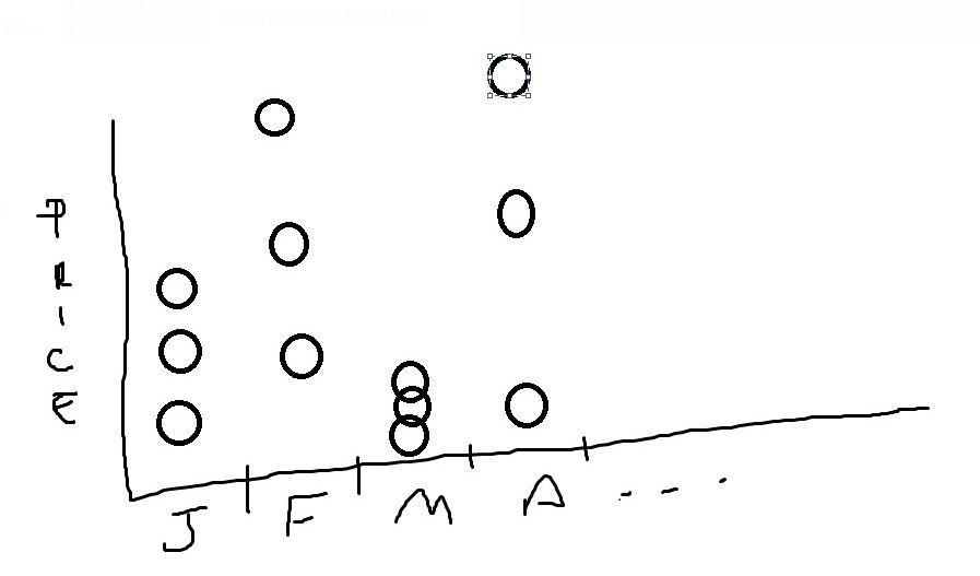
I need to plot a scatterplot time over month, without summarize Producs. I want to see Product 1, 2, and 3 distribuited in that month


Example:


Capture.JPG


1 ACCEPTED SOLUTION

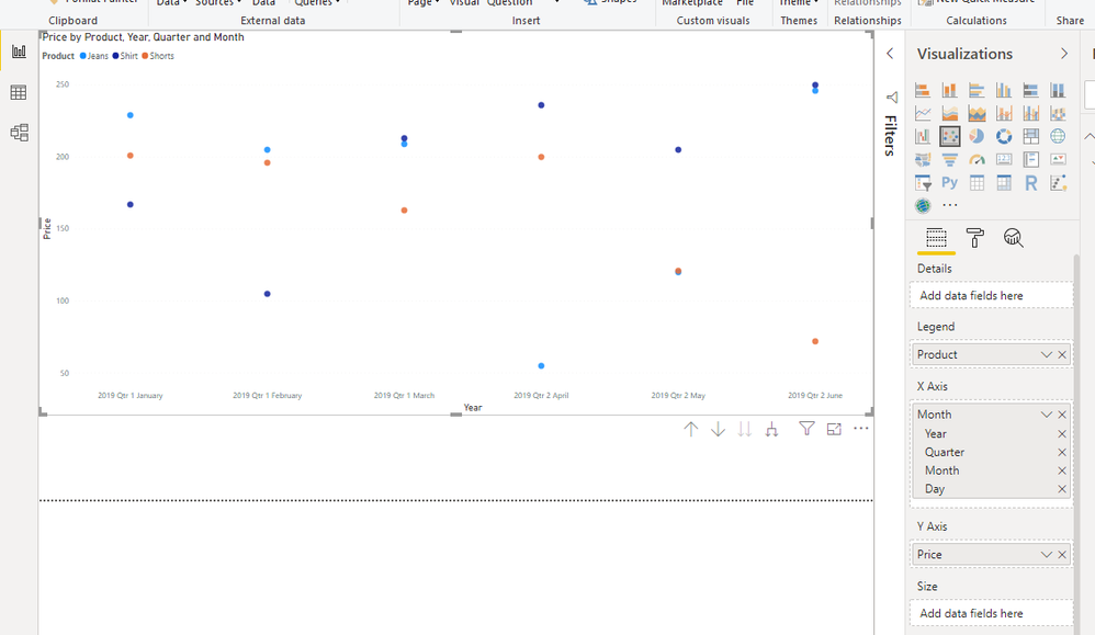
You don't need to do anything with it then, just drop the fields into the scatter plot...


scatter.PNG

View solution in original post

3 REPLIES 3
jthomson
Solution Sage
Solution Sage

Should be trivial to convert a data set in order to give you what you want, but without knowing what your data actually looks like it's hard to suggest how to do it

JMelo
Frequent Visitor

Month	Product	Price
Jan-19	Shirt	167
Jan-19	Jeans	229
Jan-19	Shorts	201
Feb-19	Shirt	105
Feb-19	Jeans	205
Feb-19	Shorts	196
Mar-19	Shirt	213
Mar-19	Jeans	209
Mar-19	Shorts	163
Apr-19	Shirt	236
Apr-19	Jeans	55
Apr-19	Shorts	200
May-19	Shirt	205
May-19	Jeans	120
May-19	Shorts	121
Jun-19	Shirt	250
Jun-19	Jeans	246
Jun-19	Shorts	72

Thanks,

this is the dataset, would it help?

You don't need to do anything with it then, just drop the fields into the scatter plot...


scatter.PNG

Helpful resources

Announcements
FabCon and SQLCon Barcelona 2026

FabCon & SQLCon – Barcelona 2026

Join us in Barcelona for FabCon and SQLCon, the Fabric, Power BI, SQL, and AI community event. Save €200 with code FABCMTY200.

Power BI DataViz World Championships carousel

Power BI DataViz World Championships - June 2026

A new Power BI DataViz World Championship is coming this June! Don't miss out on submitting your entry.