FabCon is coming to Atlanta
Join us at FabCon Atlanta from March 16 - 20, 2026, for the ultimate Fabric, Power BI, AI and SQL community-led event. Save $200 with code FABCOMM.
Register now!- Power BI forums
- Get Help with Power BI
- Desktop
- Service
- Report Server
- Power Query
- Mobile Apps
- Developer
- DAX Commands and Tips
- Custom Visuals Development Discussion
- Health and Life Sciences
- Power BI Spanish forums
- Translated Spanish Desktop
- Training and Consulting
- Instructor Led Training
- Dashboard in a Day for Women, by Women
- Galleries
- Data Stories Gallery
- Themes Gallery
- Contests Gallery
- QuickViz Gallery
- Quick Measures Gallery
- Visual Calculations Gallery
- Notebook Gallery
- Translytical Task Flow Gallery
- TMDL Gallery
- R Script Showcase
- Webinars and Video Gallery
- Ideas
- Custom Visuals Ideas (read-only)
- Issues
- Issues
- Events
- Upcoming Events
The Power BI Data Visualization World Championships is back! It's time to submit your entry. Live now!
- Power BI forums
- Forums
- Get Help with Power BI
- Desktop
- Re: Scatterplot over time
- Subscribe to RSS Feed
- Mark Topic as New
- Mark Topic as Read
- Float this Topic for Current User
- Bookmark
- Subscribe
- Printer Friendly Page
- Mark as New
- Bookmark
- Subscribe
- Mute
- Subscribe to RSS Feed
- Permalink
- Report Inappropriate Content
Scatterplot over time
Hi,
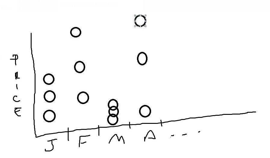
on this example i have 3 producs with different prices each.
Could anyone give me a hint?
Lets say:
Jan
Product 1 - $100
Produc 2 - $200
Produc 3 - $300
Feb
Product 1 - $50
Produc 2 - $55
Produc 3 - $60
I need to plot a scatterplot time over month, without summarize Producs. I want to see Product 1, 2, and 3 distribuited in that month
Example:
Solved! Go to Solution.
- Mark as New
- Bookmark
- Subscribe
- Mute
- Subscribe to RSS Feed
- Permalink
- Report Inappropriate Content
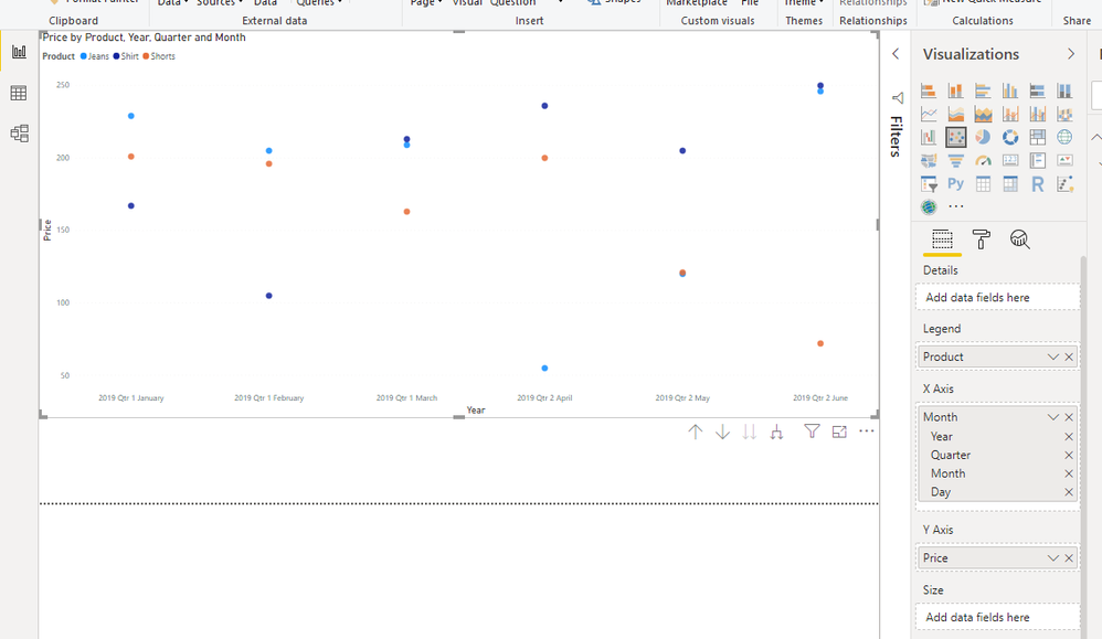
You don't need to do anything with it then, just drop the fields into the scatter plot...
- Mark as New
- Bookmark
- Subscribe
- Mute
- Subscribe to RSS Feed
- Permalink
- Report Inappropriate Content
Should be trivial to convert a data set in order to give you what you want, but without knowing what your data actually looks like it's hard to suggest how to do it
- Mark as New
- Bookmark
- Subscribe
- Mute
- Subscribe to RSS Feed
- Permalink
- Report Inappropriate Content
Month	Product	Price
Jan-19	Shirt	167
Jan-19	Jeans	229
Jan-19	Shorts	201
Feb-19	Shirt	105
Feb-19	Jeans	205
Feb-19	Shorts	196
Mar-19	Shirt	213
Mar-19	Jeans	209
Mar-19	Shorts	163
Apr-19	Shirt	236
Apr-19	Jeans	55
Apr-19	Shorts	200
May-19	Shirt	205
May-19	Jeans	120
May-19	Shorts	121
Jun-19	Shirt	250
Jun-19	Jeans	246
Jun-19	Shorts	72
Thanks,
this is the dataset, would it help?
- Mark as New
- Bookmark
- Subscribe
- Mute
- Subscribe to RSS Feed
- Permalink
- Report Inappropriate Content
You don't need to do anything with it then, just drop the fields into the scatter plot...
Helpful resources
| User | Count |
|---|---|
| 53 | |
| 40 | |
| 31 | |
| 24 | |
| 22 |
| User | Count |
|---|---|
| 134 | |
| 111 | |
| 57 | |
| 44 | |
| 37 |


