FabCon is coming to Atlanta
Join us at FabCon Atlanta from March 16 - 20, 2026, for the ultimate Fabric, Power BI, AI and SQL community-led event. Save $200 with code FABCOMM.
Register now!- Power BI forums
- Get Help with Power BI
- Desktop
- Service
- Report Server
- Power Query
- Mobile Apps
- Developer
- DAX Commands and Tips
- Custom Visuals Development Discussion
- Health and Life Sciences
- Power BI Spanish forums
- Translated Spanish Desktop
- Training and Consulting
- Instructor Led Training
- Dashboard in a Day for Women, by Women
- Galleries
- Data Stories Gallery
- Themes Gallery
- Contests Gallery
- QuickViz Gallery
- Quick Measures Gallery
- Visual Calculations Gallery
- Notebook Gallery
- Translytical Task Flow Gallery
- TMDL Gallery
- R Script Showcase
- Webinars and Video Gallery
- Ideas
- Custom Visuals Ideas (read-only)
- Issues
- Issues
- Events
- Upcoming Events
The Power BI Data Visualization World Championships is back! It's time to submit your entry. Live now!
- Power BI forums
- Forums
- Get Help with Power BI
- Desktop
- Re: Scatterplot over time
- Subscribe to RSS Feed
- Mark Topic as New
- Mark Topic as Read
- Float this Topic for Current User
- Bookmark
- Subscribe
- Printer Friendly Page
- Mark as New
- Bookmark
- Subscribe
- Mute
- Subscribe to RSS Feed
- Permalink
- Report Inappropriate Content
Scatterplot over time
Hi,
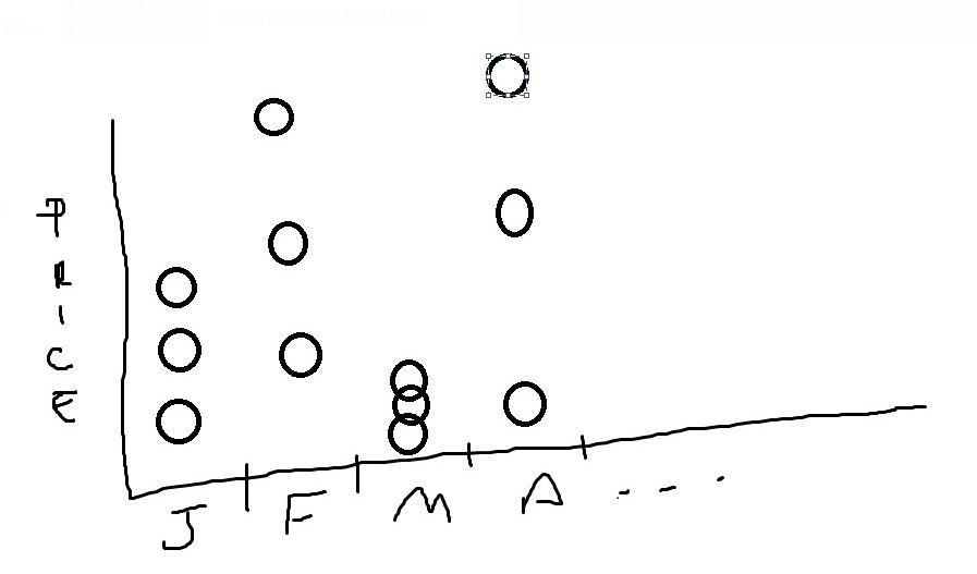
on this example i have 3 producs with different prices each.
Could anyone give me a hint?
Lets say:
Jan
Product 1 - $100
Produc 2 - $200
Produc 3 - $300
Feb
Product 1 - $50
Produc 2 - $55
Produc 3 - $60
I need to plot a scatterplot time over month, without summarize Producs. I want to see Product 1, 2, and 3 distribuited in that month
Example:
Solved! Go to Solution.
- Mark as New
- Bookmark
- Subscribe
- Mute
- Subscribe to RSS Feed
- Permalink
- Report Inappropriate Content
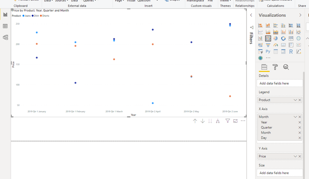
You don't need to do anything with it then, just drop the fields into the scatter plot...
- Mark as New
- Bookmark
- Subscribe
- Mute
- Subscribe to RSS Feed
- Permalink
- Report Inappropriate Content
Should be trivial to convert a data set in order to give you what you want, but without knowing what your data actually looks like it's hard to suggest how to do it
- Mark as New
- Bookmark
- Subscribe
- Mute
- Subscribe to RSS Feed
- Permalink
- Report Inappropriate Content
Month	Product	Price
Jan-19	Shirt	167
Jan-19	Jeans	229
Jan-19	Shorts	201
Feb-19	Shirt	105
Feb-19	Jeans	205
Feb-19	Shorts	196
Mar-19	Shirt	213
Mar-19	Jeans	209
Mar-19	Shorts	163
Apr-19	Shirt	236
Apr-19	Jeans	55
Apr-19	Shorts	200
May-19	Shirt	205
May-19	Jeans	120
May-19	Shorts	121
Jun-19	Shirt	250
Jun-19	Jeans	246
Jun-19	Shorts	72
Thanks,
this is the dataset, would it help?
- Mark as New
- Bookmark
- Subscribe
- Mute
- Subscribe to RSS Feed
- Permalink
- Report Inappropriate Content
You don't need to do anything with it then, just drop the fields into the scatter plot...
Helpful resources

Power BI Dataviz World Championships
The Power BI Data Visualization World Championships is back! It's time to submit your entry.

Power BI Monthly Update - January 2026
Check out the January 2026 Power BI update to learn about new features.

| User | Count |
|---|---|
| 69 | |
| 44 | |
| 36 | |
| 28 | |
| 23 |
| User | Count |
|---|---|
| 141 | |
| 124 | |
| 59 | |
| 40 | |
| 32 |


