This is best Fabric, Power BI, SQL and AI community event. How do we know? The last event sold out! Save €200 with code FABCMTY200.
Register nowJuly 28 - August 9 | Final Round of the Power BI Dataviz World Championships. This is your chance. Learn more
Hi,
Below is my sample data, can I create a scatter chart "length vs width"?
Objective: For the same serial number, is there a trendline between length vs width, length vs height, width vs height
Actul data has more >50 parameters and millions of rows.
| serial number | Parameter | Value |
| 1111 | Length | 10.1 |
| 2222 | Length | 10.2 |
| 3333 | Length | 10.1 |
| 1111 | width | 5.2 |
| 2222 | width | 5.3 |
| 3333 | width | 5.1 |
| 1111 | height | 2.1 |
| 2222 | height | 2.2 |
| 3333 | height | 2.4 |
Solved! Go to Solution.
Create the following measures in your table.
LengthMeasure = CALCULATE(SUM('Length table'[Value]),FILTER('Length table','Length table'[Parameter]="Length"))
widthmeasure = CALCULATE(SUM('Length table'[Value]),FILTER('Length table','Length table'[Parameter]="width"))
heightmeasure = CALCULATE(SUM('Length table'[Value]),FILTER('Length table','Length table'[Parameter]="height"))
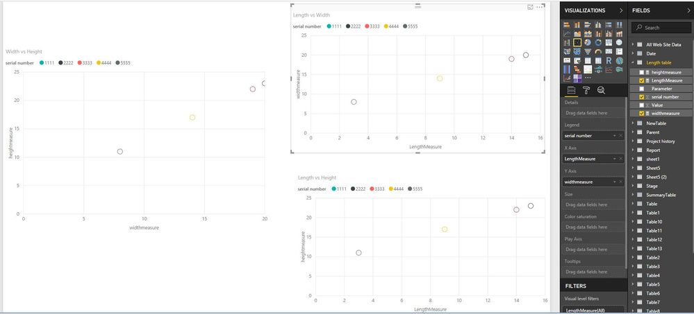
Then create scatter chart as shown in the following screenshot. Please note that in this case, it is not possible to parameter slicer to filter the charts.
Regards,
Lydia
So, what would be an example of what you would like to see as output?
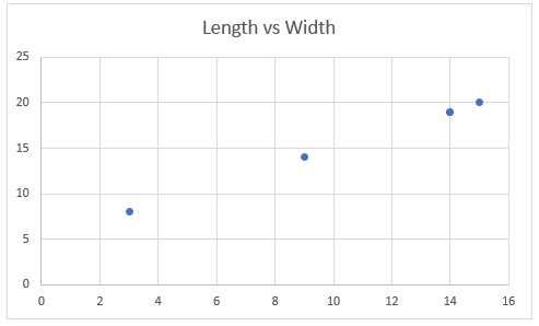
Updated table values and below is a sample chart (length vs width).
At some point, I will also need a slicer to select "length" and "width".
| serial number | Parameter | Value |
| 1111 | Length | 14 |
| 2222 | Length | 15 |
| 3333 | Length | 14 |
| 4444 | Length | 9 |
| 5555 | Length | 3 |
| 1111 | width | 19 |
| 2222 | width | 20 |
| 3333 | width | 19 |
| 4444 | width | 14 |
| 5555 | width | 8 |
| 1111 | height | 22 |
| 2222 | height | 23 |
| 3333 | height | 22 |
| 4444 | height | 17 |
| 5555 | height | 11 |
Create the following measures in your table.
LengthMeasure = CALCULATE(SUM('Length table'[Value]),FILTER('Length table','Length table'[Parameter]="Length"))
widthmeasure = CALCULATE(SUM('Length table'[Value]),FILTER('Length table','Length table'[Parameter]="width"))
heightmeasure = CALCULATE(SUM('Length table'[Value]),FILTER('Length table','Length table'[Parameter]="height"))
Then create scatter chart as shown in the following screenshot. Please note that in this case, it is not possible to parameter slicer to filter the charts.
Regards,
Lydia
Join us in Barcelona for FabCon and SQLCon, the Fabric, Power BI, SQL, and AI community event. Save €200 with code FABCMTY200.
If you love stickers, then you will definitely want to check out our community sticker challenge, Barcelona edition!
Check out the July 2026 Power BI update to learn about new features.
| User | Count |
|---|---|
| 25 | |
| 23 | |
| 19 | |
| 17 | |
| 14 |
| User | Count |
|---|---|
| 24 | |
| 23 | |
| 20 | |
| 20 | |
| 19 |