Get certified for free when you join Fabric Data Days 2026 and dive into Fabric, Power BI, SQL, AI, and other essential data skills.
Join nowJuly 7 - July 17 | Round 2 of the Power BI Dataviz World Championships. Don't miss your chance! Learn more
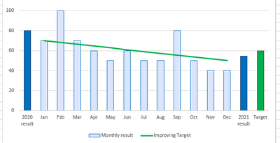
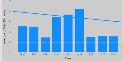
I have Montly data bars on my bar graph and I would like to display bar with current year average and a custome value bar of target at the end, how can I achieve this.
Thankyou!
Solved! Go to Solution.
Hi, @mokhan
Based on your description, I created data to reproduce your scenario. The pbix file is attached in the end.
Table:
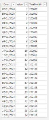
Table 2(a calculated table):
Table 2 =
UNION(
DISTINCT('Table'[YearMonth]),
ROW("YearMonth","2020-Avg"),
ROW("YearMonth","2021-Avg"),
ROW("YearMonth","Target")
)
You may two measures as below.
Result =
SWITCH(
MAX('Table 2'[YearMonth]),
"2020-Avg",
CALCULATE(
AVERAGE('Table'[Value]),
FILTER(
ALL('Table'),
YEAR([Date])=2020
)
),
"2021-Avg",
CALCULATE(
AVERAGE('Table'[Value]),
FILTER(
ALL('Table'),
YEAR([Date])=2021
)
),
"Target",12,
CALCULATE(
SUM('Table'[Value]),
FILTER(
ALL('Table'),
[YearMonth]=MAX('Table 2'[YearMonth])
)
)
)Color Control =
SWITCH(
MAX('Table 2'[YearMonth]),
"2020-Avg","yellow",
"2021-Avg","red",
"Target","green"
)
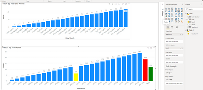
Then you may use 'YearMonth' from 'Table 2' as 'Shared axis' and apply conditional format based on 'Color Control'.
Result:
Best Regards
Allan
If this post helps, then please consider Accept it as the solution to help the other members find it more quickly.
Hi, @mokhan
Based on your description, I created data to reproduce your scenario. The pbix file is attached in the end.
Table:
Table 2(a calculated table):
Table 2 =
UNION(
DISTINCT('Table'[YearMonth]),
ROW("YearMonth","2020-Avg"),
ROW("YearMonth","2021-Avg"),
ROW("YearMonth","Target")
)
You may two measures as below.
Result =
SWITCH(
MAX('Table 2'[YearMonth]),
"2020-Avg",
CALCULATE(
AVERAGE('Table'[Value]),
FILTER(
ALL('Table'),
YEAR([Date])=2020
)
),
"2021-Avg",
CALCULATE(
AVERAGE('Table'[Value]),
FILTER(
ALL('Table'),
YEAR([Date])=2021
)
),
"Target",12,
CALCULATE(
SUM('Table'[Value]),
FILTER(
ALL('Table'),
[YearMonth]=MAX('Table 2'[YearMonth])
)
)
)Color Control =
SWITCH(
MAX('Table 2'[YearMonth]),
"2020-Avg","yellow",
"2021-Avg","red",
"Target","green"
)
Then you may use 'YearMonth' from 'Table 2' as 'Shared axis' and apply conditional format based on 'Color Control'.
Result:
Best Regards
Allan
If this post helps, then please consider Accept it as the solution to help the other members find it more quickly.
I need this
So far I got this
Need to add current year avg and target bar at the end.
@mokhan You will need to do a lot of manual work/calculations to achieve this. Would you settle for using the Line Column combo chart and putting the custom target value as a line value?
Or you could even use the Analytics features to set custom target as constant line and average for current year:
https://docs.microsoft.com/en-us/power-bi/transform-model/desktop-analytics-pane
Copying DAX from this post? Click here for a hack to quickly replace it with your own table names
Has this post solved your problem? Please Accept as Solution so that others can find it quickly and to let the community know your problem has been solved.
If you found this post helpful, please give Kudos C
I work as a Microsoft trainer and consultant, specialising in Power BI and Power Query.
www.excelwithallison.com
Join us in Barcelona for FabCon and SQLCon, the Fabric, Power BI, SQL, and AI community event. Save €200 with code FABCMTY200.
Join Data Days 2026: 60 days of free live/on-demand sessions, challenges, study groups, and certification opportunities.
| User | Count |
|---|---|
| 27 | |
| 23 | |
| 18 | |
| 18 | |
| 15 |
| User | Count |
|---|---|
| 53 | |
| 44 | |
| 42 | |
| 39 | |
| 34 |