FabCon is coming to Atlanta
Join us at FabCon Atlanta from March 16 - 20, 2026, for the ultimate Fabric, Power BI, AI and SQL community-led event. Save $200 with code FABCOMM.
Register now!- Power BI forums
- Get Help with Power BI
- Desktop
- Service
- Report Server
- Power Query
- Mobile Apps
- Developer
- DAX Commands and Tips
- Custom Visuals Development Discussion
- Health and Life Sciences
- Power BI Spanish forums
- Translated Spanish Desktop
- Training and Consulting
- Instructor Led Training
- Dashboard in a Day for Women, by Women
- Galleries
- Data Stories Gallery
- Themes Gallery
- Contests Gallery
- QuickViz Gallery
- Quick Measures Gallery
- Visual Calculations Gallery
- Notebook Gallery
- Translytical Task Flow Gallery
- TMDL Gallery
- R Script Showcase
- Webinars and Video Gallery
- Ideas
- Custom Visuals Ideas (read-only)
- Issues
- Issues
- Events
- Upcoming Events
The Power BI Data Visualization World Championships is back! Get ahead of the game and start preparing now! Learn more
- Power BI forums
- Forums
- Get Help with Power BI
- Desktop
- Pie Chart: Positive Values vs Negative Values
- Subscribe to RSS Feed
- Mark Topic as New
- Mark Topic as Read
- Float this Topic for Current User
- Bookmark
- Subscribe
- Printer Friendly Page
- Mark as New
- Bookmark
- Subscribe
- Mute
- Subscribe to RSS Feed
- Permalink
- Report Inappropriate Content
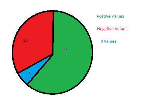
Pie Chart: Positive Values vs Negative Values
I have a Measured column that shows the variance between 2 columns..

Solved! Go to Solution.
- Mark as New
- Bookmark
- Subscribe
- Mute
- Subscribe to RSS Feed
- Permalink
- Report Inappropriate Content
Hi @StuartSmith ,
You can do a caluclation as follows:
NegaticveCnt = CALCULATE(DISTINCTCOUNT(tablename[Country]), tablename[GroupCol] = "Negative")
Do similar measures for Positive and 0.
Thanks,
Pragati
- Mark as New
- Bookmark
- Subscribe
- Mute
- Subscribe to RSS Feed
- Permalink
- Report Inappropriate Content
@StuartSmith ,
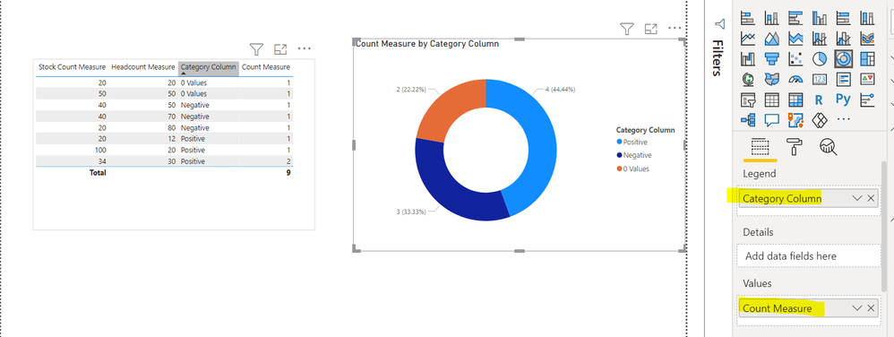
I replicated some sample at my end as per your deets.
SO create first one calculated column:
Then create measure like below:

Please take a quick glance at newly created dashboards : Restaurant Management Dashboard , HR Analytics Report , Hotel Management Report, Sales Analysis Report , Fortune 500 Companies Analysis , Revenue Tracking Dashboard
- Mark as New
- Bookmark
- Subscribe
- Mute
- Subscribe to RSS Feed
- Permalink
- Report Inappropriate Content
Hi @StuartSmith ,
You can try created a calculated column as follows to use on pie-chart:
GroupCalc = IF([Measure] = 0, "0 Values", IF([Measure] > 0, "Positive Values", "Negative Values"))
Replace [Measure] in above DAX with your measure/column.
Thanks,
Pragati
- Mark as New
- Bookmark
- Subscribe
- Mute
- Subscribe to RSS Feed
- Permalink
- Report Inappropriate Content
Thanks, your measure worked great, but then reaslied the result wasnt exactly what I wanted. I now have a table similar to the below
The chart is then conting each row, so Negative = 2, Positive = 2 & 0 = 1, but I realised that I need it to count each distinct country, so Negative = 1 (UK) , Positive = 1 (France) & 0 = 2 (Germany & Spain).
I am trying "DistinctCount" with your measure, but can figure it out. Hope that makes sense.
- Mark as New
- Bookmark
- Subscribe
- Mute
- Subscribe to RSS Feed
- Permalink
- Report Inappropriate Content
Hi @StuartSmith ,
You can do a caluclation as follows:
NegaticveCnt = CALCULATE(DISTINCTCOUNT(tablename[Country]), tablename[GroupCol] = "Negative")
Do similar measures for Positive and 0.
Thanks,
Pragati
Helpful resources

Power BI Dataviz World Championships
The Power BI Data Visualization World Championships is back! Get ahead of the game and start preparing now!

| User | Count |
|---|---|
| 38 | |
| 36 | |
| 33 | |
| 31 | |
| 28 |
| User | Count |
|---|---|
| 129 | |
| 88 | |
| 79 | |
| 68 | |
| 63 |


