Join us at FabCon Vienna from September 15-18, 2025
The ultimate Fabric, Power BI, SQL, and AI community-led learning event. Save €200 with code FABCOMM.
Get registered- Power BI forums
- Get Help with Power BI
- Desktop
- Service
- Report Server
- Power Query
- Mobile Apps
- Developer
- DAX Commands and Tips
- Custom Visuals Development Discussion
- Health and Life Sciences
- Power BI Spanish forums
- Translated Spanish Desktop
- Training and Consulting
- Instructor Led Training
- Dashboard in a Day for Women, by Women
- Galleries
- Data Stories Gallery
- Themes Gallery
- Contests Gallery
- Quick Measures Gallery
- Notebook Gallery
- Translytical Task Flow Gallery
- TMDL Gallery
- R Script Showcase
- Webinars and Video Gallery
- Ideas
- Custom Visuals Ideas (read-only)
- Issues
- Issues
- Events
- Upcoming Events
Compete to become Power BI Data Viz World Champion! First round ends August 18th. Get started.
- Power BI forums
- Forums
- Get Help with Power BI
- Desktop
- Re: Overlaying Graphs
- Subscribe to RSS Feed
- Mark Topic as New
- Mark Topic as Read
- Float this Topic for Current User
- Bookmark
- Subscribe
- Printer Friendly Page
- Mark as New
- Bookmark
- Subscribe
- Mute
- Subscribe to RSS Feed
- Permalink
- Report Inappropriate Content
Overlaying Graphs
I have a set of monthly cost data over the course of several years. If, for example, I want to plot cost over time for January-June of 2014, is there a way to overlay a plot on top of that for January -June of 2015, to compare trends over the two years? Is this done in the reports or can it be done on a dashboard as well?
Solved! Go to Solution.
- Mark as New
- Bookmark
- Subscribe
- Mute
- Subscribe to RSS Feed
- Permalink
- Report Inappropriate Content
Hi @jgenchanok
In answer to your most recent question, I generated some dummy data as follows
Date	Usage
1/01/2014	10
1/02/2014	21
1/03/2014	29
1/04/2014	36
1/05/2014	44
1/06/2014	44
1/07/2014	47
1/08/2014	51
1/09/2014	65
1/10/2014	72
1/11/2014	82
1/12/2014	93
1/01/2015	104
1/02/2015	117
1/03/2015	114
1/04/2015	129
1/05/2015	143
1/06/2015	138
1/07/2015	141
1/08/2015	149
1/09/2015	155
1/10/2015	163
1/11/2015	169
1/12/2015	171
1/01/2016	180
1/02/2016	178
1/03/2016	186
1/04/2016	191
1/05/2016	191
1/06/2016	191
1/07/2016	190
1/08/2016	191
1/09/2016	200
1/10/2016	211
1/11/2016	218
1/12/2016	229
Which gave me three years.
I then added the following two calcualated columns to my table
Month = FORMAT('Table9'[Date],"MMMM")

MonthID = INT(FORMAT('Table9'[Date],"MM"))
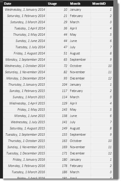
The MonthID is just there to help sort the [Month] column in order. The table now looks like this
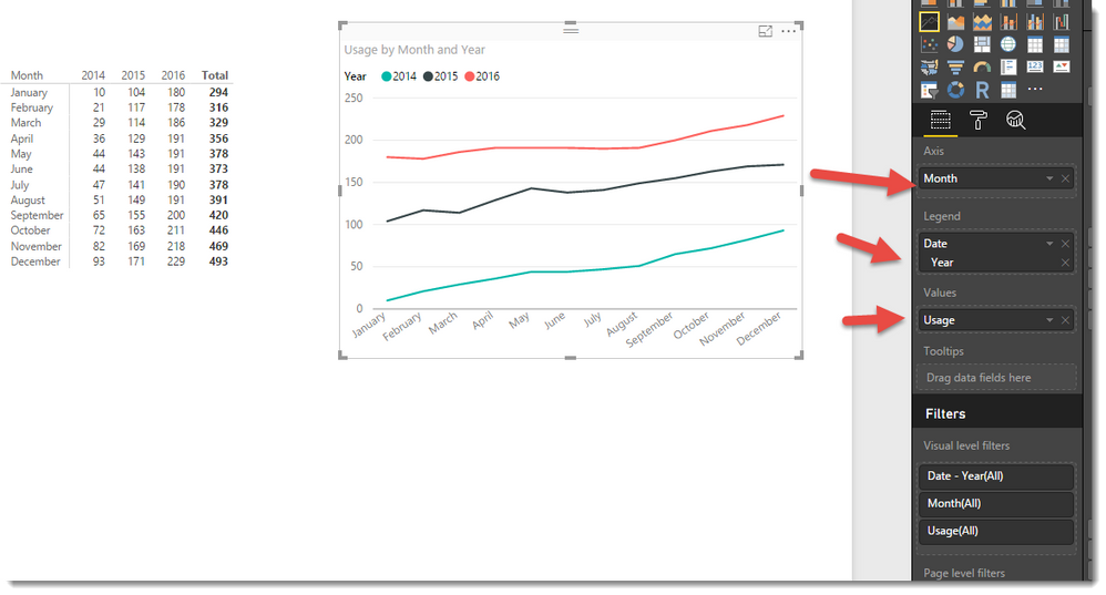
I can then make Matrix and Line visuals as follows
- Mark as New
- Bookmark
- Subscribe
- Mute
- Subscribe to RSS Feed
- Permalink
- Report Inappropriate Content
Hi @jgenchanok,
Yes this is possible. I suggest you create two measures. The first will be simple and might be the sum of cost, The second will be similar but use one of the Time-Intelligence functions like SAMEPERIODLASTYEAR to build a second measure that you can add to your visual.
If you post a small set of your data we can try and build something for you.
- Mark as New
- Bookmark
- Subscribe
- Mute
- Subscribe to RSS Feed
- Permalink
- Report Inappropriate Content
Thanks Phil,
I was wondering if it had similar functionality to creating a pivot table in excel. For example, in excel, I can create a pivot table that has months as rows and years as columns and it will plot those years individually.
I
If I try to make a similar format matrix table in Power, it does not correlate to the same type of graph if I wanted to make a combo chart.
- Mark as New
- Bookmark
- Subscribe
- Mute
- Subscribe to RSS Feed
- Permalink
- Report Inappropriate Content
Hi @jgenchanok
In answer to your most recent question, I generated some dummy data as follows
Date	Usage
1/01/2014	10
1/02/2014	21
1/03/2014	29
1/04/2014	36
1/05/2014	44
1/06/2014	44
1/07/2014	47
1/08/2014	51
1/09/2014	65
1/10/2014	72
1/11/2014	82
1/12/2014	93
1/01/2015	104
1/02/2015	117
1/03/2015	114
1/04/2015	129
1/05/2015	143
1/06/2015	138
1/07/2015	141
1/08/2015	149
1/09/2015	155
1/10/2015	163
1/11/2015	169
1/12/2015	171
1/01/2016	180
1/02/2016	178
1/03/2016	186
1/04/2016	191
1/05/2016	191
1/06/2016	191
1/07/2016	190
1/08/2016	191
1/09/2016	200
1/10/2016	211
1/11/2016	218
1/12/2016	229
Which gave me three years.
I then added the following two calcualated columns to my table
Month = FORMAT('Table9'[Date],"MMMM")

MonthID = INT(FORMAT('Table9'[Date],"MM"))
The MonthID is just there to help sort the [Month] column in order. The table now looks like this
I can then make Matrix and Line visuals as follows


