Get Fabric certified for FREE!
Don't miss your chance to take the Fabric Data Engineer (DP-700) exam on us!
Learn more- Power BI forums
- Get Help with Power BI
- Desktop
- Service
- Report Server
- Power Query
- Mobile Apps
- Developer
- DAX Commands and Tips
- Custom Visuals Development Discussion
- Health and Life Sciences
- Power BI Spanish forums
- Translated Spanish Desktop
- Training and Consulting
- Instructor Led Training
- Dashboard in a Day for Women, by Women
- Galleries
- Data Stories Gallery
- Themes Gallery
- Contests Gallery
- QuickViz Gallery
- Quick Measures Gallery
- Visual Calculations Gallery
- Notebook Gallery
- Translytical Task Flow Gallery
- TMDL Gallery
- R Script Showcase
- Webinars and Video Gallery
- Ideas
- Custom Visuals Ideas (read-only)
- Issues
- Issues
- Events
- Upcoming Events
Next up in the FabCon + SQLCon recap series: The roadmap for Microsoft SQL and Maximizing Developer experiences in Fabric. All sessions are available on-demand after the live show. Register now
- Power BI forums
- Forums
- Get Help with Power BI
- Desktop
- Re: Overlaying Graphs
- Subscribe to RSS Feed
- Mark Topic as New
- Mark Topic as Read
- Float this Topic for Current User
- Bookmark
- Subscribe
- Printer Friendly Page
- Mark as New
- Bookmark
- Subscribe
- Mute
- Subscribe to RSS Feed
- Permalink
- Report Inappropriate Content
Overlaying Graphs
I have a set of monthly cost data over the course of several years. If, for example, I want to plot cost over time for January-June of 2014, is there a way to overlay a plot on top of that for January -June of 2015, to compare trends over the two years? Is this done in the reports or can it be done on a dashboard as well?
Solved! Go to Solution.
- Mark as New
- Bookmark
- Subscribe
- Mute
- Subscribe to RSS Feed
- Permalink
- Report Inappropriate Content
Hi @jgenchanok
In answer to your most recent question, I generated some dummy data as follows
Date	Usage
1/01/2014	10
1/02/2014	21
1/03/2014	29
1/04/2014	36
1/05/2014	44
1/06/2014	44
1/07/2014	47
1/08/2014	51
1/09/2014	65
1/10/2014	72
1/11/2014	82
1/12/2014	93
1/01/2015	104
1/02/2015	117
1/03/2015	114
1/04/2015	129
1/05/2015	143
1/06/2015	138
1/07/2015	141
1/08/2015	149
1/09/2015	155
1/10/2015	163
1/11/2015	169
1/12/2015	171
1/01/2016	180
1/02/2016	178
1/03/2016	186
1/04/2016	191
1/05/2016	191
1/06/2016	191
1/07/2016	190
1/08/2016	191
1/09/2016	200
1/10/2016	211
1/11/2016	218
1/12/2016	229
Which gave me three years.
I then added the following two calcualated columns to my table
Month = FORMAT('Table9'[Date],"MMMM")

MonthID = INT(FORMAT('Table9'[Date],"MM"))
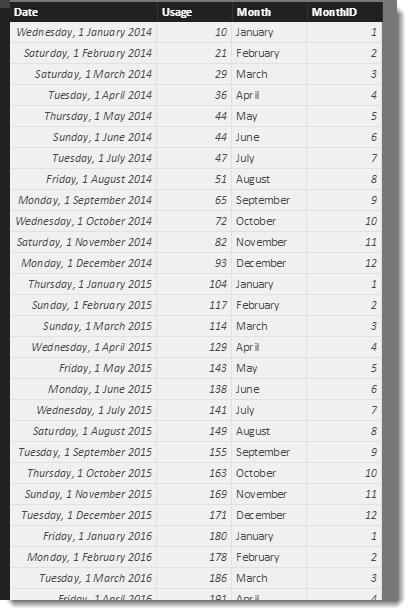
The MonthID is just there to help sort the [Month] column in order. The table now looks like this
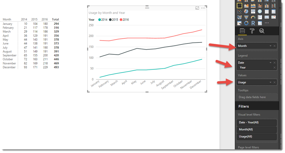
I can then make Matrix and Line visuals as follows
- Mark as New
- Bookmark
- Subscribe
- Mute
- Subscribe to RSS Feed
- Permalink
- Report Inappropriate Content
Hi @jgenchanok,
Yes this is possible. I suggest you create two measures. The first will be simple and might be the sum of cost, The second will be similar but use one of the Time-Intelligence functions like SAMEPERIODLASTYEAR to build a second measure that you can add to your visual.
If you post a small set of your data we can try and build something for you.
- Mark as New
- Bookmark
- Subscribe
- Mute
- Subscribe to RSS Feed
- Permalink
- Report Inappropriate Content
Thanks Phil,
I was wondering if it had similar functionality to creating a pivot table in excel. For example, in excel, I can create a pivot table that has months as rows and years as columns and it will plot those years individually.
I
If I try to make a similar format matrix table in Power, it does not correlate to the same type of graph if I wanted to make a combo chart.
- Mark as New
- Bookmark
- Subscribe
- Mute
- Subscribe to RSS Feed
- Permalink
- Report Inappropriate Content
Hi @jgenchanok
In answer to your most recent question, I generated some dummy data as follows
Date	Usage
1/01/2014	10
1/02/2014	21
1/03/2014	29
1/04/2014	36
1/05/2014	44
1/06/2014	44
1/07/2014	47
1/08/2014	51
1/09/2014	65
1/10/2014	72
1/11/2014	82
1/12/2014	93
1/01/2015	104
1/02/2015	117
1/03/2015	114
1/04/2015	129
1/05/2015	143
1/06/2015	138
1/07/2015	141
1/08/2015	149
1/09/2015	155
1/10/2015	163
1/11/2015	169
1/12/2015	171
1/01/2016	180
1/02/2016	178
1/03/2016	186
1/04/2016	191
1/05/2016	191
1/06/2016	191
1/07/2016	190
1/08/2016	191
1/09/2016	200
1/10/2016	211
1/11/2016	218
1/12/2016	229
Which gave me three years.
I then added the following two calcualated columns to my table
Month = FORMAT('Table9'[Date],"MMMM")

MonthID = INT(FORMAT('Table9'[Date],"MM"))
The MonthID is just there to help sort the [Month] column in order. The table now looks like this
I can then make Matrix and Line visuals as follows
Helpful resources

New to Fabric Survey
If you have recently started exploring Fabric, we'd love to hear how it's going. Your feedback can help with product improvements.

Power BI DataViz World Championships - June 2026
A new Power BI DataViz World Championship is coming this June! Don't miss out on submitting your entry.

Join our Fabric User Panel
Share feedback directly with Fabric product managers, participate in targeted research studies and influence the Fabric roadmap.

| User | Count |
|---|---|
| 53 | |
| 45 | |
| 44 | |
| 20 | |
| 19 |
| User | Count |
|---|---|
| 73 | |
| 71 | |
| 34 | |
| 33 | |
| 31 |


