Huge last-minute discounts for FabCon Vienna from September 15-18, 2025
Supplies are limited. Contact info@espc.tech right away to save your spot before the conference sells out.
Get your discount- Power BI forums
- Get Help with Power BI
- Desktop
- Service
- Report Server
- Power Query
- Mobile Apps
- Developer
- DAX Commands and Tips
- Custom Visuals Development Discussion
- Health and Life Sciences
- Power BI Spanish forums
- Translated Spanish Desktop
- Training and Consulting
- Instructor Led Training
- Dashboard in a Day for Women, by Women
- Galleries
- Data Stories Gallery
- Themes Gallery
- Contests Gallery
- Quick Measures Gallery
- Notebook Gallery
- Translytical Task Flow Gallery
- TMDL Gallery
- R Script Showcase
- Webinars and Video Gallery
- Ideas
- Custom Visuals Ideas (read-only)
- Issues
- Issues
- Events
- Upcoming Events
Score big with last-minute savings on the final tickets to FabCon Vienna. Secure your discount
- Power BI forums
- Forums
- Get Help with Power BI
- Desktop
- Mapping latitude and longitude without showing coo...
- Subscribe to RSS Feed
- Mark Topic as New
- Mark Topic as Read
- Float this Topic for Current User
- Bookmark
- Subscribe
- Printer Friendly Page
- Mark as New
- Bookmark
- Subscribe
- Mute
- Subscribe to RSS Feed
- Permalink
- Report Inappropriate Content
Mapping latitude and longitude without showing coordinates in label
Hi,
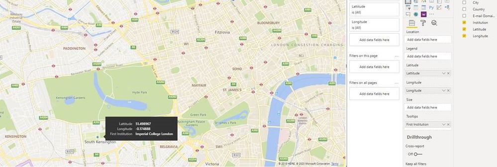
I am trying to map some location data using lat and long coordinates but I do not want these to show up on the labels on the map (as they do in the first screenshot). I saw a previous suggested solution on here which was to use an average of lat and long values but I do not have the option to average them (see second screenshot). Does anyone have any other ideas? I want the label to only show the institution name.
Thanks!
Solved! Go to Solution.
- Mark as New
- Bookmark
- Subscribe
- Mute
- Subscribe to RSS Feed
- Permalink
- Report Inappropriate Content
Unfortunately, this is basic Power BI tooltip functionality. Your only option is to turn off tooltips entirely.
Think of a tooltip when you hover over a line chart. It always shows the data along with the value. And when you hover over a bar in a bar chart, it always shows the category for that bar.
I understand your desire, but i hope you see how introducing that ability to turn the labels off for a tooltip could lead to misrepresenting data.
- Mark as New
- Bookmark
- Subscribe
- Mute
- Subscribe to RSS Feed
- Permalink
- Report Inappropriate Content
I disagree with the argument for mandating lat/long in the map tooltip. When I look at a bar in a bar chart, the visual appearance of bar gives me quick information, and then the exact value in the tooltip provides unquestionable precision.
But when I use lat/long in the map viz to eliminate address issues for the rendering engine, I am in no way asking the user to visit my stores by dropping coordinates into an orienteering gps system. Tooltipping those values should always be an option, not a mandate.
- Mark as New
- Bookmark
- Subscribe
- Mute
- Subscribe to RSS Feed
- Permalink
- Report Inappropriate Content
Unfortunately, this is basic Power BI tooltip functionality. Your only option is to turn off tooltips entirely.
Think of a tooltip when you hover over a line chart. It always shows the data along with the value. And when you hover over a bar in a bar chart, it always shows the category for that bar.
I understand your desire, but i hope you see how introducing that ability to turn the labels off for a tooltip could lead to misrepresenting data.


