FabCon is coming to Atlanta
Join us at FabCon Atlanta from March 16 - 20, 2026, for the ultimate Fabric, Power BI, AI and SQL community-led event. Save $200 with code FABCOMM.
Register now!- Power BI forums
- Get Help with Power BI
- Desktop
- Service
- Report Server
- Power Query
- Mobile Apps
- Developer
- DAX Commands and Tips
- Custom Visuals Development Discussion
- Health and Life Sciences
- Power BI Spanish forums
- Translated Spanish Desktop
- Training and Consulting
- Instructor Led Training
- Dashboard in a Day for Women, by Women
- Galleries
- Data Stories Gallery
- Themes Gallery
- Contests Gallery
- QuickViz Gallery
- Quick Measures Gallery
- Visual Calculations Gallery
- Notebook Gallery
- Translytical Task Flow Gallery
- TMDL Gallery
- R Script Showcase
- Webinars and Video Gallery
- Ideas
- Custom Visuals Ideas (read-only)
- Issues
- Issues
- Events
- Upcoming Events
The Power BI Data Visualization World Championships is back! Get ahead of the game and start preparing now! Learn more
- Power BI forums
- Forums
- Get Help with Power BI
- Desktop
- Re: How to get trend lines?
- Subscribe to RSS Feed
- Mark Topic as New
- Mark Topic as Read
- Float this Topic for Current User
- Bookmark
- Subscribe
- Printer Friendly Page
- Mark as New
- Bookmark
- Subscribe
- Mute
- Subscribe to RSS Feed
- Permalink
- Report Inappropriate Content
How to get trend lines in a date hiearchy?
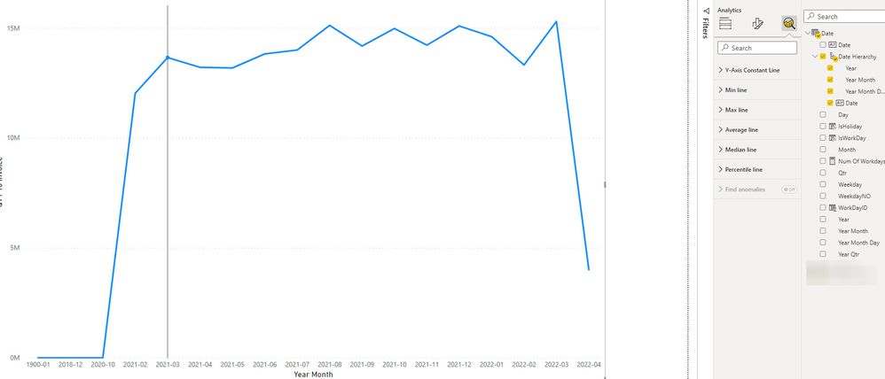
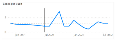
Edit--because trend lines are only offered with continuous x-axis and continuous are only offered with date fields, how do I get a trend line with a date hiearchy? For example how do I show trend line for year month. See the following image where I no longer have the trend line option when I go from Date to Year Month
The trend line option is not showing under the add more analytics option in the Visualization pane.
I'm using dates from a Date table.
I tried following this tutorial https://www.youtube.com/watch?v=u-nEn8aolQ8
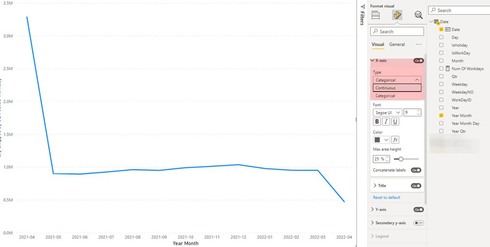
In the clustered column chart, there is no option to change from categorical to continuous in the format's x-axis. see image below.
In the line chart, there is the continuous option but it stays as categorical when I click on it. see image further below
- Mark as New
- Bookmark
- Subscribe
- Mute
- Subscribe to RSS Feed
- Permalink
- Report Inappropriate Content
I had this problem too and I've seen many people asking it in different forums without getting great answers. I'm going to describe here of how I solved it, in case others come looking for the answer:
First, I'll summarize the problem. In order to add a trendline to a visualization, the x-axis needs to have the type set to "continuous" rather than "categorical" in the formatting pane. This can be done when using Power BI's built-in date hierarchy, but if you build your own date table and hierarchy, that option is not available. I saw some commentors state that you just need to make sure each level of your hierachy is formatted as a number, with the summarization set to "Don't summarize," but I found that making these changes didn't solve the problem. As far as I can tell, if you build your own date hierarchy, Power BI simply will not let you set it as continuous in the x-axis, and you will not be able to add a trendline.
Here is my work around. You need to add a separate date field that will summarize your data by month. Since I built my date table using MQuery, I just reopened my table in "Transform data" and added a column called "Last Date of Month," using this formula:
each Date.EndOfMonth([insertdatecolumnname])
So for every date in, say, January 2023, this field shows the date "January 31, 2023." Then I set the data type for the new column to "date" and formatted the field to show the date as "YYYY-MM." Now, I can create a visualization using this field in the x-axis. Because it is a simple date field, it can be set as Continuous and a trendline can be added.
Obviously, it's not a hierarchy, so there will be no drilling down or up. But if you only need to display the monthly data, this should work.
Of course, if your data table is built using DAX instead of MQuery, you'll need to use the corresponding DAX formula.
- Mark as New
- Bookmark
- Subscribe
- Mute
- Subscribe to RSS Feed
- Permalink
- Report Inappropriate Content
Hi winhTon,
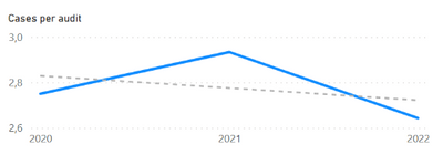
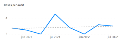
I am expriencing the same problem. I have fond that if Power BI generates the date hierarchy automatically the trendline is available when you go throught the different levels.
However when I create a date table and use that then I am no longer able to get the trendline for anything but years. I don't know how the automatically generated hierarchy defines its levels and the data types in order to keep them all "continuous".
I have tried to have quarter and months be "date" by definingen them as for example end of quarter or end of month, but it does not work.
Here are som examples from an automatic hierarchy when I can see the trend line on all levels of the hierarchy (year, quarter, month):
- Mark as New
- Bookmark
- Subscribe
- Mute
- Subscribe to RSS Feed
- Permalink
- Report Inappropriate Content
@VinhTon what have you tried based on the provided solution.
✨ Follow us on LinkedIn and  to our YouTube channel
I would ❤ Kudos if my solution helped. 👉 If you can spend time posting the question, you can also make effort to give Kudos to whoever helped to solve your problem. It is a token of appreciation!
⚡ Visit us at https://perytus.com, your one-stop shop for Power BI-related projects/training/consultancy.
Subscribe to the @PowerBIHowTo YT channel for an upcoming video on List and Record functions in Power Query!!
Learn Power BI and Fabric - subscribe to our YT channel - Click here: @PowerBIHowTo
If my solution proved useful, I'd be delighted to receive Kudos. When you put effort into asking a question, it's equally thoughtful to acknowledge and give Kudos to the individual who helped you solve the problem. It's a small gesture that shows appreciation and encouragement! ❤
Did I answer your question? Mark my post as a solution. Proud to be a Super User! Appreciate your Kudos 🙂
Feel free to email me with any of your BI needs.
- Mark as New
- Bookmark
- Subscribe
- Mute
- Subscribe to RSS Feed
- Permalink
- Report Inappropriate Content
@VinhTon check this video on my YT channel and see if it helps. X-Axis Type, Data Type and Visual Scroll Bar - Power BI - YouTube
Subscribe to the @PowerBIHowTo YT channel for an upcoming video on List and Record functions in Power Query!!
Learn Power BI and Fabric - subscribe to our YT channel - Click here: @PowerBIHowTo
If my solution proved useful, I'd be delighted to receive Kudos. When you put effort into asking a question, it's equally thoughtful to acknowledge and give Kudos to the individual who helped you solve the problem. It's a small gesture that shows appreciation and encouragement! ❤
Did I answer your question? Mark my post as a solution. Proud to be a Super User! Appreciate your Kudos 🙂
Feel free to email me with any of your BI needs.
- Mark as New
- Bookmark
- Subscribe
- Mute
- Subscribe to RSS Feed
- Permalink
- Report Inappropriate Content
@VinhTon Continuous option is only available when you have a number or date column on the x-axis.
✨ Follow us on LinkedIn and  to our YouTube channel
I would ❤ Kudos if my solution helped. 👉 If you can spend time posting the question, you can also make effort to give Kudos to whoever helped to solve your problem. It is a token of appreciation!
⚡ Visit us at https://perytus.com, your one-stop shop for Power BI-related projects/training/consultancy.
Subscribe to the @PowerBIHowTo YT channel for an upcoming video on List and Record functions in Power Query!!
Learn Power BI and Fabric - subscribe to our YT channel - Click here: @PowerBIHowTo
If my solution proved useful, I'd be delighted to receive Kudos. When you put effort into asking a question, it's equally thoughtful to acknowledge and give Kudos to the individual who helped you solve the problem. It's a small gesture that shows appreciation and encouragement! ❤
Did I answer your question? Mark my post as a solution. Proud to be a Super User! Appreciate your Kudos 🙂
Feel free to email me with any of your BI needs.
- Mark as New
- Bookmark
- Subscribe
- Mute
- Subscribe to RSS Feed
- Permalink
- Report Inappropriate Content
Thanks this helps identify the problem but I still am not able to get a trend line with a year month format. I tried creating a date hiearchy and updated the post to reflect that. Would you know?
- Mark as New
- Bookmark
- Subscribe
- Mute
- Subscribe to RSS Feed
- Permalink
- Report Inappropriate Content
Hi, @VinhTon
If your problem has been solved, please accept a reply as solution to close this thread, so that other community members will easily find the solution when they get the same issue.
Best Regards,
Community Support Team _ Eason
- Mark as New
- Bookmark
- Subscribe
- Mute
- Subscribe to RSS Feed
- Permalink
- Report Inappropriate Content
it has not been solved
- Mark as New
- Bookmark
- Subscribe
- Mute
- Subscribe to RSS Feed
- Permalink
- Report Inappropriate Content
.... Thoughts on creating a messure, that is your own math to create your own 'trend line' then add as a secondary 'values'?
Please give Kudos or Mark as a Solution!
https://www.linkedin.com/in/forrest-hill-04480730/
Proud to give back to the community!
Thank You!
Helpful resources

Power BI Dataviz World Championships
The Power BI Data Visualization World Championships is back! Get ahead of the game and start preparing now!

| User | Count |
|---|---|
| 39 | |
| 38 | |
| 36 | |
| 28 | |
| 28 |
| User | Count |
|---|---|
| 126 | |
| 88 | |
| 78 | |
| 66 | |
| 65 |
