This is best Fabric, Power BI, SQL and AI community event. How do we know? The last event sold out! Save €200 with code FABCMTY200.
Register nowThe Fabric community is upgrading! Read all of the details including the timeline and what you can expect. Learn more
Hi,
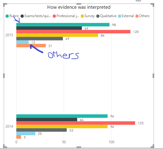
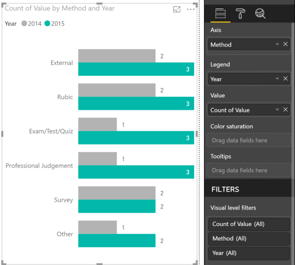
Could you please tell me how I can get the data labels to be shown on the bars, not on top of the chart?
T
Thanks,
Hi clairethnguyen,
I believe that you have use a wrong set up for the chart if you want to show each label on the Y axis.
I assume that you are trying to compare different evidence between two years:
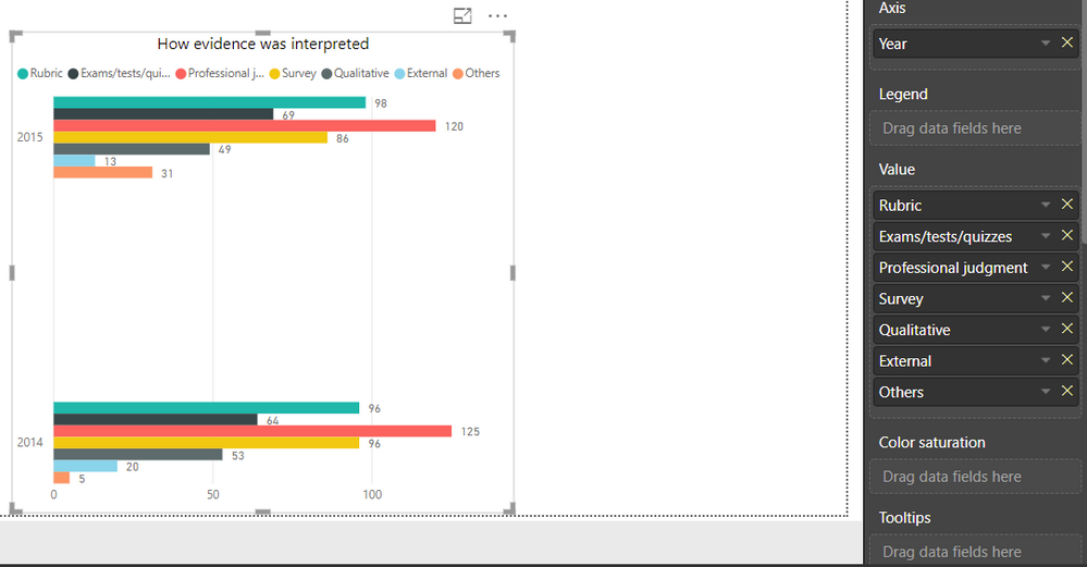
Your current set up:
Put following field to positions of bar chart:
Let me know if this help. Thanks.
Hi,
This is how I set up the data:
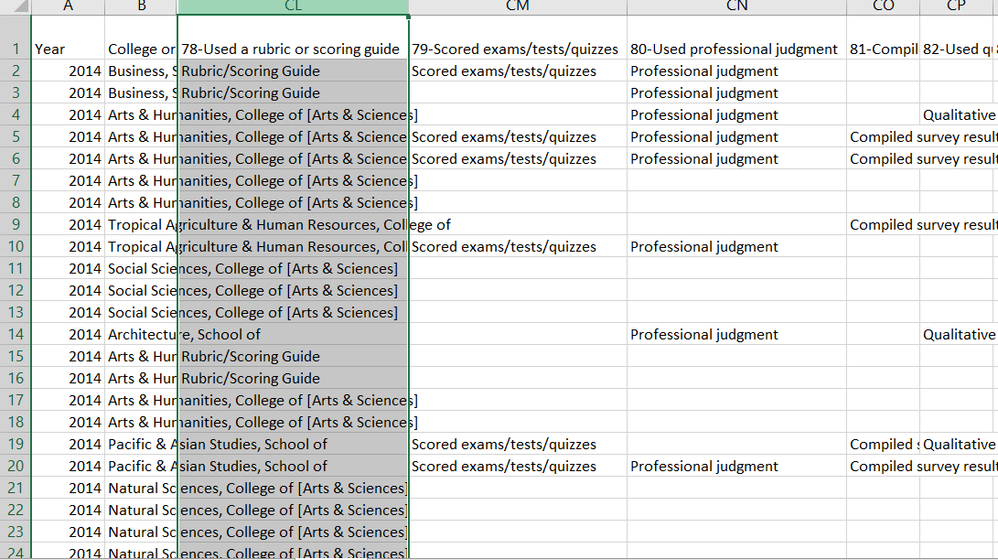
When I tried to change the set up, I couldn't drag more than one values to the "Value" field. Also, this is my raw data if it helps:
Ok, now it is clear that your problem is from your data structure. I suggest to unpivot the data first.
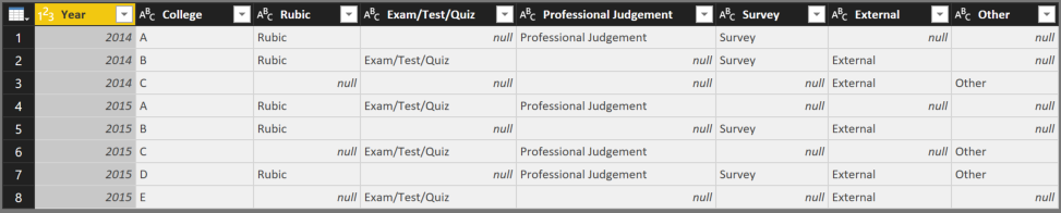
Let say, I have similar data:
By select 2 columns: Year & College collumn -> Transform -> Unpivot Columns -> Unpivot other columns, we have new data:
Now, when import and create visualization, you can set up bar chart like following:
Let me know if this work. Thanks
Hi,
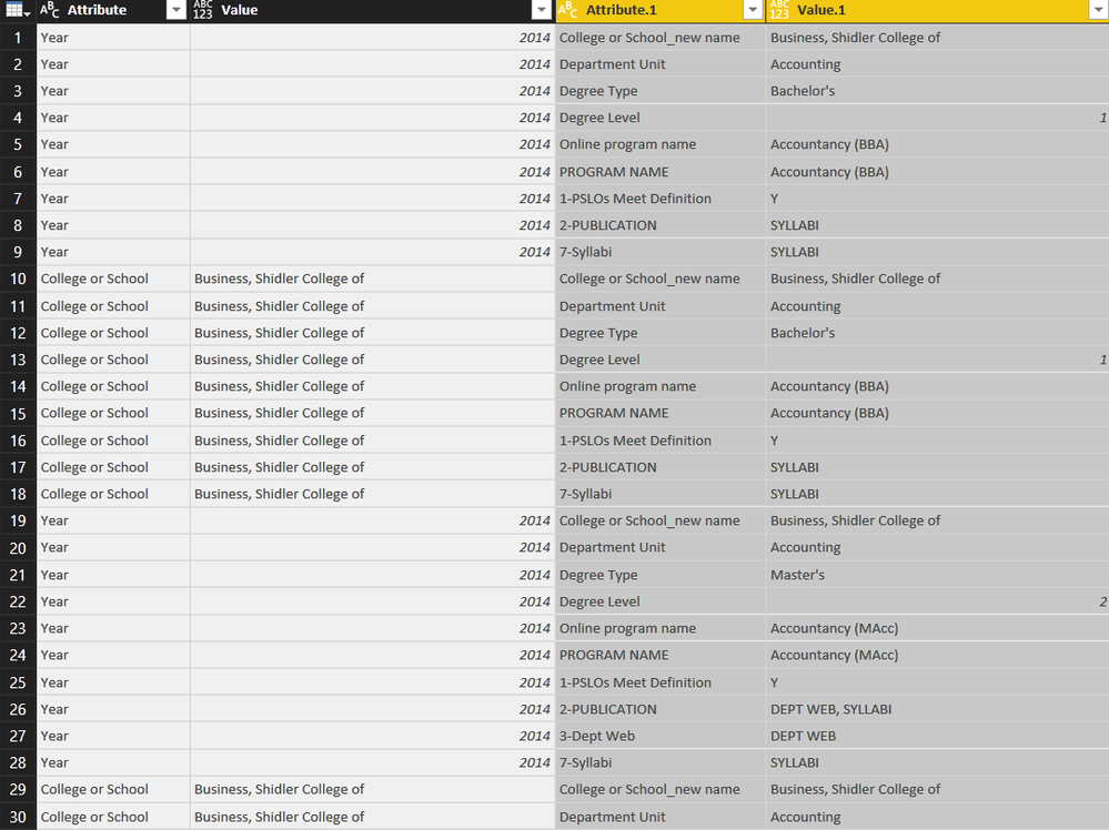
I tried "unpivot columns" but it didn't seem to work, I guess because I have other columns of data (college new name, program name, degree type, etc.) please see below
This is what I got after unpivot columns and unpivot other columns:
Could you let me know where the problem is? Thanks!
Go to .
Where it says "Position" select "Inside End" or the like and it will move the location of them.
Join us in Barcelona for FabCon and SQLCon, the Fabric, Power BI, SQL, and AI community event. Save €200 with code FABCMTY200.
| User | Count |
|---|---|
| 24 | |
| 22 | |
| 20 | |
| 18 | |
| 14 |
| User | Count |
|---|---|
| 45 | |
| 38 | |
| 24 | |
| 21 | |
| 20 |