A new Data Days event is coming soon!
This time we’re going bigger than ever. Fabric, Power BI, SQL, AI and more. We're covering it all. You won't want to miss it.
Learn more- Power BI forums
- Get Help with Power BI
- Desktop
- Service
- Report Server
- Power Query
- Mobile Apps
- Developer
- DAX Commands and Tips
- Custom Visuals Development Discussion
- Health and Life Sciences
- Power BI Spanish forums
- Translated Spanish Desktop
- Training and Consulting
- Instructor Led Training
- Dashboard in a Day for Women, by Women
- Galleries
- Data Stories Gallery
- Themes Gallery
- Contests Gallery
- QuickViz Gallery
- Quick Measures Gallery
- Visual Calculations Gallery
- Notebook Gallery
- Translytical Task Flow Gallery
- TMDL Gallery
- R Script Showcase
- Webinars and Video Gallery
- Ideas
- Custom Visuals Ideas (read-only)
- Issues
- Issues
- Events
- Upcoming Events
Level up your Power BI skills this month - build one visual each week and tell better stories with data! Get started
- Power BI forums
- Forums
- Get Help with Power BI
- Desktop
- Re: Help needed with data labeling
- Subscribe to RSS Feed
- Mark Topic as New
- Mark Topic as Read
- Float this Topic for Current User
- Bookmark
- Subscribe
- Printer Friendly Page
- Mark as New
- Bookmark
- Subscribe
- Mute
- Subscribe to RSS Feed
- Permalink
- Report Inappropriate Content
Help needed with data labeling
Hi,
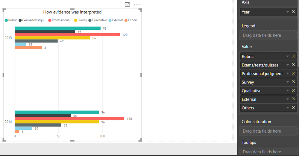
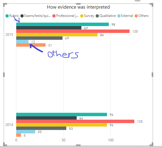
Could you please tell me how I can get the data labels to be shown on the bars, not on top of the chart?
Thanks,
- Mark as New
- Bookmark
- Subscribe
- Mute
- Subscribe to RSS Feed
- Permalink
- Report Inappropriate Content
Hi clairethnguyen,
I believe that you have use a wrong set up for the chart if you want to show each label on the Y axis.
I assume that you are trying to compare different evidence between two years:
Your current set up:
- Evidence (Rubic to Others) ---> Legend
- Year ---> Axis
- Value ---> Values
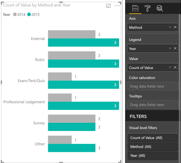
Put following field to positions of bar chart:
- Evidence (Rubic to Others) ---> Axis
- Year ---> Legend
- Value ---> Values
Let me know if this help. Thanks.
- Mark as New
- Bookmark
- Subscribe
- Mute
- Subscribe to RSS Feed
- Permalink
- Report Inappropriate Content
Hi,
This is how I set up the data:
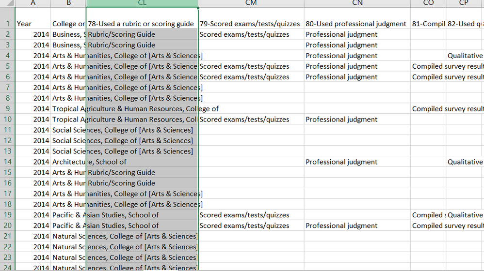
When I tried to change the set up, I couldn't drag more than one values to the "Value" field. Also, this is my raw data if it helps:
- Mark as New
- Bookmark
- Subscribe
- Mute
- Subscribe to RSS Feed
- Permalink
- Report Inappropriate Content
Ok, now it is clear that your problem is from your data structure. I suggest to unpivot the data first.
Let say, I have similar data:
By select 2 columns: Year & College collumn -> Transform -> Unpivot Columns -> Unpivot other columns, we have new data:
Now, when import and create visualization, you can set up bar chart like following:
Let me know if this work. Thanks
- Mark as New
- Bookmark
- Subscribe
- Mute
- Subscribe to RSS Feed
- Permalink
- Report Inappropriate Content
Hi,
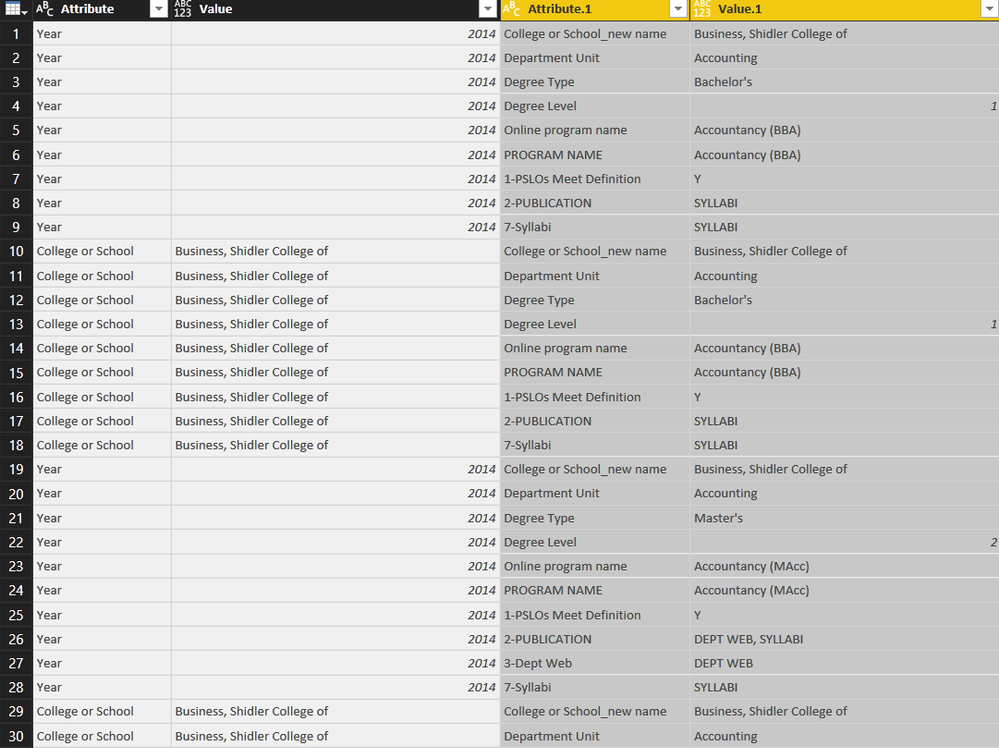
I tried "unpivot columns" but it didn't seem to work, I guess because I have other columns of data (college new name, program name, degree type, etc.) please see below
This is what I got after unpivot columns and unpivot other columns:
Could you let me know where the problem is? Thanks!
- Mark as New
- Bookmark
- Subscribe
- Mute
- Subscribe to RSS Feed
- Permalink
- Report Inappropriate Content
Go to 
Where it says "Position" select "Inside End" or the like and it will move the location of them.
Helpful resources

Power BI Monthly Update - April 2026
Check out the April 2026 Power BI update to learn about new features.

Data Days 2026 coming soon!
Sign up to receive a private message when registration opens and key events begin.

New to Fabric Survey
If you have recently started exploring Fabric, we'd love to hear how it's going. Your feedback can help with product improvements.

| User | Count |
|---|---|
| 36 | |
| 28 | |
| 28 | |
| 20 | |
| 18 |
| User | Count |
|---|---|
| 65 | |
| 35 | |
| 33 | |
| 25 | |
| 24 |
