This is best Fabric, Power BI, SQL and AI community event. How do we know? The last event sold out! Save €200 with code FABCMTY200.
Register nowThe Fabric community is upgrading! Read all of the details including the timeline and what you can expect. Learn more
Hello,
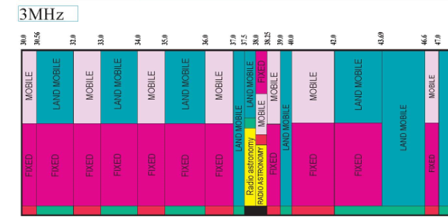
Can we create visual similar to this in power bi ?
In this visual they showed the service name between lowerlimit and upperlimit, if we have 2 service names in the same range, it shows both of them in that range.
full image
https://www.ntia.doc.gov/files/ntia/publications/january_2016_spectrum_wall_chart.pdf
I have this information
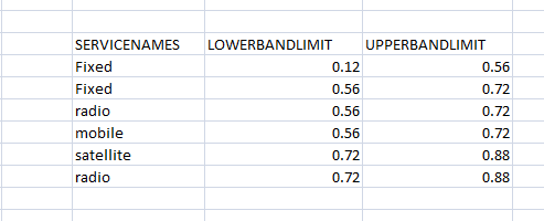
In this, we can see between 0.56 & 0.72 , we have fixed and radio services & between 0.72 & 0.88 , we have satellite and radio.
I want to show this data like the 1st visual.
I have tried treemap but it is grouping all fixed values and showing limits as 0.12 & 0.72 .
But I need to show both values -
1st as 0.12-0.56 & 2nd as 0.56-0.72 and b/n 0.56-0.72 both fixed & radio
Solved! Go to Solution.
@dia612 , I doubt I have seen something like this
check if you can find something here
https://appsource.microsoft.com/en-us/marketplace/apps?product=power-bi-visuals
I dont think it is possibel with Tree Map.
What you can do is use Matrix Table.
Put your Upper Bound in Column
Put your Lower Bound in Rows
Put ServicesNames in Values (FirstValue)
Then do some color formatting. But values will not be showing in Vertical,
Proud to be a Super User!
@dia612 , I doubt I have seen something like this
check if you can find something here
https://appsource.microsoft.com/en-us/marketplace/apps?product=power-bi-visuals
Join us in Barcelona for FabCon and SQLCon, the Fabric, Power BI, SQL, and AI community event. Save €200 with code FABCMTY200.
| User | Count |
|---|---|
| 23 | |
| 22 | |
| 14 | |
| 14 | |
| 13 |
| User | Count |
|---|---|
| 47 | |
| 39 | |
| 24 | |
| 22 | |
| 20 |