Get Fabric certified for FREE!
Don't miss your chance to take the Fabric Data Engineer (DP-600) exam for FREE! Find out how by watching the DP-600 session on-demand now through April 28th.
Learn more- Power BI forums
- Get Help with Power BI
- Desktop
- Service
- Report Server
- Power Query
- Mobile Apps
- Developer
- DAX Commands and Tips
- Custom Visuals Development Discussion
- Health and Life Sciences
- Power BI Spanish forums
- Translated Spanish Desktop
- Training and Consulting
- Instructor Led Training
- Dashboard in a Day for Women, by Women
- Galleries
- Data Stories Gallery
- Themes Gallery
- Contests Gallery
- QuickViz Gallery
- Quick Measures Gallery
- Visual Calculations Gallery
- Notebook Gallery
- Translytical Task Flow Gallery
- TMDL Gallery
- R Script Showcase
- Webinars and Video Gallery
- Ideas
- Custom Visuals Ideas (read-only)
- Issues
- Issues
- Events
- Upcoming Events
Join the FabCon + SQLCon recap series. Up next: Power BI, Real-Time Intelligence, IQ and AI, and Data Factory take center stage. All sessions are available on-demand after the live show. Register now
- Power BI forums
- Forums
- Get Help with Power BI
- Desktop
- Re: Custom Tree Map Visual
- Subscribe to RSS Feed
- Mark Topic as New
- Mark Topic as Read
- Float this Topic for Current User
- Bookmark
- Subscribe
- Printer Friendly Page
- Mark as New
- Bookmark
- Subscribe
- Mute
- Subscribe to RSS Feed
- Permalink
- Report Inappropriate Content
Custom Tree Map Visual
Hello,
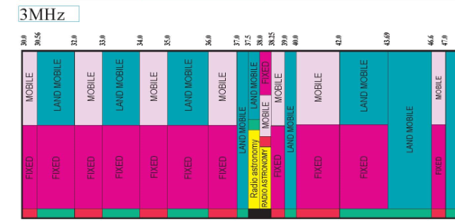
Can we create visual similar to this in power bi ?
In this visual they showed the service name between lowerlimit and upperlimit, if we have 2 service names in the same range, it shows both of them in that range.
full image
https://www.ntia.doc.gov/files/ntia/publications/january_2016_spectrum_wall_chart.pdf
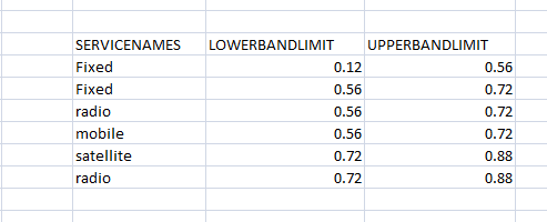
I have this information
In this, we can see between 0.56 & 0.72 , we have fixed and radio services & between 0.72 & 0.88 , we have satellite and radio.
I want to show this data like the 1st visual.
I have tried treemap but it is grouping all fixed values and showing limits as 0.12 & 0.72 .
But I need to show both values -
1st as 0.12-0.56 & 2nd as 0.56-0.72 and b/n 0.56-0.72 both fixed & radio
Solved! Go to Solution.
- Mark as New
- Bookmark
- Subscribe
- Mute
- Subscribe to RSS Feed
- Permalink
- Report Inappropriate Content
@dia612 , I doubt I have seen something like this
check if you can find something here
https://appsource.microsoft.com/en-us/marketplace/apps?product=power-bi-visuals
- Mark as New
- Bookmark
- Subscribe
- Mute
- Subscribe to RSS Feed
- Permalink
- Report Inappropriate Content
I dont think it is possibel with Tree Map.
What you can do is use Matrix Table.
Put your Upper Bound in Column
Put your Lower Bound in Rows
Put ServicesNames in Values (FirstValue)
Then do some color formatting. But values will not be showing in Vertical,
Did I answer your question? Mark my post as a solution! Appreciate your Kudos!!
Proud to be a Super User!
- Mark as New
- Bookmark
- Subscribe
- Mute
- Subscribe to RSS Feed
- Permalink
- Report Inappropriate Content
@dia612 , I doubt I have seen something like this
check if you can find something here
https://appsource.microsoft.com/en-us/marketplace/apps?product=power-bi-visuals
Helpful resources

Power BI Monthly Update - April 2026
Check out the April 2026 Power BI update to learn about new features.

New to Fabric Survey
If you have recently started exploring Fabric, we'd love to hear how it's going. Your feedback can help with product improvements.

Power BI DataViz World Championships - June 2026
A new Power BI DataViz World Championship is coming this June! Don't miss out on submitting your entry.

| User | Count |
|---|---|
| 43 | |
| 37 | |
| 34 | |
| 21 | |
| 16 |
| User | Count |
|---|---|
| 65 | |
| 64 | |
| 31 | |
| 26 | |
| 25 |


