A new Data Days event is coming soon!
This time we’re going bigger than ever. Fabric, Power BI, SQL, AI and more. We're covering it all. You won't want to miss it.
Learn more- Power BI forums
- Get Help with Power BI
- Desktop
- Service
- Report Server
- Power Query
- Mobile Apps
- Developer
- DAX Commands and Tips
- Custom Visuals Development Discussion
- Health and Life Sciences
- Power BI Spanish forums
- Translated Spanish Desktop
- Training and Consulting
- Instructor Led Training
- Dashboard in a Day for Women, by Women
- Galleries
- Data Stories Gallery
- Themes Gallery
- Contests Gallery
- QuickViz Gallery
- Quick Measures Gallery
- Visual Calculations Gallery
- Notebook Gallery
- Translytical Task Flow Gallery
- TMDL Gallery
- R Script Showcase
- Webinars and Video Gallery
- Ideas
- Custom Visuals Ideas (read-only)
- Issues
- Issues
- Events
- Upcoming Events
Level up your Power BI skills this month - build one visual each week and tell better stories with data! Get started
- Power BI forums
- Forums
- Get Help with Power BI
- Desktop
- Combining Different Measures into A Scatterplot
- Subscribe to RSS Feed
- Mark Topic as New
- Mark Topic as Read
- Float this Topic for Current User
- Bookmark
- Subscribe
- Printer Friendly Page
- Mark as New
- Bookmark
- Subscribe
- Mute
- Subscribe to RSS Feed
- Permalink
- Report Inappropriate Content
Combining Different Measures into A Scatterplot
Hello,
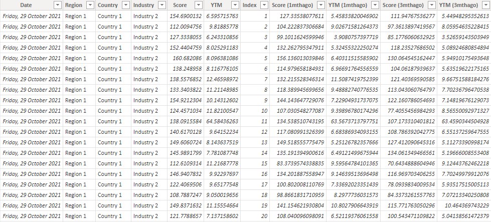
I'm trying to combine different measures into the same graph. Currently, my dataset looks like this:
I have measures that calculate the average for each industry at each timeframe:
Score =
AVERAGEX(
	KEEPFILTERS(VALUES('Data'[Industry])),
	CALCULATE(AVERAGE('Data'[Score]))
)
Score (1mthago) =
AVERAGEX(
KEEPFILTERS(VALUES('Data'[Industry])),
CALCULATE(AVERAGE('Data'[Score (1mthago)]))
)YTM =
AVERAGEX(
KEEPFILTERS(VALUES('Data'[Industry])),
CALCULATE(AVERAGE('Data'[YTM]))
)YTM (1mthago) =
AVERAGEX(
KEEPFILTERS(VALUES('Data'[Industry])),
CALCULATE(AVERAGE('Data'[YTM (1mthago)]))
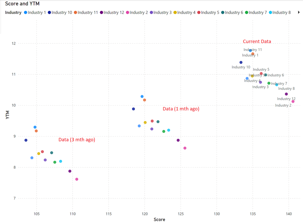
)I'm trying to create a graph that looks like this:
However, I am unable to put the measures into the same scatter plot. Instead, I am currently overlaying 3 seperate scatter plots to achieve this graph. Are there anyway to combine these measures into the same visual?
I have uploaded sample data here: https://drive.google.com/file/d/17MYxjTzoqZxxKdHFdtM5drRZo-0jbWz-/view?usp=sharing
Thank you
- Mark as New
- Bookmark
- Subscribe
- Mute
- Subscribe to RSS Feed
- Permalink
- Report Inappropriate Content
@Deermeat , You are using both details and legend. If you use one of them you can create a calculation group on these measures and use that either on details or legend
Calculation Groups- Measure Slicer, Measure Header Grouping, Measure to dimension conversion. Complex Table display : https://youtu.be/qMNv67P8Go0
Helpful resources

Power BI Monthly Update - April 2026
Check out the April 2026 Power BI update to learn about new features.

Data Days 2026 coming soon!
Sign up to receive a private message when registration opens and key events begin.

New to Fabric Survey
If you have recently started exploring Fabric, we'd love to hear how it's going. Your feedback can help with product improvements.

| User | Count |
|---|---|
| 38 | |
| 28 | |
| 27 | |
| 22 | |
| 18 |
| User | Count |
|---|---|
| 67 | |
| 37 | |
| 32 | |
| 25 | |
| 25 |


