A new Data Days event is coming soon!
This time we’re going bigger than ever. Fabric, Power BI, SQL, AI and more. We're covering it all. You won't want to miss it.
Learn more- Power BI forums
- Get Help with Power BI
- Desktop
- Service
- Report Server
- Power Query
- Mobile Apps
- Developer
- DAX Commands and Tips
- Custom Visuals Development Discussion
- Health and Life Sciences
- Power BI Spanish forums
- Translated Spanish Desktop
- Training and Consulting
- Instructor Led Training
- Dashboard in a Day for Women, by Women
- Galleries
- Data Stories Gallery
- Themes Gallery
- Contests Gallery
- QuickViz Gallery
- Quick Measures Gallery
- Visual Calculations Gallery
- Notebook Gallery
- Translytical Task Flow Gallery
- TMDL Gallery
- R Script Showcase
- Webinars and Video Gallery
- Ideas
- Custom Visuals Ideas (read-only)
- Issues
- Issues
- Events
- Upcoming Events
Level up your Power BI skills this month - build one visual each week and tell better stories with data! Get started
- Power BI forums
- Forums
- Get Help with Power BI
- Custom Visuals Development Discussion
- The November 2021 Update Visuals Pane Love it and ...
- Subscribe to RSS Feed
- Mark Topic as New
- Mark Topic as Read
- Float this Topic for Current User
- Bookmark
- Subscribe
- Printer Friendly Page
- Mark as New
- Bookmark
- Subscribe
- Mute
- Subscribe to RSS Feed
- Permalink
- Report Inappropriate Content
Power BI Custom Visuals' Community
Welcome to Power BI Custom Visuals Community!
Power BI custom visuals is all about community. We are very excited to announce that custom visuals now have a special place in the Power BI community site, to share knowledge, ideas and news!
- Custom visuals development discussion – Ask questions and share knowledge about developing custom visuals.
- Custom visuals ideas – Share your ideas, ask for features, propose new custom visuals.
- Custom visuals community blog – Community news and announcements for new custom visuals available, new APIs released, tips & tricks from developers and users.
Power BI custom visuals useful links for developers
- Developer documents - find here all documents you need
- Step-by-step tutorial
- Looking for advanced tutorial? Find it here
- Visit also our github
- Find here Power BI visuals' Samples
- Custom visual's webinar
- For technichal questions and help please reach out pbicvsupport@microsoft.com
- Mark as New
- Bookmark
- Subscribe
- Mute
- Subscribe to RSS Feed
- Permalink
- Report Inappropriate Content
Hi, bkara. I was able to resolve my issue by changing the FIPS field in my table to whole number instead of text. Once I did that, the visual rendered correctly. I referred to this link:
https://community.powerbi.com/t5/Desktop/Shape-Map-unique-map-keys/m-p/474154
Had to read it a couple of times before I actually got it into my head to check the field formatting. . .
Hope this helps.
- Mark as New
- Bookmark
- Subscribe
- Mute
- Subscribe to RSS Feed
- Permalink
- Report Inappropriate Content
Drilldown Choropleth Visual Issue: The following has been noted in using the Drilldown Choropleth Visual for Microsoft Power BI - Filtering on First Level location causes inaccurate Second Level location geographical visual - For example filtering on States results in inaccurate depiction of County level mapping. Also, if the source data does not contain a complete state-county representation, drilling down on the visual creates similar inaccurate representation of counties especially in cases where counties in different states have the same name. This could be due to how the Json shape files are constructed, but I experienced similar results using different json files. I may need to forego using this visual and defer to the Shape File visual which does not offer drill down capabilities.
- Mark as New
- Bookmark
- Subscribe
- Mute
- Subscribe to RSS Feed
- Permalink
- Report Inappropriate Content
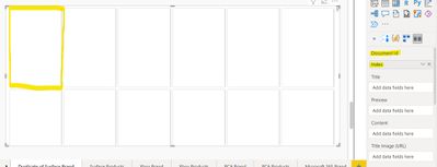
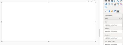
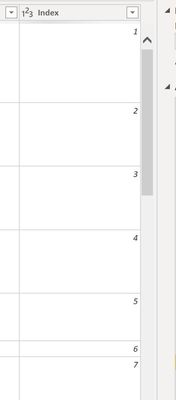
Card Browser Visual is not working with the document id of one table, although it works just fine on another. Eliminating all discrepancies, the index column on both tables are the same data type, both are created exactly the same way, yet one populates into the "card" format, while the other remains blank. Any suggestions?
- Mark as New
- Bookmark
- Subscribe
- Mute
- Subscribe to RSS Feed
- Permalink
- Report Inappropriate Content
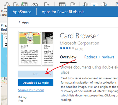
Hi there, I've tried several times to download the Card Browser Custom Visual by Microsoft, but the "Add" button is greyed out. I'm signed in when I try and download the app (and I tried under my other Power BI account too- same story). What needs to happen for me to get it?
- Mark as New
- Bookmark
- Subscribe
- Mute
- Subscribe to RSS Feed
- Permalink
- Report Inappropriate Content
Same here, but at my side issue is only in the desktop version. I managed to add a custom visual in the online service. Maybe a workaround for the moment is to publish the report online, edit/add the visual in the online service, download the pbix and continue your work...
- Mark as New
- Bookmark
- Subscribe
- Mute
- Subscribe to RSS Feed
- Permalink
- Report Inappropriate Content
we are having the same problem here , do anyone have a solution already?
- Mark as New
- Bookmark
- Subscribe
- Mute
- Subscribe to RSS Feed
- Permalink
- Report Inappropriate Content
Also have the same issue as of 20 minutes ago. Was okay all morning, and all of a sudden it's greyed out..
- Mark as New
- Bookmark
- Subscribe
- Mute
- Subscribe to RSS Feed
- Permalink
- Report Inappropriate Content
Same here. anyone got a solution?
- Mark as New
- Bookmark
- Subscribe
- Mute
- Subscribe to RSS Feed
- Permalink
- Report Inappropriate Content
Hi All,
Im looking for a custom radar chart where i can show value labels on the axis (e.g. a score of 1 through 5) Anyone have a solution for this?
KR,
Nick
- Mark as New
- Bookmark
- Subscribe
- Mute
- Subscribe to RSS Feed
- Permalink
- Report Inappropriate Content
I am trying to use Microsoft's Stream Graph custom visual and don't see any options to change data value colors. Is this an available feature?
- Mark as New
- Bookmark
- Subscribe
- Mute
- Subscribe to RSS Feed
- Permalink
- Report Inappropriate Content
The options available for controlling the Chiclet slicer under "General" disappear in the new format experience.
We use loads of chiclets and love them, but this makes them really hard to control
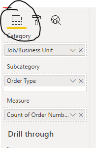
The basic controls about rows, columns etc look like this in the old experience:
But when I activate the new format pane:
I can't do the orientation, columns, rows in the same place:
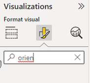
They aren't available using search either:
- Mark as New
- Bookmark
- Subscribe
- Mute
- Subscribe to RSS Feed
- Permalink
- Report Inappropriate Content
Hello good night, I have a problem in the Chiclet Slicer visual that is not being rendered in the power bi service , the visual only appears when the page is reloaded, I am a user from Brazil.
- Mark as New
- Bookmark
- Subscribe
- Mute
- Subscribe to RSS Feed
- Permalink
- Report Inappropriate Content
I have 2 issues when trying to sort an axis in Charticulator.
1) It does not properly sort whole numbers. It improperly sorts based on the first digit. For example, it will produce this sort order: 1, 15, 3, 35, 5, 6, 7, 75, 8, 85, 9. It will only resolve when I change my field format to decimal type.
2) When I sort it does not dynamically sort. For example, I sort by numeric value and it produces the correct sort for the year that is selected when I'm editing the visual. However, if a user makes any changes to slicers, the sort order remains sorted on the values that appeared when the edits were made. For example, if attribute 1 is 3.25 and attribute 2 is 4.25 in year 2020 when the sort was created, the axis will always keep attribute 1 at the top, even if it's value has decreased making it the lowest number in another selected year.
The link to my PBI report is here.
- Mark as New
- Bookmark
- Subscribe
- Mute
- Subscribe to RSS Feed
- Permalink
- Report Inappropriate Content
I am also experiencing the issue with dynamic sorting. When I sort, it only applies to the filter currently selected. I am also having another issue related to sorting. I am using a data axis that should only appear on the last value (at the bottom of the chart). When I try to change the field that determines the order of the chart (I want it ordered by date), the data axis still appears on the original last value (alphabetically). I am not sure how to fix this, so if anyone has advice, please let me know!
- Mark as New
- Bookmark
- Subscribe
- Mute
- Subscribe to RSS Feed
- Permalink
- Report Inappropriate Content
Hello All,
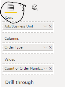
I am using the Sunburst Visual. All I did was copy a visual on the same report and change the visual type to the Sunburst. The "total" displayed in the middle is different from the "table" visual. I ensured the fields have the same parameters on each visual. Could i get an explanation as to why the "totals" would show different when applying a slicer? the only difference i see between the two visuals is that one says category and one says rows. i've tried changing the fields around to try and manipulate the data but it wont work.
- Mark as New
- Bookmark
- Subscribe
- Mute
- Subscribe to RSS Feed
- Permalink
- Report Inappropriate Content
Greeting!
I have a question regarding the Text Filter.
When I want to search by multiple keywords, I use the * symbol.
The problem is that the search does not return results if the keywords are ranked in a different order.
Example:
gives the result:
* gloves**nitrile**3.2*
does not give a result:
*3.2**nitrile**gloves*
Thanks in advance!
- Mark as New
- Bookmark
- Subscribe
- Mute
- Subscribe to RSS Feed
- Permalink
- Report Inappropriate Content
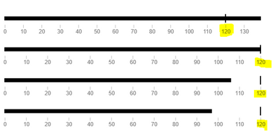
Hi, it is possible on the microsoft Bullet Chart (https://appsource.microsoft.com/en-us/product/power-bi-visuals/wa104380755?tab=overview)
To have the same scale for all the elements?
Its confusing that for some category values, the scale changes.
thanks a lot.
- Mark as New
- Bookmark
- Subscribe
- Mute
- Subscribe to RSS Feed
- Permalink
- Report Inappropriate Content
I am using the Text Filter PowerBI Visual (Text Filter (microsoft.com)) this is just on a single csv right now. When I change the underlying CSV file to a new filename in the same format from PowerQuery Editor the Text Filter no longer filters the data. If i delete the Text Filter visuals and add as new it works as expected.
Let me know if I should have posted this elsewhere.
- Mark as New
- Bookmark
- Subscribe
- Mute
- Subscribe to RSS Feed
- Permalink
- Report Inappropriate Content
Can you make sure your filter logic is correct?
- Mark as New
- Bookmark
- Subscribe
- Mute
- Subscribe to RSS Feed
- Permalink
- Report Inappropriate Content
Many of my commonly used visuals can no longer be customized, easily. I am trying to modify the number of columns and rows for the chiclet slicer and I can not find where to make this very basic modification. HELP PLEASE!
- Mark as New
- Bookmark
- Subscribe
- Mute
- Subscribe to RSS Feed
- Permalink
- Report Inappropriate Content
I just spent 10 minutes looking through the same few formatting options in the November 2021 update for the Chiclet slicer. I just want to control how many columns and rows the visual has, but the control is either missing or so well hidden that it may as well BE missing. Please fix, PBI team! Too many cool features to lose by rolling back to Oct 2021.
Helpful resources

Power BI Monthly Update - April 2026
Check out the April 2026 Power BI update to learn about new features.

Data Days 2026 coming soon!
Sign up to receive a private message when registration opens and key events begin.

New to Fabric Survey
If you have recently started exploring Fabric, we'd love to hear how it's going. Your feedback can help with product improvements.

