FabCon is coming to Atlanta
Join us at FabCon Atlanta from March 16 - 20, 2026, for the ultimate Fabric, Power BI, AI and SQL community-led event. Save $200 with code FABCOMM.
Register now!- Power BI forums
- Get Help with Power BI
- Desktop
- Service
- Report Server
- Power Query
- Mobile Apps
- Developer
- DAX Commands and Tips
- Custom Visuals Development Discussion
- Health and Life Sciences
- Power BI Spanish forums
- Translated Spanish Desktop
- Training and Consulting
- Instructor Led Training
- Dashboard in a Day for Women, by Women
- Galleries
- Data Stories Gallery
- Themes Gallery
- Contests Gallery
- QuickViz Gallery
- Quick Measures Gallery
- Visual Calculations Gallery
- Notebook Gallery
- Translytical Task Flow Gallery
- TMDL Gallery
- R Script Showcase
- Webinars and Video Gallery
- Ideas
- Custom Visuals Ideas (read-only)
- Issues
- Issues
- Events
- Upcoming Events
The Power BI Data Visualization World Championships is back! Get ahead of the game and start preparing now! Learn more
- Power BI forums
- Forums
- Get Help with Power BI
- Service
- Re: Visual to show data change in time
- Subscribe to RSS Feed
- Mark Topic as New
- Mark Topic as Read
- Float this Topic for Current User
- Bookmark
- Subscribe
- Printer Friendly Page
- Mark as New
- Bookmark
- Subscribe
- Mute
- Subscribe to RSS Feed
- Permalink
- Report Inappropriate Content
Visual to show data change in time
Hello, I would like to know if there is a visual I can use to measure the variation of a certain quantity month by month possibly splitted by category.
Example
I have a table
| ID | Subscription date | Country |
I would like to see, in the last six months some thing like
| December 2021 | November 2021 | October 2021 | September 2021 | Agoust 2021 | June 2021 | |
| US | 381 (-11%) | 428 (+7%) | 400 (+12%) | ... | ... | ... |
| FR | 123 (+17%) | 105 (-3%) | 108 (-9%) | ... | ... | ... |
| IT | 762 (-6%) | 810 (+15%) | 705 (+24%) | ... | ... | ... |
It shouldn't be necessarily a matrix of course
Solved! Go to Solution.
- Mark as New
- Bookmark
- Subscribe
- Mute
- Subscribe to RSS Feed
- Permalink
- Report Inappropriate Content
Hi, @fabiomanniti
If you don't process the data in advance on the desktop, you won't get your desired results directly through the visuals.
Maybe you can try the following methods.
Column:
last date = DATEADD('Table'[Subscription date],-1,MONTH)Measure:
Difference =
VAR N1 =CALCULATE (
        SUM ( 'Table'[Value] ),
        FILTER ( ALL ( 'Table' ),
            [Country] = MAX ( 'Table'[Country] )
                && [ID] = MAX ( 'Table'[ID] ) ) )
VAR N2 =CALCULATE (
        SUM ( 'Table'[Value] ),
        FILTER (  ALL ( 'Table' ),
            [Country] = MAX ( 'Table'[Country] )
                && [Subscription date] = MAX ( 'Table'[last date] ) ) )
RETURN DIVIDE ( N1 - N2, N2 )
Best Regards,
Community Support Team _Charlotte
If this post helps, then please consider Accept it as the solution to help the other members find it more quickly.
- Mark as New
- Bookmark
- Subscribe
- Mute
- Subscribe to RSS Feed
- Permalink
- Report Inappropriate Content
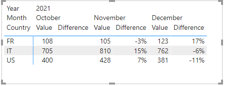
There are some visuals that are specifically for this. For example:
More options:
https://datadriven.pro/2019/04/16/9-ways-to-do-variance-analysis-in-power-bi/
- Mark as New
- Bookmark
- Subscribe
- Mute
- Subscribe to RSS Feed
- Permalink
- Report Inappropriate Content
Yes, these tools per se look good but, for I understood, I must already have data worked on Desktop...
I mean: if I only have this table
| ID | Subscription date | Country |
| 1 | 01/01/2019 | IT |
| 2 | 02/01/2019 | FR |
| 3 | 03/01/2019 | US |
Can I know ONLY with a visual the id counting for each Country and each month (for only the last n months) and see the changing ratio compared to the previous month?
If I can do it with those visual then I think I didn't understand how
- Mark as New
- Bookmark
- Subscribe
- Mute
- Subscribe to RSS Feed
- Permalink
- Report Inappropriate Content
Hi, @fabiomanniti
If you don't process the data in advance on the desktop, you won't get your desired results directly through the visuals.
Maybe you can try the following methods.
Column:
last date = DATEADD('Table'[Subscription date],-1,MONTH)Measure:
Difference =
VAR N1 =CALCULATE (
        SUM ( 'Table'[Value] ),
        FILTER ( ALL ( 'Table' ),
            [Country] = MAX ( 'Table'[Country] )
                && [ID] = MAX ( 'Table'[ID] ) ) )
VAR N2 =CALCULATE (
        SUM ( 'Table'[Value] ),
        FILTER (  ALL ( 'Table' ),
            [Country] = MAX ( 'Table'[Country] )
                && [Subscription date] = MAX ( 'Table'[last date] ) ) )
RETURN DIVIDE ( N1 - N2, N2 )
Best Regards,
Community Support Team _Charlotte
If this post helps, then please consider Accept it as the solution to help the other members find it more quickly.
- Mark as New
- Bookmark
- Subscribe
- Mute
- Subscribe to RSS Feed
- Permalink
- Report Inappropriate Content
I don't know if there's anything that will work without writing a measure or two. The visual doesn't automatically know what values and granularities you want to compare.
Helpful resources

Power BI Monthly Update - November 2025
Check out the November 2025 Power BI update to learn about new features.

Fabric Data Days
Advance your Data & AI career with 50 days of live learning, contests, hands-on challenges, study groups & certifications and more!


