Join us at FabCon Vienna from September 15-18, 2025
The ultimate Fabric, Power BI, SQL, and AI community-led learning event. Save €200 with code FABCOMM.
Get registered- Power BI forums
- Get Help with Power BI
- Desktop
- Service
- Report Server
- Power Query
- Mobile Apps
- Developer
- DAX Commands and Tips
- Custom Visuals Development Discussion
- Health and Life Sciences
- Power BI Spanish forums
- Translated Spanish Desktop
- Training and Consulting
- Instructor Led Training
- Dashboard in a Day for Women, by Women
- Galleries
- Data Stories Gallery
- Themes Gallery
- Contests Gallery
- Quick Measures Gallery
- Notebook Gallery
- Translytical Task Flow Gallery
- TMDL Gallery
- R Script Showcase
- Webinars and Video Gallery
- Ideas
- Custom Visuals Ideas (read-only)
- Issues
- Issues
- Events
- Upcoming Events
Enhance your career with this limited time 50% discount on Fabric and Power BI exams. Ends August 31st. Request your voucher.
- Power BI forums
- Forums
- Get Help with Power BI
- Service
- Re: Power BI charts ghost unsliced data
- Subscribe to RSS Feed
- Mark Topic as New
- Mark Topic as Read
- Float this Topic for Current User
- Bookmark
- Subscribe
- Printer Friendly Page
- Mark as New
- Bookmark
- Subscribe
- Mute
- Subscribe to RSS Feed
- Permalink
- Report Inappropriate Content
Power BI charts ghost unsliced data
Hard to put this into words for the purposes of searching for solutions! Can anyone assist?
The chart shown is based on data that looks a little like this:
Owner, status
Tim, In Time
Tim, Overdue
Sally, In Time
Sally, In Time
Sally, Overdue
By default, all data is shown in the pie chart, so using my sample data, there would be 3 in-time records and two overdue records. It's expect to see a 60% (3/5) vs 40% (2/5) split in the pie chart. There is a slicer on the page that lets me choose between Tim and Sally. When I select Sally, I'd expect the chart to change and show 67% (2/3) vs 33% (1/3).
But as you can see in the picture, that's not what happens. Instead, most of the chart is ghosted, and the selected owner's data is shown in the original proportions, but with the individual elements scaled up. WIth my sample data, the proportions would still be 60/40.
How do I stop this behaviour and make the charts display only the selected data?
Solved! Go to Solution.
- Mark as New
- Bookmark
- Subscribe
- Mute
- Subscribe to RSS Feed
- Permalink
- Report Inappropriate Content
Hi, you can change the interaction between visuals to filter instead of highlight the pie. There is a menu for that. You click on a visual and all others shown a menu with the interactions. You can check more about that here: https://learn.microsoft.com/en-us/power-bi/create-reports/service-reports-visual-interactions?tabs=p...
I hope that helps,
Happy to help!
- Mark as New
- Bookmark
- Subscribe
- Mute
- Subscribe to RSS Feed
- Permalink
- Report Inappropriate Content
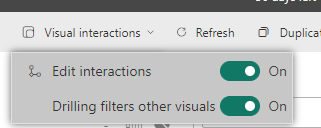
Ah, I figured it out. You have to turn it on first:
Thanks!
- Mark as New
- Bookmark
- Subscribe
- Mute
- Subscribe to RSS Feed
- Permalink
- Report Inappropriate Content
Thanks! That's great, but I am finding the documentation confussing:
I don't see those icons. I see these:
Am I looking in the wrong place?
Helpful resources
| User | Count |
|---|---|
| 35 | |
| 14 | |
| 11 | |
| 11 | |
| 8 |
| User | Count |
|---|---|
| 44 | |
| 43 | |
| 19 | |
| 18 | |
| 17 |


