Join us at the 2025 Microsoft Fabric Community Conference
March 31 - April 2, 2025, in Las Vegas, Nevada. Use code MSCUST for a $150 discount! Early bird discount ends December 31.
Register Now- Power BI forums
- Get Help with Power BI
- Desktop
- Service
- Report Server
- Power Query
- Mobile Apps
- Developer
- DAX Commands and Tips
- Custom Visuals Development Discussion
- Health and Life Sciences
- Power BI Spanish forums
- Translated Spanish Desktop
- Training and Consulting
- Instructor Led Training
- Dashboard in a Day for Women, by Women
- Galleries
- Community Connections & How-To Videos
- COVID-19 Data Stories Gallery
- Themes Gallery
- Data Stories Gallery
- R Script Showcase
- Webinars and Video Gallery
- Quick Measures Gallery
- 2021 MSBizAppsSummit Gallery
- 2020 MSBizAppsSummit Gallery
- 2019 MSBizAppsSummit Gallery
- Events
- Ideas
- Custom Visuals Ideas
- Issues
- Issues
- Events
- Upcoming Events
Be one of the first to start using Fabric Databases. View on-demand sessions with database experts and the Microsoft product team to learn just how easy it is to get started. Watch now
- Power BI forums
- Forums
- Get Help with Power BI
- Service
- Re: Line chart with shaded area?
- Subscribe to RSS Feed
- Mark Topic as New
- Mark Topic as Read
- Float this Topic for Current User
- Bookmark
- Subscribe
- Printer Friendly Page
- Mark as New
- Bookmark
- Subscribe
- Mute
- Subscribe to RSS Feed
- Permalink
- Report Inappropriate Content
Line chart with shaded area?
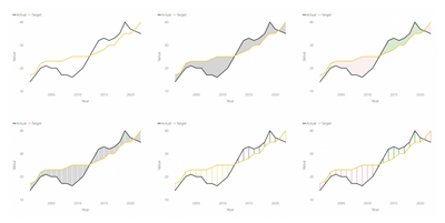
I would like to make a chart like this:
Where there is a shaded goal area, and then a line.
The goal area is NOT hard coded, it needs to be set be mapped against a measure. In the above example the goal line happend to be static, but it could change over time.
Any suggestions? Thanks!
EDIT:
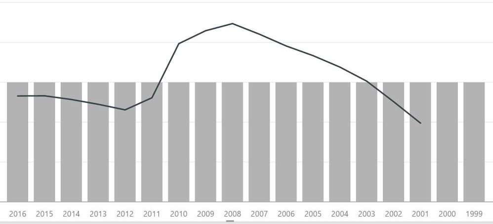
This is the closest I could come, but I would really like to be able to format the shading to drop that from the second measure:
That redish pink area would work better as a LINE not a shaded area.
- Mark as New
- Bookmark
- Subscribe
- Mute
- Subscribe to RSS Feed
- Permalink
- Report Inappropriate Content
There's one way to do it:
http://www.informationmagician.com/shaded-area-between-two-lines/
____________
⭐️ Fabric Group Channel
⭐️ Microsoft Fabric Community
Please join the Power BI UX/UI User Group if you need help with dashboard design and usability
Join to Data Governance User Group
Join to DENEB and Power BI Enthusiasts User Group
Join to Data Fabric Best Practices User Group
Subscribe to my medium blog
- Mark as New
- Bookmark
- Subscribe
- Mute
- Subscribe to RSS Feed
- Permalink
- Report Inappropriate Content
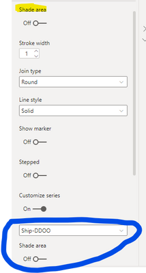
In case someone is still looking for this option, it's one of the updated versions in 2021 (not sure which one). Allows you to pick which line to shade under.
- Mark as New
- Bookmark
- Subscribe
- Mute
- Subscribe to RSS Feed
- Permalink
- Report Inappropriate Content
@OneWithQuestion This would be a good formatting option to have in the Area Chart for sure... to be able disable some of the shades in the lines to use a goal line measure. Other than your idea below, the only other thing I could come up with is to use a "line and stacked column chart" - but this produces gaps and is visually distracting. I tried a bunch of different overlays and tricks, but the x-axis isn't constant and it won't align well in overlap correctly as the goal changes. 😞
Looking for more Power BI tips, tricks & tools? Check out PowerBI.tips the site I co-own with Mike Carlo. Also, if you are near SE WI? Join our PUG Milwaukee Brew City PUG
- Mark as New
- Bookmark
- Subscribe
- Mute
- Subscribe to RSS Feed
- Permalink
- Report Inappropriate Content
Yeah, I tried that too and ran into issues with bar gaps that I know would really distract and confuse the users so... I just gave up on that 😞
I did post a question about anyway to hide gap though.
- Mark as New
- Bookmark
- Subscribe
- Mute
- Subscribe to RSS Feed
- Permalink
- Report Inappropriate Content
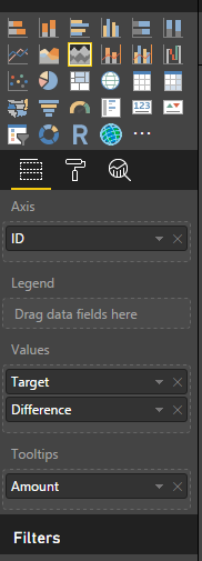
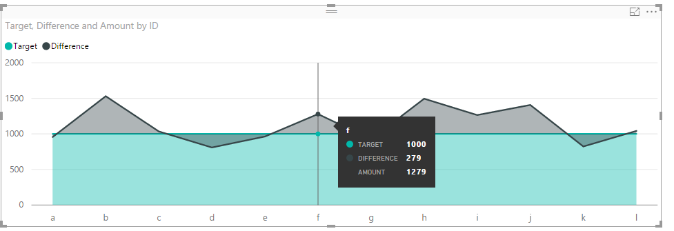
Hi @OneWithQuestion,
I have tested it on my local environment using the sample data below.
We can get the expected result like below.
Regards,
Charlie Liao
- Mark as New
- Bookmark
- Subscribe
- Mute
- Subscribe to RSS Feed
- Permalink
- Report Inappropriate Content
Hi @v-caliao-msft,
Thanks for this solution. How did you get the Difference series to start at 1000?
Thanks much !
- Mark as New
- Bookmark
- Subscribe
- Mute
- Subscribe to RSS Feed
- Permalink
- Report Inappropriate Content
- Mark as New
- Bookmark
- Subscribe
- Mute
- Subscribe to RSS Feed
- Permalink
- Report Inappropriate Content
Sadly, that still shows a shaded area under the line.
Ideally one would be a line and the other would be a shaded area (or column bar chart with adjusted gap width)
- Mark as New
- Bookmark
- Subscribe
- Mute
- Subscribe to RSS Feed
- Permalink
- Report Inappropriate Content
Hi @OneWithQuestion,
Currently, this the closest workaround we can achieve in Power BI, if this is not what you want, you can create a custom visual to achieve it if you have rich experience in coding.
Regards,
Charlie Liao
Helpful resources

Join us at the Microsoft Fabric Community Conference
March 31 - April 2, 2025, in Las Vegas, Nevada. Use code MSCUST for a $150 discount!

Microsoft Fabric Community Conference 2025
Arun Ulag shares exciting details about the Microsoft Fabric Conference 2025, which will be held in Las Vegas, NV.

| User | Count |
|---|---|
| 25 | |
| 21 | |
| 11 | |
| 10 | |
| 9 |
| User | Count |
|---|---|
| 48 | |
| 30 | |
| 18 | |
| 17 | |
| 15 |


