Forum Discussion

 Post Prodigy
Line chart with shaded area?


OneWithQuestion This would be a good formatting option to have in the Area Chart for sure... to be able disable some of the shades in the lines to use a goal line measure. Other than your idea below, the only other thing I could come up with is to use a "line and stacked column chart" - but this produces gaps and is visually distracting. I tried a bunch of different overlays and tricks, but the x-axis isn't constant and it won't align well in overlap correctly as the goal changes. :(
 OneWithQuestion9 years ago
Yeah, I tried that too and ran into issues with bar gaps that I know would really distract and confuse the users so... I just gave up on that :(
I did post a question about anyway to hide gap though.
 v-caliao-msft9 years ago
Microsoft Employee
Hi OneWithQuestion,
I have tested it on my local environment using the sample data below.
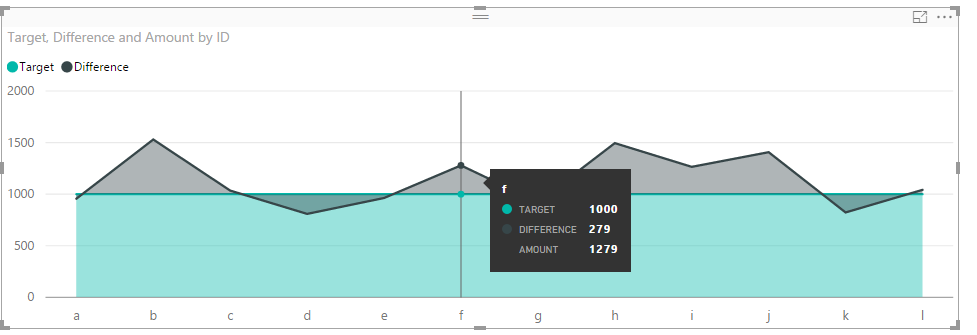
We can get the expected result like below.
Regards,
Charlie Liao
- OneWithQuestion9 years ago
Sadly, that still shows a shaded area under the line.
Ideally one would be a line and the other would be a shaded area (or column bar chart with adjusted gap width)