Join us at FabCon Vienna from September 15-18, 2025
The ultimate Fabric, Power BI, SQL, and AI community-led learning event. Save €200 with code FABCOMM.
Get registered- Power BI forums
- Get Help with Power BI
- Desktop
- Service
- Report Server
- Power Query
- Mobile Apps
- Developer
- DAX Commands and Tips
- Custom Visuals Development Discussion
- Health and Life Sciences
- Power BI Spanish forums
- Translated Spanish Desktop
- Training and Consulting
- Instructor Led Training
- Dashboard in a Day for Women, by Women
- Galleries
- Data Stories Gallery
- Themes Gallery
- Contests Gallery
- Quick Measures Gallery
- Notebook Gallery
- Translytical Task Flow Gallery
- TMDL Gallery
- R Script Showcase
- Webinars and Video Gallery
- Ideas
- Custom Visuals Ideas (read-only)
- Issues
- Issues
- Events
- Upcoming Events
Enhance your career with this limited time 50% discount on Fabric and Power BI exams. Ends September 15. Request your voucher.
- Power BI forums
- Forums
- Get Help with Power BI
- Service
- Help displaying line chart visual with high varian...
- Subscribe to RSS Feed
- Mark Topic as New
- Mark Topic as Read
- Float this Topic for Current User
- Bookmark
- Subscribe
- Printer Friendly Page
- Mark as New
- Bookmark
- Subscribe
- Mute
- Subscribe to RSS Feed
- Permalink
- Report Inappropriate Content
Help displaying line chart visual with high variance of Y-axis values
Hi there,
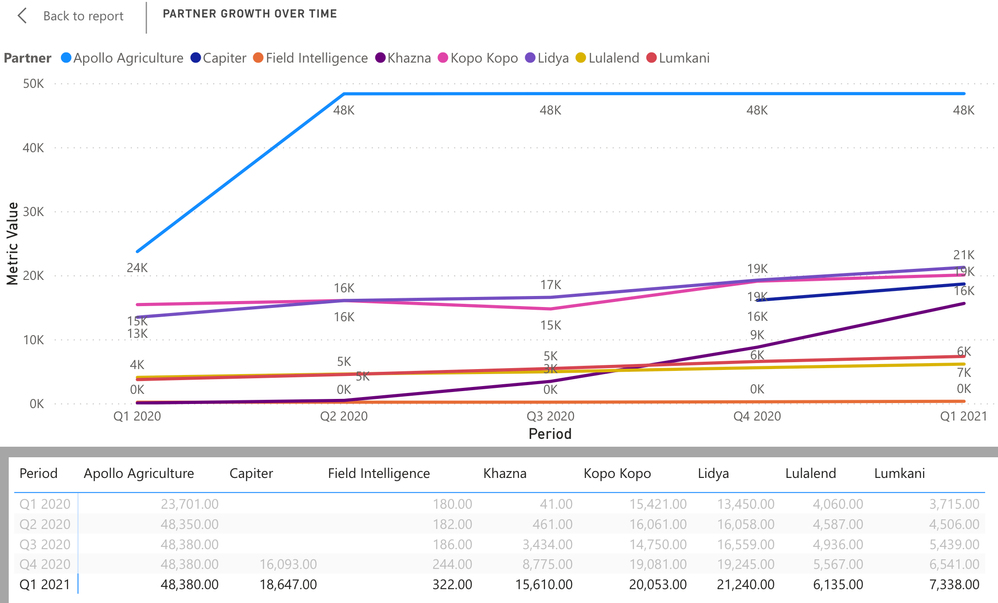
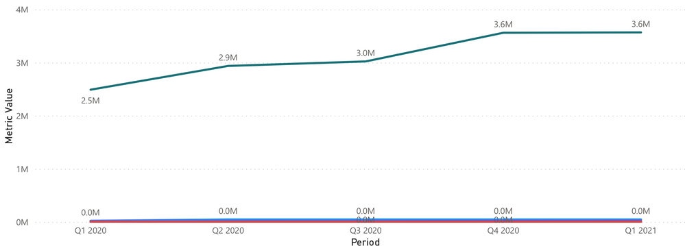
I am working on a simple line chart visual. I am seeking workarounds/tips and tricks to better display the data in my chart considering the variance of Y-axis values. One datapoint is the 2-3M range (seen in second screengrab) while the rest of of my datapoints are >50k (first screengrab) so it appears skewed and does not enable data labels that are an accurate representation of those lower values. Is there a way to break the Y-axis to be more demonstrative of all datapoints? If not, is there a way to not make the data labels on the lower values not "0M" but rather their value, e.g. "20k"? Any help would be greatly appreciated.
Solved! Go to Solution.
- Mark as New
- Bookmark
- Subscribe
- Mute
- Subscribe to RSS Feed
- Permalink
- Report Inappropriate Content
Hey @Anonymous ,
as far as I know this problem still exists with values of such a big difference.
Breaking the Y-axis would make it more visible, but you would change the data as the scale doesn't fit anymore.
You have 2 possibilities:
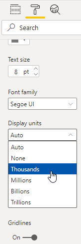
1. You can change the display units to thousands:
2. You could use the "Line and stacked column chart". There you can have two axis, one for the bars and one for the line. This helps in some cases.


