FabCon is coming to Atlanta
Join us at FabCon Atlanta from March 16 - 20, 2026, for the ultimate Fabric, Power BI, AI and SQL community-led event. Save $200 with code FABCOMM.
Register now!- Power BI forums
- Get Help with Power BI
- Desktop
- Service
- Report Server
- Power Query
- Mobile Apps
- Developer
- DAX Commands and Tips
- Custom Visuals Development Discussion
- Health and Life Sciences
- Power BI Spanish forums
- Translated Spanish Desktop
- Training and Consulting
- Instructor Led Training
- Dashboard in a Day for Women, by Women
- Galleries
- Data Stories Gallery
- Themes Gallery
- Contests Gallery
- QuickViz Gallery
- Quick Measures Gallery
- Visual Calculations Gallery
- Notebook Gallery
- Translytical Task Flow Gallery
- TMDL Gallery
- R Script Showcase
- Webinars and Video Gallery
- Ideas
- Custom Visuals Ideas (read-only)
- Issues
- Issues
- Events
- Upcoming Events
The Power BI Data Visualization World Championships is back! Get ahead of the game and start preparing now! Learn more
- Power BI forums
- Forums
- Get Help with Power BI
- Service
- Custom Data Label ignored in tooltip based on repo...
- Subscribe to RSS Feed
- Mark Topic as New
- Mark Topic as Read
- Float this Topic for Current User
- Bookmark
- Subscribe
- Printer Friendly Page
- Mark as New
- Bookmark
- Subscribe
- Mute
- Subscribe to RSS Feed
- Permalink
- Report Inappropriate Content
Custom Data Label ignored in tooltip based on report page
Hi!
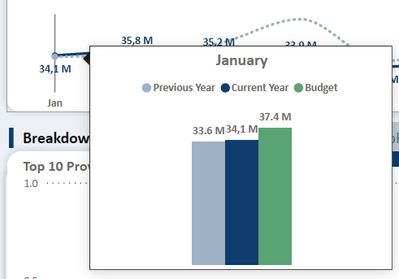
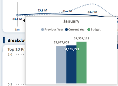
I created a custom data label to format numbers in the visuals, but also have a custom tooltip based on report page where the visual also have custom data labels. On Desktop(1st picture), it works fine, the line chart and tooltip have the correct labels as you can see. However, on Service (2nd picture), the line chart continues working fine but the tooltip is ignoring the format and is showing values without the formatting.
Power BI Desktop:
Power BI Service:
The DAX measure is the following:

Thanks for any help!
- Mark as New
- Bookmark
- Subscribe
- Mute
- Subscribe to RSS Feed
- Permalink
- Report Inappropriate Content
Hi @Gian_Tafur - This issue where custom formatting works in Power BI Desktop but not in Power BI Service is a common problem
slight modification of your dax:
Format_Acum_Opex =
VAR Value = [Acum_Opex]
RETURN
SWITCH(
TRUE(),
Value >= 1000000, Value / 1000000, // Convert to Millions
Value >= 1000, Value / 1000, // Convert to Thousands
Value <= -1000000, Value / 1000000, // Negative Millions
Value <= -1000, Value / 1000, // Negative Thousands
Value // Keep original for small numbers
)
Try re-publishing your report.Clear the browser cache & cookies.Refresh the dataset.
Hope this helps.
Proud to be a Super User! |  |
Helpful resources

Power BI Dataviz World Championships
The Power BI Data Visualization World Championships is back! Get ahead of the game and start preparing now!

| User | Count |
|---|---|
| 56 | |
| 56 | |
| 35 | |
| 18 | |
| 14 |


