FabCon is coming to Atlanta
Join us at FabCon Atlanta from March 16 - 20, 2026, for the ultimate Fabric, Power BI, AI and SQL community-led event. Save $200 with code FABCOMM.
Register now!- Power BI forums
- Get Help with Power BI
- Desktop
- Service
- Report Server
- Power Query
- Mobile Apps
- Developer
- DAX Commands and Tips
- Custom Visuals Development Discussion
- Health and Life Sciences
- Power BI Spanish forums
- Translated Spanish Desktop
- Training and Consulting
- Instructor Led Training
- Dashboard in a Day for Women, by Women
- Galleries
- Data Stories Gallery
- Themes Gallery
- Contests Gallery
- QuickViz Gallery
- Quick Measures Gallery
- Visual Calculations Gallery
- Notebook Gallery
- Translytical Task Flow Gallery
- TMDL Gallery
- R Script Showcase
- Webinars and Video Gallery
- Ideas
- Custom Visuals Ideas (read-only)
- Issues
- Issues
- Events
- Upcoming Events
View all the Fabric Data Days sessions on demand. View schedule
- Power BI forums
- Forums
- Get Help with Power BI
- Service
- Re: Anyone else having difficulties with report vi...
- Subscribe to RSS Feed
- Mark Topic as New
- Mark Topic as Read
- Float this Topic for Current User
- Bookmark
- Subscribe
- Printer Friendly Page
- Mark as New
- Bookmark
- Subscribe
- Mute
- Subscribe to RSS Feed
- Permalink
- Report Inappropriate Content
Anyone else having difficulties with report visuals?
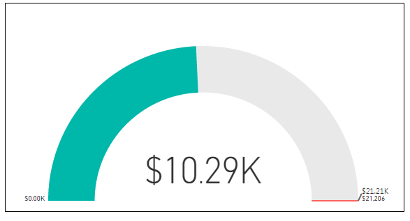
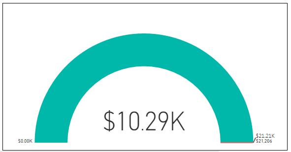
Good morning. Not sure what has happened to the web based service overnight, but the visuals are not reporting data correctly in some instances. For example, the gauge visual is showing correctly when I have only VALUE and MAXIMUM VALUE populated. (see below). But when I add a TARGET , the actual VALUE is not represented correctly on the visual.
Notes.
Sum of value = $14.52K
Max Value = $32.21K
Target Value = $32.21k - this is a moving target but happens to equal the max target today)
see that the green chart area should NOT be filled when the actual value is less than half of the target? ALSO, this isnt happening in the Desktop version, and visuals act normally.
Solved! Go to Solution.
- Mark as New
- Bookmark
- Subscribe
- Mute
- Subscribe to RSS Feed
- Permalink
- Report Inappropriate Content
@Anonymous,
I just confirmed, there is an active bug for this and it is being worked on.
Take care,
Michele
- Mark as New
- Bookmark
- Subscribe
- Mute
- Subscribe to RSS Feed
- Permalink
- Report Inappropriate Content
Hi pchapple,
I've tried to replicate this but it is working fine for me. Would you please try again and let me know if you are still experiencing the same problem?
Thanks,
Michele
- Mark as New
- Bookmark
- Subscribe
- Mute
- Subscribe to RSS Feed
- Permalink
- Report Inappropriate Content
Hi @Anonymous thanks for the reply.
I have tried again this morning, and Im seeing the same issues. Also, I have tried on IE11, Chrome, and Firefox. All browsers who the same issue where the VALUE is not showing correctly. It seems to be an issue when the MAXIMUM VALUE and the TARGET are the same. In my case, the MAXIMUM Value is the final total, and the TARGET is the 'to date' today (month to date for example). However as soon as the sales period finishes, the MAX VALUE and TARGET are the same, and it send the VALUE gauge into a bit of tail spin. This only began occurring recently.
Here are shots where you can see the difference between the DESKTOP version, and the BROWSER version, as you can see the charts replicate differently.


- Mark as New
- Bookmark
- Subscribe
- Mute
- Subscribe to RSS Feed
- Permalink
- Report Inappropriate Content
UPDATE - the issue seems to be caused when the MAXIMUM VALUE and TARGET VALE are the same. If this is exact then the visual misbehaves. However, Ive installed a merssy work around by subtracting 0.001 from the TARGET, which is small enough to be insignificant fore the figure rounding, but large enough for the TARGET and MAXIMUM VALUE to be recognized as different, therefore the Web Based portal represents the visual as expected.
Obviously, this is not ideal, as Im hard coding a error into the calculation. But, for now, it will have to do... Hopefully MS Power BI can come up with a solution.
- Mark as New
- Bookmark
- Subscribe
- Mute
- Subscribe to RSS Feed
- Permalink
- Report Inappropriate Content
@Anonymous,
I just confirmed, there is an active bug for this and it is being worked on.
Take care,
Michele
- Mark as New
- Bookmark
- Subscribe
- Mute
- Subscribe to RSS Feed
- Permalink
- Report Inappropriate Content
Hi pchapple,
>>Hopefully MS Power BI can come up with a solution.
I will report this issue to Microsoft.
Thanks for your support.
Regards,
Xiaoxin Sheng
Helpful resources

Power BI Monthly Update - November 2025
Check out the November 2025 Power BI update to learn about new features.

Fabric Data Days
Advance your Data & AI career with 50 days of live learning, contests, hands-on challenges, study groups & certifications and more!


