This is best Fabric, Power BI, SQL and AI community event. How do we know? The last event sold out! Save €200 with code FABCMTY200.
Register nowThe Fabric community is upgrading! Read all of the details including the timeline and what you can expect. Learn more
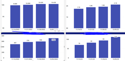
The data sets used in both charts are the same. The Power BI report on top displays correctly but below is the same report on Report builder which does not display correctly. The lower two charts on report builder displays the same data for the previous weeks. I need to use report builder for sending the reports
How can I solve this problem on the report builder
Solved! Go to Solution.
I have resolved this. The problem was that the last 3 charts were coming from the same dataset. I created a dataset for each chart and the display was fine
Try this and see if that works:
Select chart > values > column > properties.
Labels: (check these properties and set)
Label: Position: Top, Visible: True, UseValueAsLabel: True
SmartLabels: Disabled: True;
See if it works.
Sample: RowsCount are the vaules used in the chart and see these properties and compare and set, see if this helps. (red color lined ones)
This didnt work. The probem is that each bar is displaying the same value which is the most current data. I need to see the cumulative data on each bar just like the upper two charts.
Ooops, what I gave is the position of data label details ...
Your issue is same data for all series. which is different than my steps.
Assuming the fields are from the same dataset, check the aggregate you are doing.
I have resolved this. The problem was that the last 3 charts were coming from the same dataset. I created a dataset for each chart and the display was fine
Glad it worked.
Join us in Barcelona for FabCon and SQLCon, the Fabric, Power BI, SQL, and AI community event. Save €200 with code FABCMTY200.
| User | Count |
|---|---|
| 4 | |
| 2 | |
| 2 | |
| 1 | |
| 1 |