FabCon is coming to Atlanta
Join us at FabCon Atlanta from March 16 - 20, 2026, for the ultimate Fabric, Power BI, AI and SQL community-led event. Save $200 with code FABCOMM.
Register now!- Power BI forums
- Get Help with Power BI
- Desktop
- Service
- Report Server
- Power Query
- Mobile Apps
- Developer
- DAX Commands and Tips
- Custom Visuals Development Discussion
- Health and Life Sciences
- Power BI Spanish forums
- Translated Spanish Desktop
- Training and Consulting
- Instructor Led Training
- Dashboard in a Day for Women, by Women
- Galleries
- Data Stories Gallery
- Themes Gallery
- Contests Gallery
- QuickViz Gallery
- Quick Measures Gallery
- Visual Calculations Gallery
- Notebook Gallery
- Translytical Task Flow Gallery
- TMDL Gallery
- R Script Showcase
- Webinars and Video Gallery
- Ideas
- Custom Visuals Ideas (read-only)
- Issues
- Issues
- Events
- Upcoming Events
View all the Fabric Data Days sessions on demand. View schedule
- Power BI forums
- Forums
- Get Help with Power BI
- Power Query
- Re: Is this even possible to do?
- Subscribe to RSS Feed
- Mark Topic as New
- Mark Topic as Read
- Float this Topic for Current User
- Bookmark
- Subscribe
- Printer Friendly Page
- Mark as New
- Bookmark
- Subscribe
- Mute
- Subscribe to RSS Feed
- Permalink
- Report Inappropriate Content
[STILL UNSOLVED] Tracking changes between tables
Hey all,
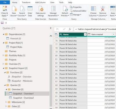
I have a sharepoint folder which contains weekly snapshots of my Excel data file.
I would like to be able to compare each file against one another and show where the changes are between them - i.e. I am trying to create a 'Track Changes' tab.
E.g. if a client wants to view what changes have been made to financial data from week 1 and week 3, they can select week 1 and week 3 filters and using conditional formatting (or some method) see if there are any changes in that column
Image 1: This is how I capture my weekly snapshots
Image 2: I then connect my Power BI dashboard to my SharePoint folder and read all the files as shown below.
Image 3: Now for the visual part, I want to be able to select 2 reports/dates (as shown in the filter) and immediately see where there are changes between the 2 reports. The current view shows the full table from week 1 and week 3 but I'm only interested in seeing where there has been changes.
Any suggestions would be hugely appreciated!
Solved! Go to Solution.
- Mark as New
- Bookmark
- Subscribe
- Mute
- Subscribe to RSS Feed
- Permalink
- Report Inappropriate Content
Here would be the query for Overview
let
    Overview = (f)=> let S = Excel.Workbook(f),
    Overview_Sheet = S{[Item="Overview",Kind="Sheet"]}[Data],
    #"Promoted Headers" = Table.PromoteHeaders(Overview_Sheet, [PromoteAllScalars=true])
in
    #"Promoted Headers",
        Source = Folder.Files("C:\Users\xxx\Downloads\Test folder"),
    #"Added Custom" = Table.AddColumn(Source, "Custom", each Overview([Content])),
    #"Removed Other Columns" = Table.SelectColumns(#"Added Custom",{"Name", "Custom"}),
    #"Expanded Custom" = Table.ExpandTableColumn(#"Removed Other Columns", "Custom", {"Report Entry Date", "Project Name", "Project ID", "Programme ID", "Project Stage", "Start Date", "EIS Forecast", "AFC Baseline (£m)", "Current AFC (£m)", "Project Maturity ID", "Configuration State ID"}, {"Report Entry Date", "Project Name", "Project ID", "Programme ID", "Project Stage", "Start Date", "EIS Forecast", "AFC Baseline (£m)", "Current AFC (£m)", "Project Maturity ID", "Configuration State ID"})
in
    #"Expanded Custom"
This will load the snapshots into a single query. Next you need to decide which columns to compare from the Overview sheet. For example the project stage:
- Mark as New
- Bookmark
- Subscribe
- Mute
- Subscribe to RSS Feed
- Permalink
- Report Inappropriate Content
Great thanks, I will post sample data for further clarification!
- Mark as New
- Bookmark
- Subscribe
- Mute
- Subscribe to RSS Feed
- Permalink
- Report Inappropriate Content
@FU Respond to your PM, if you post sample data as text or a link to your PBIX this will be much easier to solve.
Follow on LinkedIn
@ me in replies or I'll lose your thread!!!
Instead of a Kudo, please vote for this idea
Become an expert!: Enterprise DNA
External Tools: MSHGQM
YouTube Channel!: Microsoft Hates Greg
Latest book!: DAX For Humans
DAX is easy, CALCULATE makes DAX hard...
- Mark as New
- Bookmark
- Subscribe
- Mute
- Subscribe to RSS Feed
- Permalink
- Report Inappropriate Content
Let's take the below table as an example. Let's assume every week I run a flow to automatically grab a snapshot of the current data in my Excel file and store these files into a SharePoint folder which is connected to my PBI file.
Example -
The week 1 table is showing my data at a given snapshot date.
Week 1:
| Project Name | Project ID | Programme ID | Forecast | Status |
| A | ProjectID 1 | ProgrammeID 1 | £500,000.00 | Status A |
| B | ProjectID 2 | ProgrammeID 2 | £500,000.00 | Status B |
| C | ProjectID 3 | ProgrammeID 3 | £500,000.00 | Status C |
| D | ProjectID 4 | ProgrammeID 4 | £500,000.00 | Statuc D |
One week later my power flow takes a snapshot of my Excel file and stores Week 2 into my SharePoint folder
Week 2: (changes from week 1 and week 2 in 'Forecast' and 'Status' columns.
| Project Name | Project ID | Programme ID | Forecast | Status |
| A | ProjectID 1 | ProgrammeID 1 | £500,000.00 | Status A |
| B | ProjectID 2 | ProgrammeID 2 | £640,000.00 | Status H |
| C | ProjectID 3 | ProgrammeID 3 | £700,000.00 | Status G |
| D | ProjectID 4 | ProgrammeID 4 | £500,000.00 | Statuc O |
After several weeks I would have multiple snapshots of this table with data changing each week. I want to create a visual which allows me to see which field have been changed. Something like the below image:
If i select week 1 and week 3 in my filters, the column+row which have changes in them would be highlighted.
I hope this is clarifies? If not please let me know!
Thanks again
- Mark as New
- Bookmark
- Subscribe
- Mute
- Subscribe to RSS Feed
- Permalink
- Report Inappropriate Content
There are new DAX functions available (OFFSET / WINDOW / INDEX ) that can make that easier.
1. add an unpivoted version of your snapshots
let
    Source = Table.FromRows(Json.Document(Binary.Decompress(Binary.FromText("i45WMlTSUXIE4oCi/KzU5BJPFwVDCC+9KDE3NxXKP7TY1MBAx8DAQM/AAMgNLkksKS1WcFSK1YGY4IRighGaCUY4TXCCm+CMYoIxmgnGOE1whpvggmKCCZoJJjhMSFZwAZtgRHE4GBEZDmYmmCZ4wE0gJhzMsbjBHW4CueHgrxQbCwA=", BinaryEncoding.Base64), Compression.Deflate)), let _t = ((type nullable text) meta [Serialized.Text = true]) in type table [Week = _t, #"Project Name" = _t, #"Project ID" = _t, #"Programme ID" = _t, Forecast = _t, Status = _t]),
    #"Unpivoted Other Columns" = Table.UnpivotOtherColumns(Source, {"Week", "Project Name", "Project ID", "Programme ID"}, "Attribute", "Value")
in
    #"Unpivoted Other Columns"
2. put your data into a matrix visual by project and week
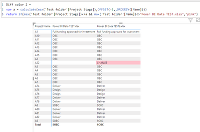
3. Create a measure that compares the adjacent weeks' data and highlights the difference.
Diff color =
var a = calculate(max('Table'[Value]),OFFSET(-1,,ORDERBY([Week])))
return if(max('Table'[Value])<>a && max('Table'[Week])<>"1","pink")
Which yields this
- Mark as New
- Bookmark
- Subscribe
- Mute
- Subscribe to RSS Feed
- Permalink
- Report Inappropriate Content
@lbendlin I love the matrix idea. I've attached 2 spreadsheets and changed the data slightly in some columns in the second sheet across the tabs
How would it look for a dataset I have below?
- Mark as New
- Bookmark
- Subscribe
- Mute
- Subscribe to RSS Feed
- Permalink
- Report Inappropriate Content
Please clarify what you mean by "second sheet"
- Mark as New
- Bookmark
- Subscribe
- Mute
- Subscribe to RSS Feed
- Permalink
- Report Inappropriate Content
Apologies - Second sheet meaning the 'Power BI TEST2' file.
Week 1: 'Power BI TEST'
Week 2: 'Power BI TEST2'
Helpful resources

Power BI Monthly Update - November 2025
Check out the November 2025 Power BI update to learn about new features.

Fabric Data Days
Advance your Data & AI career with 50 days of live learning, contests, hands-on challenges, study groups & certifications and more!

| User | Count |
|---|---|
| 10 | |
| 9 | |
| 6 | |
| 5 | |
| 3 |


