Join the Fabric User Panel to shape the future of Fabric.
Share feedback directly with Fabric product managers, participate in targeted research studies and influence the Fabric roadmap.
Sign up now- Power BI forums
- Get Help with Power BI
- Desktop
- Service
- Report Server
- Power Query
- Mobile Apps
- Developer
- DAX Commands and Tips
- Custom Visuals Development Discussion
- Health and Life Sciences
- Power BI Spanish forums
- Translated Spanish Desktop
- Training and Consulting
- Instructor Led Training
- Dashboard in a Day for Women, by Women
- Galleries
- Data Stories Gallery
- Themes Gallery
- Contests Gallery
- QuickViz Gallery
- Quick Measures Gallery
- Visual Calculations Gallery
- Notebook Gallery
- Translytical Task Flow Gallery
- TMDL Gallery
- R Script Showcase
- Webinars and Video Gallery
- Ideas
- Custom Visuals Ideas (read-only)
- Issues
- Issues
- Events
- Upcoming Events
Get Fabric certified for FREE! Don't miss your chance! Learn more
- Power BI forums
- Forums
- Get Help with Power BI
- Power Query
- Display column and row values for max
- Subscribe to RSS Feed
- Mark Topic as New
- Mark Topic as Read
- Float this Topic for Current User
- Bookmark
- Subscribe
- Printer Friendly Page
- Mark as New
- Bookmark
- Subscribe
- Mute
- Subscribe to RSS Feed
- Permalink
- Report Inappropriate Content
Display column and row values for max
Hi,
I have a dataset that looks something like this (just a lot bigger and with columns from 1 o'clock till 24).
I know I can add a column for rowwise max values in query. But How do I then find the corresponding timestamp for that row? And how do I display it in a card or something like that in desktop?
Thanks!
| Dato | Kl. 1 | Kl. 2 | Kl. 3 | Kl. 4 |
| 01.01.2022 | 106,20 | 100,20 | 107,40 | 110,40 |
| 02.01.2022 | 114,60 | 114,00 | 111,60 | 103,80 |
| 03.01.2022 | 167,40 | 118,80 | 109,80 | 120,60 |
| 04.01.2022 | 136,80 | 120,60 | 120,00 | 123,60 |
| 05.01.2022 | 152,40 | 134,40 | 132,60 | 138,00 |
| 06.01.2022 | 150,00 | 130,80 | 131,40 | 152,40 |
| 07.01.2022 | 144,00 | 130,80 | 128,40 | 136,80 |
Solved! Go to Solution.
- Mark as New
- Bookmark
- Subscribe
- Mute
- Subscribe to RSS Feed
- Permalink
- Report Inappropriate Content
So I have an update:
I used this: https://www.excelnaccess.com/finding-the-column-name-with-max-or-min-value/
And that worked fine. But if I have a data set like mine (i.e. dates instead of apples and oranges) - how do I get the max value to vary when I change my filters (between months) in desktop?
- Mark as New
- Bookmark
- Subscribe
- Mute
- Subscribe to RSS Feed
- Permalink
- Report Inappropriate Content
Hi @Anonymous ,
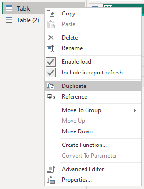
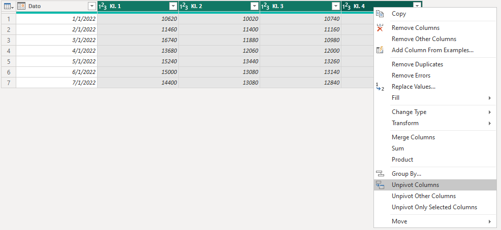
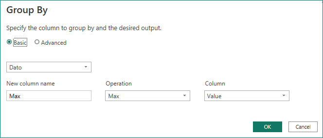
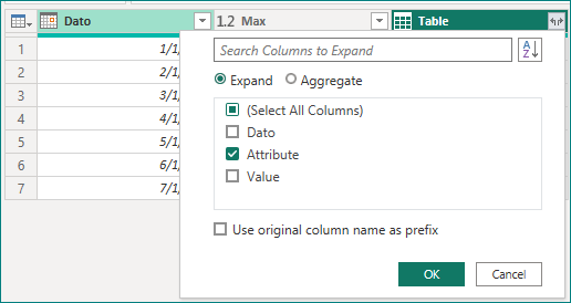
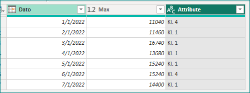
You can duplicate the table --> select [Kl. 1] to [Kl. 24] and unpivot the columns --> select [Dato] and Grouping --> Merge Query --> Expand Columns.
Result:
Such data is well reflected in the change of maximum values by creating line charts in the desktop.
Best Regards,
Gao
Community Support Team
If there is any post helps, then please consider Accept it as the solution to help the other members find it more quickly. If I misunderstand your needs or you still have problems on it, please feel free to let us know. Thanks a lot!
How to get your questions answered quickly -- How to provide sample data in the Power BI Forum
- Mark as New
- Bookmark
- Subscribe
- Mute
- Subscribe to RSS Feed
- Permalink
- Report Inappropriate Content
Thanks! That worked! 🙂
Sorry for the late reply..!
- Mark as New
- Bookmark
- Subscribe
- Mute
- Subscribe to RSS Feed
- Permalink
- Report Inappropriate Content
So I have an update:
I used this: https://www.excelnaccess.com/finding-the-column-name-with-max-or-min-value/
And that worked fine. But if I have a data set like mine (i.e. dates instead of apples and oranges) - how do I get the max value to vary when I change my filters (between months) in desktop?
- Mark as New
- Bookmark
- Subscribe
- Mute
- Subscribe to RSS Feed
- Permalink
- Report Inappropriate Content
Hi @Anonymous ,
You can duplicate the table --> select [Kl. 1] to [Kl. 24] and unpivot the columns --> select [Dato] and Grouping --> Merge Query --> Expand Columns.
Result:
Such data is well reflected in the change of maximum values by creating line charts in the desktop.
Best Regards,
Gao
Community Support Team
If there is any post helps, then please consider Accept it as the solution to help the other members find it more quickly. If I misunderstand your needs or you still have problems on it, please feel free to let us know. Thanks a lot!
How to get your questions answered quickly -- How to provide sample data in the Power BI Forum
Helpful resources

Join our Community Sticker Challenge 2026
If you love stickers, then you will definitely want to check out our Community Sticker Challenge!

Power BI Monthly Update - January 2026
Check out the January 2026 Power BI update to learn about new features.

| User | Count |
|---|---|
| 13 | |
| 11 | |
| 11 | |
| 7 | |
| 6 |
