FabCon is coming to Atlanta
Join us at FabCon Atlanta from March 16 - 20, 2026, for the ultimate Fabric, Power BI, AI and SQL community-led event. Save $200 with code FABCOMM.
Register now!- Power BI forums
- Get Help with Power BI
- Desktop
- Service
- Report Server
- Power Query
- Mobile Apps
- Developer
- DAX Commands and Tips
- Custom Visuals Development Discussion
- Health and Life Sciences
- Power BI Spanish forums
- Translated Spanish Desktop
- Training and Consulting
- Instructor Led Training
- Dashboard in a Day for Women, by Women
- Galleries
- Data Stories Gallery
- Themes Gallery
- Contests Gallery
- QuickViz Gallery
- Quick Measures Gallery
- Visual Calculations Gallery
- Notebook Gallery
- Translytical Task Flow Gallery
- TMDL Gallery
- R Script Showcase
- Webinars and Video Gallery
- Ideas
- Custom Visuals Ideas (read-only)
- Issues
- Issues
- Events
- Upcoming Events
Get Fabric Certified for FREE during Fabric Data Days. Don't miss your chance! Request now
- Power BI forums
- Forums
- Get Help with Power BI
- Power Query
- Re: Column Comparison Percent of progress
- Subscribe to RSS Feed
- Mark Topic as New
- Mark Topic as Read
- Float this Topic for Current User
- Bookmark
- Subscribe
- Printer Friendly Page
- Mark as New
- Bookmark
- Subscribe
- Mute
- Subscribe to RSS Feed
- Permalink
- Report Inappropriate Content
Column Comparison Percent of progress
I'm new to Power BI and I want to show the total percent of miles complete against the forecasted miles. I want my stacked bar chart to reflect that 84.9% of forecasted miles have been completed. However Power BI is displaying the allocation for the miles complete and forecast miles. Instead of showing 84.9% its showing 45.9%. How do I fix this? Percent of Column Total percent of progress
| Miles Complete | Forecast Miles |
| 22 | 24 |
| 34 | 35 |
| 43 | 43 |
| 4 | 4 |
| 34 | 38 |
| 9 | 9 |
| 42 | 64 |
| 6 | 8 |
| 87 | 100 |
| 24 | 34 |
- Mark as New
- Bookmark
- Subscribe
- Mute
- Subscribe to RSS Feed
- Permalink
- Report Inappropriate Content
Hi @Anonymous ,
Can you provide your expectations what the bar graph looks like?
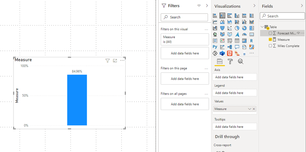
From the data you give to test, the following measurement can get 84.9%
Measure = DIVIDE(SUM('Table'[Miles Complete]),SUM('Table'[Forecast Miles]))
Best Regards,
Stephen Tao
If this post helps, then please consider Accept it as the solution to help the other members find it more quickly.
- Mark as New
- Bookmark
- Subscribe
- Mute
- Subscribe to RSS Feed
- Permalink
- Report Inappropriate Content
It is responding by saying the Expression Error: The name 'Divide' wasn't recognized, make sure its spelled correctly, but looks like its spelled correctly.
- Mark as New
- Bookmark
- Subscribe
- Mute
- Subscribe to RSS Feed
- Permalink
- Report Inappropriate Content
Hi @Anonymous
Please follow this steps .
Create a Line and clustered column chart
- Add a field to the shared axis.
- Add a metric to both the column values and line values.
- Click the dropdown on the metric in the column values and select Show value as -> Percent of grand total.
- In the formatting pane, under Y axis, turn on Align zeros.
- In the primary Y axis settings, set the position to right. Remove the axis title and change the primary axis font color to white
- Turn on Data labels.
- Scroll to the bottom of the Data labels category until you see Customize series. Turn that on. Select your metric in the drop down and turn Show to of
Thank & Regards
Rohit Jaiswal
Helpful resources

Power BI Monthly Update - November 2025
Check out the November 2025 Power BI update to learn about new features.

Fabric Data Days
Advance your Data & AI career with 50 days of live learning, contests, hands-on challenges, study groups & certifications and more!

| User | Count |
|---|---|
| 11 | |
| 9 | |
| 7 | |
| 4 | |
| 4 |
| User | Count |
|---|---|
| 24 | |
| 15 | |
| 13 | |
| 12 | |
| 9 |

