Huge last-minute discounts for FabCon Vienna from September 15-18, 2025
Supplies are limited. Contact info@espc.tech right away to save your spot before the conference sells out.
Get your discountScore big with last-minute savings on the final tickets to FabCon Vienna. Secure your discount
- Microsoft Fabric Community
- Fabric community blogs
- Power BI Community Blog
- Creating a “custom” or “hybrid” matrix in PowerBI
- Subscribe to RSS Feed
- Mark as New
- Mark as Read
- Bookmark
- Subscribe
- Printer Friendly Page
- Report Inappropriate Content
- Subscribe to RSS Feed
- Mark as New
- Mark as Read
- Bookmark
- Subscribe
- Printer Friendly Page
- Report Inappropriate Content
Backround
It seems that the request for help in creating a “custom” or “hybrid” matrix is fairly frequent in the PowerBI forums (I have come across three different threads asking for assistance regarding this topic over the last week alone).
While the default table and matrix visuals do not cater for these types of custom layouts of information, developing a solution is not actually that complicated, though it does require some work.
As is normally the case with PowerBI, there are probably a number of ways to achieve this, but I thought I would showcase a method I find relatively “painless”.
The challenge: How can we create a “custom” layout for the information in a matrix?
In the following example we wish to include a combination of columns of aggregated values as well as values filtered by a dimension itself.
Let me try to explain what I mean by the question above. Let’s say we have a simple model for sales by Channel and Item and we would like to see the performance of the sales against a target over selected periods. The default matrix visual will allow us to visualise this, albeit the layout of the information is restricted to the default structure inherent to the visual. For example we can show the information:
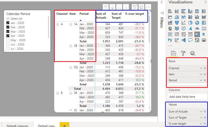
1) Having the dimensions and period itself as rows, and the [Sum of Actuals], Sum of Target] and [% over target] as values:
2) Having the Dimensions as rows, the periods as columns, and the [Sum of Actuals], [Sum of Target] and [% over target] as values:
However there is no option currently to “turn off” certain elements in the headers (or rearrange the actual structure to a specific custom layout). If we want to see the periods as columns, each value (in this case three different measures) is shown for each period.
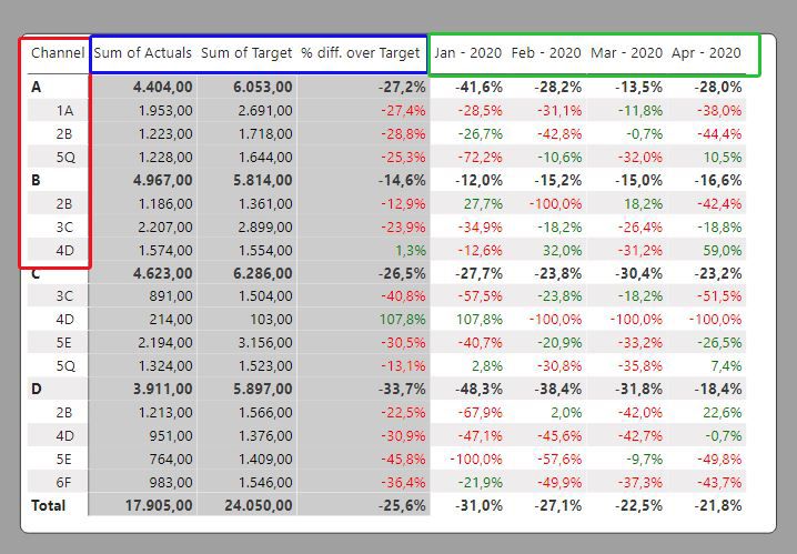
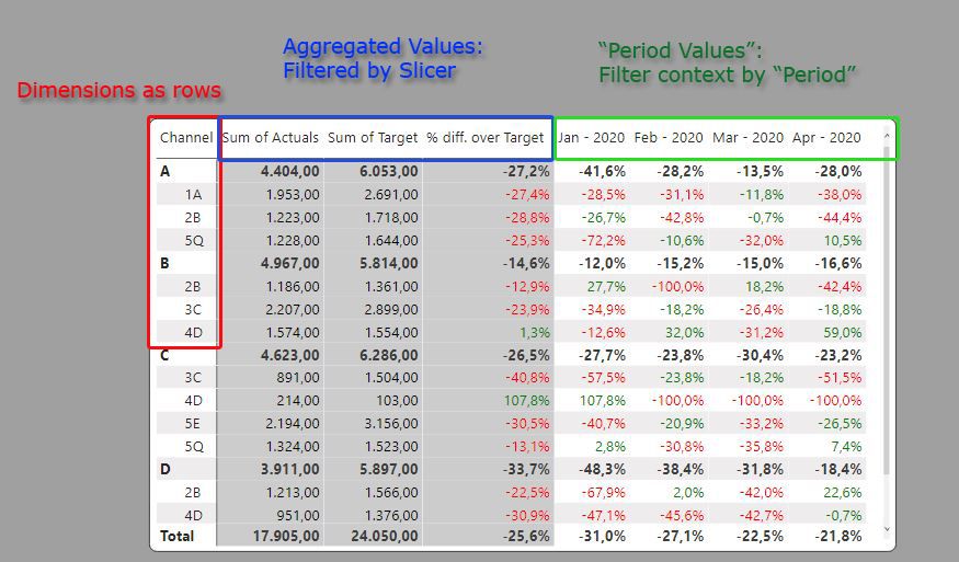
What if we wanted to “customise” the structure of the visual to show something like this? We can actually create a custom column layout to show the information we need. We just need to define it.
One way to create a “Custom” or “Hybrid” matrix:
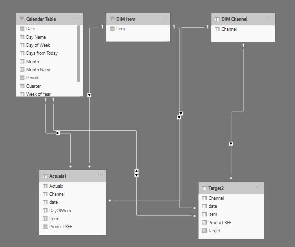
First the model for the example: Two fact tables (Actuals1 & Target2) and three dimension tables (Calendar Table, Dim Item and Dim Channel)
Step 1: Creating the custom layout for the columns of the matrix
The key to this solution is to create a “custom” column layout to use in the column bucket in the matrix. In this example, the column layout we are seeking is this:
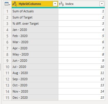
and the way to replicate this structure is by creating a corresponding table where each column header is a row of a table. This should not be hard to do in Power Query/Dax. For the purpose of this exercise
- Create a table with three rows for the aggregate values (and an index for sorting/filtering purposes):
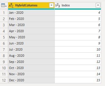
- Create a period table using the Calendar Table [Period] column referenced to the Calendar table already present in the model (in this case, the index starts at “4” to cater for the previous table rows in the previous table created):
- …and by appending these two tables, we have created the structure we need for the custom layout (let’s call this table “Hybrid Table”):
Since the periods in this table are referenced to the calendar table, the rows will “grow” accordingly.
Something worth mentioning at this point is that the index column is important for two reasons:
- It allows for the correct sorting of the actual columns, even if the periods are filtered
- The index column is actually very useful in the FILTER expressions of the measures needed.
This table is unrelated to/disconnected from any other table in the model.
Just beware that if we are tempted to check the matrix out with the new column headers we have created the visual will “refuse to render” and complain about the lack of relationships between tables… just ignore this for now.
Step 2: Creating the measures for the custom matrix
Let the DAX fun begin…!
Since we are using as columns for our matrix an unrelated table, there are two main issues to be aware of regarding the filter context (with regards to the columns in the matrix) of the measures we are going to use. For this example:
- Which measures can rely on the actual relationships established in the model (the “aggregated values”)
We can use the simple aggregation measures for these values (simple SUM and DIVIDE functions). We will specify the filter context for these in the final measure.
2. In which measures we need to be specific as to the filter context and write the appropriate DAX to relate the filter to the corresponding context in the model. (the “Period Values”)
For these measures we need to be specific about the filter context we want in the calculation. Since we are using columns from the “Hybrid Table” (which has no relationships in the model), we need to use a function to establish a virtual “one-to-one/many” relationship (TREATAS function) to enforce the filter context and filter the values accordingly using the expression as the filter in the measure.
Basically what we are doing is saying: “when the matrix column = Jan – 2020, filter the rows to show those which are filtered by the Calendar Table [Period] = Jan – 2020”.
In this example, we want to show the % difference between the actuals vs the target for each period in the matrix:
Having established the measures we need, all we need now is the final measure we will use in the matrix to take into account the filter context for each of the “HybridColumns” we are using in the matrix columns. This measure will establish which of the previous measures must be used based on the filter context established by the columns included in the matrix from our Hybrid Table. Since the actual results vary from whole/decimal numbers, we also need to specify the FORMAT required for each result:
The filter context is established by the columns:
Which come from our “Hybrid Table” (we are using the index reference for the Hybrid table for simplicity purposes):
And this is the final measure which we will use for the values in the matrix:
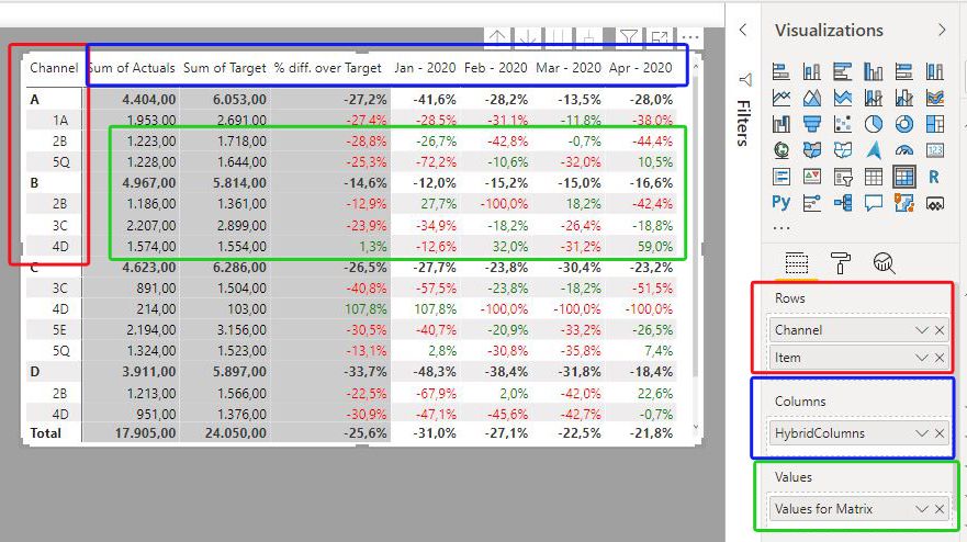
We can now create the matrix using:
a) The Channel and Item dimensions as rows.
b) The HybridColumns from our Hybrid Table for the Column Bucket
c) The final measure [Values for Matrix] in the values bucket to get this:
d) (some conditional formatting for the values displayed)
Step 3: Enabling the filtering of the columns in the custom matrix
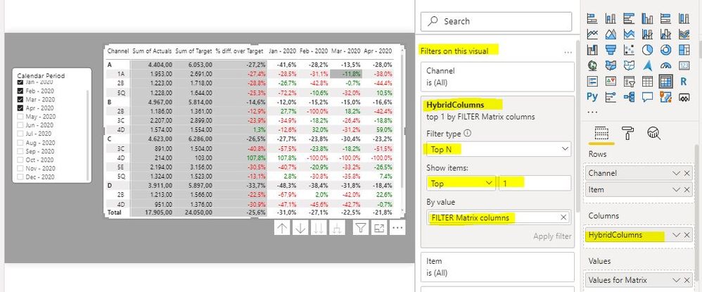
Since we want to be able to filter the matrix by our periods of choice in a slicer, we need one more measure. The slicer on the page is from the ‘Calendar Table’ [Period] column, so we need to be able to select the periods to be shown in the matrix based on the selection made on this slicer from the calendar table. The measure must compare the values selected in the slicer with those established in the visual from the Hybrid Table:
We can then use this filter in the filter pane for the matrix visual to filter the columns based on the selection in the Calendar Table [Period] Slicer. We set the TopN for the HybridColumns field in the filter Pane as “1” to make the visual respond to the selection made in the ‘Calendar Table’ [Period] Slicer.
We thereby can now use the Calendar Slicer (Calendar Table [Period]) to filter the periods we want to see in the visual.
Conclusion: The flexibility offered by PowerBI and DAX allows us to create “custom” matrices to reflect the layout of information we need to depict in our reports.
PS: If this tutorial is unclear, please feel free to contact me on this thread or via pm!
- « Previous
-
- 1
- 2
- 3
- 4
- Next »
You must be a registered user to add a comment. If you've already registered, sign in. Otherwise, register and sign in.
- 🏆 Announcing the judges' favorites from the Power...
- Lock In your spot! Last-minute discount Available ...
- Stop Building Multiple Apps – Master Power BI App ...
- 🏆 Announcing the finalists of the Power BI DataVi...
- Power BI DAX Functions: Basics to Real-World Cases
- Power BI Copilot: Write DAX Measures Fast
- August 2025 Power BI Update: Features That Matter ...
- 🏆 Power BI DataViz World Championships | EU Editi...
- Create a custom role in Power BI Report Server (SS...
- Do Not Use Web.BrowserContents (2/2)
-
Peter_23
 on:
🏆 Announcing the judges' favorites from the Power...
-
 bhanu_gautam
on:
🏆 Announcing the finalists of the Power BI DataVi...
-
Abhilash_P
 on:
Power BI Copilot: Write DAX Measures Fast
-
wardy912
 on:
August 2025 Power BI Update: Features That Matter ...
-
Shubham_rai955
 on:
Create a custom role in Power BI Report Server (SS...
-
Olayemi_Awofe
 on:
Do Not Use Web.BrowserContents (2/2)
-
Shahid12523
 on:
Calculation Groups and Field Parameters
- damlapeker on: Power BI CI/CD Made Simple – A Beginner’s Guide wi...
-
Shubham_rai955
 on:
Power BI Apply All & Clear All Slicers (Step-by-St...
-
Shubham_rai955
 on:
🧠 CALCULATE() vs. CALCULATETABLE() in Power BI: W...
-
How To
687 -
Tips & Tricks
660 -
Events
157 -
Support insights
121 -
Opinion
83 -
DAX
66 -
Power BI
65 -
Power Query
62 -
Power BI Dev Camp
45 -
Power BI Desktop
40 -
Roundup
38 -
Dataflow
25 -
Featured User Group Leader
24 -
Power BI Embedded
20 -
Time Intelligence
19 -
Tips&Tricks
18 -
Data Protection
13 -
PowerBI REST API
12 -
Power BI Service
8 -
Power Query Tips & Tricks
8 -
finance
8 -
Direct Query
7 -
Data Visualization
6 -
Python
6 -
Power BI REST API
6 -
Auto ML
6 -
financial reporting
6 -
Data Analysis
6 -
Power Automate
6 -
Tips and Tricks
5 -
Machine Learning
5 -
Income Statement
5 -
Dax studio
5 -
powerbi
5 -
service
5 -
Power BI PowerShell
5 -
Bookmarks
4 -
Line chart
4 -
Group By
4 -
community
4 -
RLS
4 -
M language
4 -
Paginated Reports
4 -
External tool
4 -
Power BI Goals
4 -
Desktop
4 -
PowerShell
4 -
PowerApps
3 -
Data Science
3 -
Azure
3 -
Data model
3 -
Conditional Formatting
3 -
Visualisation
3 -
Life Sciences
3 -
Administration
3 -
M code
3 -
Visuals
3 -
SQL Server 2017 Express Edition
3 -
R script
3 -
Aggregation
3 -
Webinar
3 -
calendar
3 -
Gateways
3 -
R
3 -
M Query
3 -
CALCULATE
3 -
R visual
3 -
Reports
3 -
Visualization
2 -
Power BI Challenge
2 -
Query Parameter
2 -
SharePoint
2 -
Power BI Installation and Updates
2 -
How Things Work
2 -
Tabular Editor
2 -
rank
2 -
ladataweb
2 -
Troubleshooting
2 -
Date DIFF
2 -
Transform data
2 -
Healthcare
2 -
Incremental Refresh
2 -
Number Ranges
2 -
Query Plans
2 -
Power BI & Power Apps
2 -
Random numbers
2 -
Day of the Week
2 -
Custom Visual
2 -
VLOOKUP
2 -
pivot
2 -
calculated column
2 -
M
2 -
hierarchies
2 -
Power BI Anniversary
2 -
Language M
2 -
inexact
2 -
Date Comparison
2 -
Power BI Premium Per user
2 -
Forecasting
2 -
REST API
2 -
Editor
2 -
Split
2 -
measure
2 -
Microsoft-flow
2 -
Paginated Report Builder
2 -
Working with Non Standatd Periods
2 -
powerbi.tips
2 -
Custom function
2 -
Reverse
2 -
PUG
2 -
Custom Measures
2 -
Filtering
2 -
Row and column conversion
2 -
Python script
2 -
Nulls
2 -
DVW Analytics
2 -
parameter
2 -
Industrial App Store
2 -
Week
2 -
Date duration
2 -
Formatting
2 -
Weekday Calendar
2 -
Support insights.
2 -
construct list
2 -
slicers
2 -
SAP
2 -
Power Platform
2 -
Workday
2 -
external tools
2 -
index
2 -
RANKX
2 -
Date
2 -
PBI Desktop
2 -
Date Dimension
2 -
Integer
2 -
Excel
1 -
Showcase
1 -
custom connector
1 -
Waterfall Chart
1 -
Power BI On-Premise Data Gateway
1 -
patch
1 -
Top Category Color
1 -
A&E data
1 -
Previous Order
1 -
Substring
1 -
Wonderware
1 -
Power M
1 -
Format DAX
1 -
Custom functions
1 -
accumulative
1 -
DAX&Power Query
1 -
Premium Per User
1 -
GENERATESERIES
1 -
Report Server
1 -
Audit Logs
1 -
analytics pane
1 -
step by step
1 -
Top Brand Color on Map
1 -
Tutorial
1 -
Previous Date
1 -
XMLA End point
1 -
color reference
1 -
Date Time
1 -
Marker
1 -
Lineage
1 -
CSV file
1 -
conditional accumulative
1 -
Matrix Subtotal
1 -
Check
1 -
null value
1 -
Show and Tell
1 -
Cumulative Totals
1 -
Report Theme
1 -
Bookmarking
1 -
oracle
1 -
mahak
1 -
pandas
1 -
Networkdays
1 -
Button
1 -
Dataset list
1 -
Keyboard Shortcuts
1 -
Fill Function
1 -
LOOKUPVALUE()
1 -
Tips &Tricks
1 -
Plotly package
1 -
Sameperiodlastyear
1 -
Office Theme
1 -
matrix
1 -
bar chart
1 -
Measures
1 -
powerbi argentina
1 -
Canvas Apps
1 -
total
1 -
Filter context
1 -
Difference between two dates
1 -
get data
1 -
OSI
1 -
Query format convert
1 -
ETL
1 -
Json files
1 -
Merge Rows
1 -
CONCATENATEX()
1 -
take over Datasets;
1 -
Networkdays.Intl
1 -
refresh M language Python script Support Insights
1 -
Tutorial Requests
1 -
Governance
1 -
Fun
1 -
Power BI gateway
1 -
gateway
1 -
Elementary
1 -
Custom filters
1 -
Vertipaq Analyzer
1 -
powerbi cordoba
1 -
Model Driven Apps
1 -
REMOVEFILTERS
1 -
XMLA endpoint
1 -
translations
1 -
OSI pi
1 -
Parquet
1 -
Change rows to columns
1 -
remove spaces
1 -
Get row and column totals
1 -
Retail
1 -
Power BI Report Server
1 -
School
1 -
Cost-Benefit Analysis
1 -
DIisconnected Tables
1 -
Sandbox
1 -
Honeywell
1 -
Combine queries
1 -
X axis at different granularity
1 -
ADLS
1 -
Primary Key
1 -
Microsoft 365 usage analytics data
1 -
Randomly filter
1 -
Week of the Day
1 -
Azure AAD
1 -
query
1 -
Dynamic Visuals
1 -
KPI
1 -
Intro
1 -
Icons
1 -
ISV
1 -
Ties
1 -
unpivot
1 -
Practice Model
1 -
Continuous streak
1 -
ProcessVue
1 -
Create function
1 -
Table.Schema
1 -
Acknowledging
1 -
Postman
1 -
Text.ContainsAny
1 -
Power BI Show
1 -
Get latest sign-in data for each user
1 -
Power Pivot
1 -
API
1 -
Kingsley
1 -
Merge
1 -
variable
1 -
Issues
1 -
function
1 -
stacked column chart
1 -
ho
1 -
ABB
1 -
KNN algorithm
1 -
List.Zip
1 -
optimization
1 -
Artificial Intelligence
1 -
Map Visual
1 -
Text.ContainsAll
1 -
Tuesday
1 -
help
1 -
group
1 -
Scorecard
1 -
Json
1 -
Tops
1 -
financial reporting hierarchies RLS
1 -
Featured Data Stories
1 -
MQTT
1 -
Custom Periods
1 -
Partial group
1 -
Reduce Size
1 -
FBL3N
1 -
Wednesday
1 -
Q&A
1 -
Quick Tips
1 -
data
1 -
PBIRS
1 -
Usage Metrics in Power BI
1 -
Multivalued column
1 -
Pipeline
1 -
Path
1 -
Yokogawa
1 -
Dynamic calculation
1 -
Data Wrangling
1 -
native folded query
1 -
transform table
1 -
UX
1 -
Cell content
1 -
General Ledger
1 -
Thursday
1 -
update
1 -
Table
1 -
Natural Query Language
1 -
Infographic
1 -
automation
1 -
Prediction
1 -
newworkspacepowerbi
1 -
Performance KPIs
1 -
HR Analytics
1 -
keepfilters
1 -
Connect Data
1 -
Financial Year
1 -
Schneider
1 -
dynamically delete records
1 -
Copy Measures
1 -
Friday
1 -
Training
1 -
Event
1 -
Custom Visuals
1 -
Free vs Pro
1 -
Format
1 -
Active Employee
1 -
Custom Date Range on Date Slicer
1 -
refresh error
1 -
PAS
1 -
certain duration
1 -
DA-100
1 -
bulk renaming of columns
1 -
Single Date Picker
1 -
Monday
1 -
PCS
1 -
Saturday
1 -
Slicer
1 -
Visual
1 -
forecast
1 -
Regression
1 -
CICD
1 -
Current Employees
1 -
date hierarchy
1 -
relationship
1 -
SIEMENS
1 -
Multiple Currency
1 -
Power BI Premium
1 -
On-premises data gateway
1 -
Binary
1 -
Power BI Connector for SAP
1 -
Sunday
1 -
Workspace
1 -
Announcement
1 -
Features
1 -
domain
1 -
pbiviz
1 -
sport statistics
1 -
Intelligent Plant
1 -
Circular dependency
1 -
GE
1 -
Exchange rate
1 -
Dendrogram
1 -
range of values
1 -
activity log
1 -
Decimal
1 -
Charticulator Challenge
1 -
Field parameters
1 -
deployment
1 -
ssrs traffic light indicators
1 -
SQL
1 -
trick
1 -
Scripts
1 -
Color Map
1 -
Industrial
1 -
Weekday
1 -
Working Date
1 -
Space Issue
1 -
Emerson
1 -
Date Table
1 -
Cluster Analysis
1 -
Stacked Area Chart
1 -
union tables
1 -
Number
1 -
Start of Week
1 -
Tips& Tricks
1 -
Theme Colours
1 -
Text
1 -
Flow
1 -
Publish to Web
1 -
Extract
1 -
Topper Color On Map
1 -
Historians
1 -
context transition
1 -
Custom textbox
1 -
OPC
1 -
Zabbix
1 -
Label: DAX
1 -
Business Analysis
1 -
Supporting Insight
1 -
rank value
1 -
Synapse
1 -
End of Week
1 -
Tips&Trick
1
- 08-24-2025 - 08-29-2025
- 08-17-2025 - 08-23-2025
- 08-10-2025 - 08-16-2025
- 08-03-2025 - 08-09-2025
- 07-27-2025 - 08-02-2025
- 07-20-2025 - 07-26-2025
- 07-13-2025 - 07-19-2025
- 07-06-2025 - 07-12-2025
- 06-29-2025 - 07-05-2025
- 06-22-2025 - 06-28-2025
- 06-15-2025 - 06-21-2025
- 06-08-2025 - 06-14-2025
- 06-01-2025 - 06-07-2025
- 05-25-2025 - 05-31-2025
- View Complete Archives
