A new Data Days event is coming soon!
This time we’re going bigger than ever. Fabric, Power BI, SQL, AI and more. We're covering it all. You won't want to miss it.
Learn more- Power BI forums
- Get Help with Power BI
- Desktop
- Service
- Report Server
- Power Query
- Mobile Apps
- Developer
- DAX Commands and Tips
- Custom Visuals Development Discussion
- Health and Life Sciences
- Power BI Spanish forums
- Translated Spanish Desktop
- Training and Consulting
- Instructor Led Training
- Dashboard in a Day for Women, by Women
- Galleries
- Data Stories Gallery
- Themes Gallery
- Contests Gallery
- QuickViz Gallery
- Quick Measures Gallery
- Visual Calculations Gallery
- Notebook Gallery
- Translytical Task Flow Gallery
- TMDL Gallery
- R Script Showcase
- Webinars and Video Gallery
- Ideas
- Custom Visuals Ideas (read-only)
- Issues
- Issues
- Events
- Upcoming Events
Level up your Power BI skills this month - build one visual each week and tell better stories with data! Get started
- Power BI forums
- Forums
- Get Help with Power BI
- Developer
- Re: KPI Color
- Subscribe to RSS Feed
- Mark Topic as New
- Mark Topic as Read
- Float this Topic for Current User
- Bookmark
- Subscribe
- Printer Friendly Page
- Mark as New
- Bookmark
- Subscribe
- Mute
- Subscribe to RSS Feed
- Permalink
- Report Inappropriate Content
KPI Color
I have made this before but now it doesn't seem to work correctly. I made a KPI tile of daily crude oil prices that i want to be green if the daily price change is positive and red if the daily price change is negative. I have three columns of data in Table1: Date, Daily Price of Oil, and Oil Daily Price Change which is how much the price of oil has gone up or down since the previous day.
I have also created a measure called: Last Oil Price Change = LASTNONBLANKVALUE('Table1'[Date],SUM('Table1'[Oil Daily Price Change])).
I set the Values of the KPI tile to be the column of data for the Daily Price of Oil and the target for the KPI to be this measure. Therefore, in the trend axis I set a rule for coloring if the measure Last Oil Price Change is >0 then green and if <0 then red. However, this doens't seem to work. any ideas what I'm doing wrong?
- Mark as New
- Bookmark
- Subscribe
- Mute
- Subscribe to RSS Feed
- Permalink
- Report Inappropriate Content
HI @dmartiprev,
If this formula does not work well on kpi visual, it means this expression internal functions and calculations not fully recognized and analysis in the visual.
Key Performance Indicator (KPI) visuals - Power BI | Microsoft Learn
Can you please share some more detail information about this issue? They should help us clarify your scenario and test to troubleshoot.
How to Get Your Question Answered Quickly
Regards,
Xiaoxin Sheng
- Mark as New
- Bookmark
- Subscribe
- Mute
- Subscribe to RSS Feed
- Permalink
- Report Inappropriate Content
Hi @Anonymous ,
Really all I want to do is have a KPI that shows the "Daily Price of Oil" and will be red or green if the last "Oil Daily Price Change" was down or up from the previous day's price. How do i do that? I have three columns of data: "Date", "Daily Price of Oil", and "Oil Daily Price Change"
- Mark as New
- Bookmark
- Subscribe
- Mute
- Subscribe to RSS Feed
- Permalink
- Report Inappropriate Content
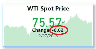
Here is a visual of the KPI, the color should be red since the daily change is negative.
- Mark as New
- Bookmark
- Subscribe
- Mute
- Subscribe to RSS Feed
- Permalink
- Report Inappropriate Content
Hi @dmartiprev,
Can you please share a pbix or some dummy data that keep the raw data structure with expected results? It should help us clarify your scenario and test to coding formula.
How to Get Your Question Answered Quickly
Regards,
Xiaoxin Sheng
- Mark as New
- Bookmark
- Subscribe
- Mute
- Subscribe to RSS Feed
- Permalink
- Report Inappropriate Content
I'm sorry I don't know how to attach a file on the reply. I can send you an excel of this data to reproduce this result if you show me how to attach it. Here is a small subset of this data that should produce the same result:
| Date | Daily Price of Oil | Oil Daily Price Change |
| 8/23/2021 | 65.65 | 3.4 |
| 8/24/2021 | 67.5 | 1.85 |
| 8/25/2021 | 68.54 | 1.04 |
| 8/26/2021 | 67.42 | -1.12 |
| 8/27/2021 | 68.84 | 1.42 |
| 8/30/2021 | 69.28 | 0.44 |
| 8/31/2021 | 68.43 | -0.85 |
Helpful resources

Power BI Monthly Update - April 2026
Check out the April 2026 Power BI update to learn about new features.

Data Days 2026 coming soon!
Sign up to receive a private message when registration opens and key events begin.

New to Fabric Survey
If you have recently started exploring Fabric, we'd love to hear how it's going. Your feedback can help with product improvements.

| User | Count |
|---|---|
| 4 | |
| 2 | |
| 1 | |
| 1 | |
| 1 |

