Get Fabric certified for FREE!
Don't miss your chance to take the Fabric Data Engineer (DP-600) exam for FREE! Find out how by watching the DP-600 session on-demand now through April 28th.
Learn more- Power BI forums
- Get Help with Power BI
- Desktop
- Service
- Report Server
- Power Query
- Mobile Apps
- Developer
- DAX Commands and Tips
- Custom Visuals Development Discussion
- Health and Life Sciences
- Power BI Spanish forums
- Translated Spanish Desktop
- Training and Consulting
- Instructor Led Training
- Dashboard in a Day for Women, by Women
- Galleries
- Data Stories Gallery
- Themes Gallery
- Contests Gallery
- QuickViz Gallery
- Quick Measures Gallery
- Visual Calculations Gallery
- Notebook Gallery
- Translytical Task Flow Gallery
- TMDL Gallery
- R Script Showcase
- Webinars and Video Gallery
- Ideas
- Custom Visuals Ideas (read-only)
- Issues
- Issues
- Events
- Upcoming Events
Join the FabCon + SQLCon recap series. Up next: Power BI, Real-Time Intelligence, IQ and AI, and Data Factory take center stage. All sessions are available on-demand after the live show. Register now
- Power BI forums
- Forums
- Get Help with Power BI
- Developer
- Re: Journey Chart Visual
- Subscribe to RSS Feed
- Mark Topic as New
- Mark Topic as Read
- Float this Topic for Current User
- Bookmark
- Subscribe
- Printer Friendly Page
- Mark as New
- Bookmark
- Subscribe
- Mute
- Subscribe to RSS Feed
- Permalink
- Report Inappropriate Content
Journey Chart Visual
Hi,
A link to the custom visual for a journey chart:
https://appsource.microsoft.com/en-us/product/power-bi-visuals/WA104380989?tab=Overview
I'm trying to build a journey chart visual using the data below:
When I try using the visual, nothing shows up. The order should be:
Service organization --> service category --> service --> solution --> application
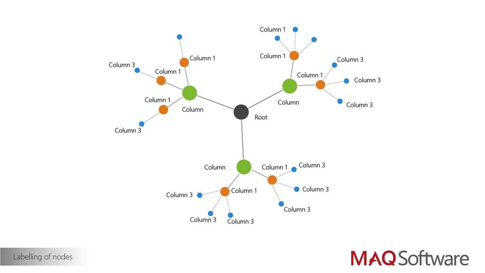
it should look something like this:
where the root would be the service organization, column as service category, column 1 as service, column 2 as solution, and column 3 as application.
I don't have any measure data, but is that something I need in order to use this visual? If so, are there any other custom visuals out there that are better suited for what I'm trying to achieve?
- Mark as New
- Bookmark
- Subscribe
- Mute
- Subscribe to RSS Feed
- Permalink
- Report Inappropriate Content
Hi,
You need measure data. without it the graph won't populate.
- Mark as New
- Bookmark
- Subscribe
- Mute
- Subscribe to RSS Feed
- Permalink
- Report Inappropriate Content
Since this custom visual is a third party custom visual we would recommend to reach out its developer to find out more: https://maqsoftware.com/expertise/powerbi
Ignat Vilesov,
Software Engineer
Microsoft Power BI Custom Visuals
Helpful resources

Power BI Monthly Update - April 2026
Check out the April 2026 Power BI update to learn about new features.

New to Fabric Survey
If you have recently started exploring Fabric, we'd love to hear how it's going. Your feedback can help with product improvements.

Power BI DataViz World Championships - June 2026
A new Power BI DataViz World Championship is coming this June! Don't miss out on submitting your entry.

| User | Count |
|---|---|
| 2 | |
| 1 | |
| 1 | |
| 1 | |
| 1 |
| User | Count |
|---|---|
| 8 | |
| 8 | |
| 4 | |
| 3 | |
| 2 |


