This is best Fabric, Power BI, SQL and AI community event. How do we know? The last event sold out! Save €200 with code FABCMTY200.
Register nowJuly 28 - August 9 | Final Round of the Power BI Dataviz World Championships. This is your chance. Learn more
Hi,
A link to the custom visual for a journey chart:
https://appsource.microsoft.com/en-us/product/power-bi-visuals/WA104380989?tab=Overview
I'm trying to build a journey chart visual using the data below:
When I try using the visual, nothing shows up. The order should be:
Service organization --> service category --> service --> solution --> application
it should look something like this:
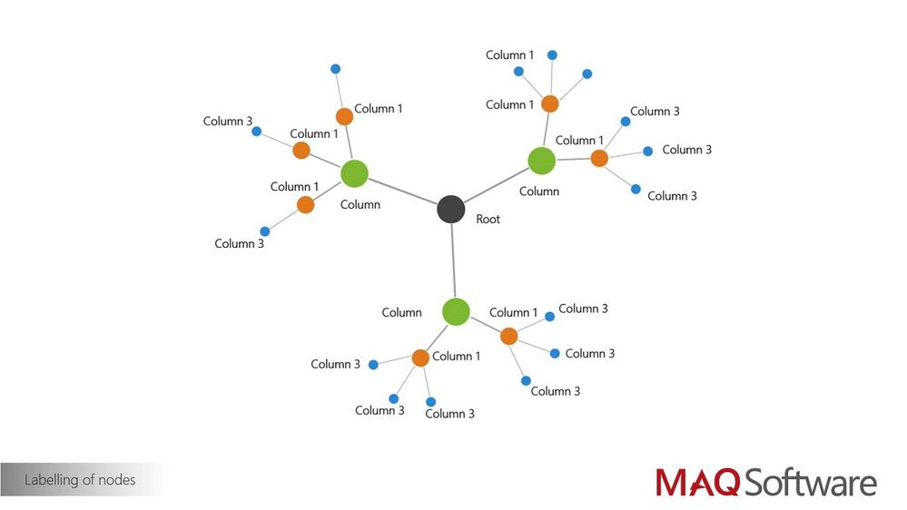
where the root would be the service organization, column as service category, column 1 as service, column 2 as solution, and column 3 as application.
I don't have any measure data, but is that something I need in order to use this visual? If so, are there any other custom visuals out there that are better suited for what I'm trying to achieve?
Hi,
You need measure data. without it the graph won't populate.
Since this custom visual is a third party custom visual we would recommend to reach out its developer to find out more: https://maqsoftware.com/expertise/powerbi
Ignat Vilesov,
Software Engineer
Microsoft Power BI Custom Visuals
Join us in Barcelona for FabCon and SQLCon, the Fabric, Power BI, SQL, and AI community event. Save €200 with code FABCMTY200.
If you love stickers, then you will definitely want to check out our community sticker challenge, Barcelona edition!
Check out the July 2026 Power BI update to learn about new features.
| User | Count |
|---|---|
| 2 | |
| 1 | |
| 1 | |
| 1 | |
| 1 |
| User | Count |
|---|---|
| 4 | |
| 2 | |
| 1 | |
| 1 | |
| 1 |