- Power BI forums
- Get Help with Power BI
- Desktop
- Service
- Report Server
- Power Query
- Mobile Apps
- Developer
- DAX Commands and Tips
- Custom Visuals Development Discussion
- Health and Life Sciences
- Power BI Spanish forums
- Translated Spanish Desktop
- Training and Consulting
- Instructor Led Training
- Dashboard in a Day for Women, by Women
- Galleries
- Data Stories Gallery
- Themes Gallery
- Contests Gallery
- QuickViz Gallery
- Quick Measures Gallery
- Visual Calculations Gallery
- Notebook Gallery
- Translytical Task Flow Gallery
- TMDL Gallery
- R Script Showcase
- Webinars and Video Gallery
- Ideas
- Custom Visuals Ideas (read-only)
- Issues
- Issues
- Events
- Upcoming Events
Learn from the best! Meet the four finalists headed to the FINALS of the Power BI Dataviz World Championships! Register now
- Power BI forums
- Forums
- Get Help with Power BI
- Developer
- Conditional Formating Power BI Custom Visual
- Subscribe to RSS Feed
- Mark Topic as New
- Mark Topic as Read
- Float this Topic for Current User
- Bookmark
- Subscribe
- Printer Friendly Page
- Mark as New
- Bookmark
- Subscribe
- Mute
- Subscribe to RSS Feed
- Permalink
- Report Inappropriate Content
Conditional Formating Power BI Custom Visual
Hi all,
I am trying to implement the condition formatting that was released not too long ago.
I am scratching my head about one thing I am seeing and was wondering if anyone can point me in the right direction.
When adding the code from the documention, the conditional function button (fx) gets appended to each data point in the format panel.

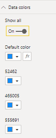
Since conditionally formating one data point will apply to them all, it would make sense to make it look like what the 'stacked bar chart' is doing which is only adding it to the first data point:
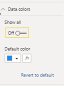
Even better would be to add the 'show all' toggle so the decault color represents all the data points:
Does anyone know how to achieve these two goals?
Thanks,
Matt
- Mark as New
- Bookmark
- Subscribe
- Mute
- Subscribe to RSS Feed
- Permalink
- Report Inappropriate Content
Hi @mroot ,
From the following paragraph from the official documentation, it seems that the function you expect is not yet available. Maybe you can go to Github for help.
We recommend that you don’t use conditional formatting with series. Instead, you should allow customers to format each series individually, making it easy to visually distinguish between series. Most out-of-the-box visuals with series, share this approach.
Best Regards
Helpful resources
| User | Count |
|---|---|
| 2 | |
| 2 | |
| 1 | |
| 1 | |
| 1 |
| User | Count |
|---|---|
| 3 | |
| 2 | |
| 2 | |
| 2 | |
| 2 |


