Hello, I am very new to Power BI and find some tasks difficult.
I have a single table with multiple forecasts that are timestamped (in this example simplified to just be called forecast 1, 2 etc.). Each forecast will contain the forecast periods (date, year, month).
I need the user to choose two forecast periods (most likley via two seperate drop downs) and then have a chart and table compare the two forecast periods.
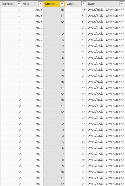
Example: Dropdown 2 user chooses Forecast 2, Dropddown 1 user choose Forecast 1.
Chart shows line graph with the two forecasts, value over month/year
then a table that caclulates the delta between each of the year/month values.
I've looked online for about 3 hours but can't seem to find a solution. This is something that would take 10 minutes in Excel but seems much more complicated in Power BI.
Please help. I am on my knees!
Daniel


